Watching is not the same as learning.
A child may be able to recognise a sign without being able to reproduce it.
Implication
The product needs a practice layer, not only a content layer.
Product Design / Accessibility / EdTech
A visual-first ISL learning experience for young Deaf and non-speaking children.
Designing a learning experience that connects written language, visual meaning and Indian Sign Language through accessible, low-pressure practice.
Project snapshot
Young Deaf and non-speaking children can encounter barriers when learning environments rely heavily on spoken instruction, text or limited opportunities for individual practice.
Create a visual-first learning experience that supports structured ISL learning and meaningful practice without making camera use mandatory.
Children aged approximately 6–8, and their parents or guardians.
A structured learning system connecting Learn → Watch → Practice → Feedback → Progress.
In short
Designed an Indian Sign Language learning app for deaf children end-to-end, from Double Diamond research to lessons, practice and guardian controls.
Practice stopped depending on the camera — a hands-only, visual-first path sits beside camera practice, with accessibility built into the flow.
Comprehension with children in the target age range, co-designed and reviewed with Deaf educators and native ISL signers.
This is an independent case study I designed to practice end-to-end product thinking — from research through to a working prototype.
View interactive prototypeProcess
I used the Double Diamond to separate problem discovery from solution development, allowing the research to shape the product direction before committing to a solution. In practice the stages overlapped — accessibility findings in Develop sent parts of the flow back into Define.
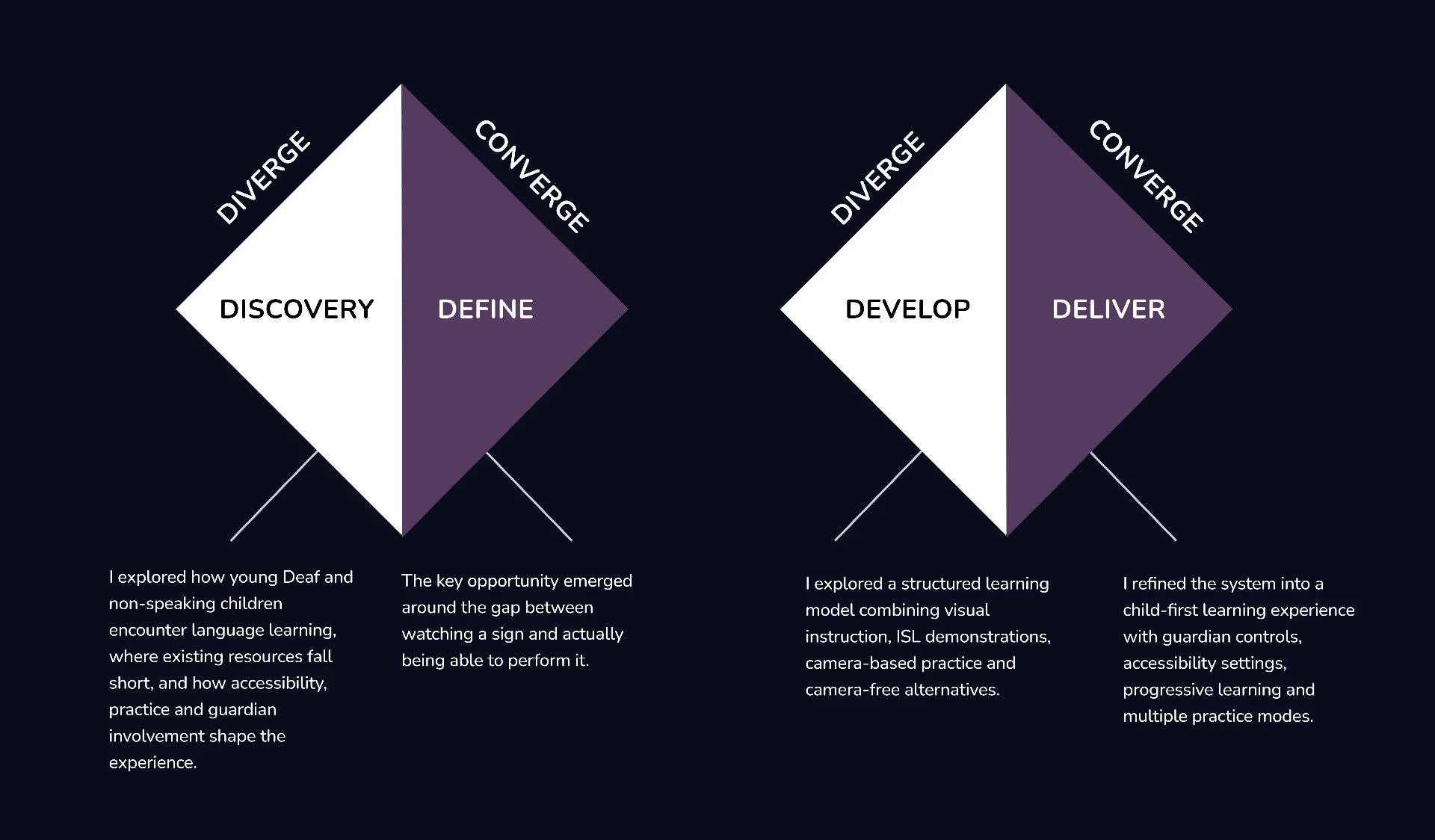
Research the problem and context.
Synthesize evidence into a focused opportunity.
Explore and prototype possible solutions.
Refine, validate and prepare the final experience.
01 / Discover
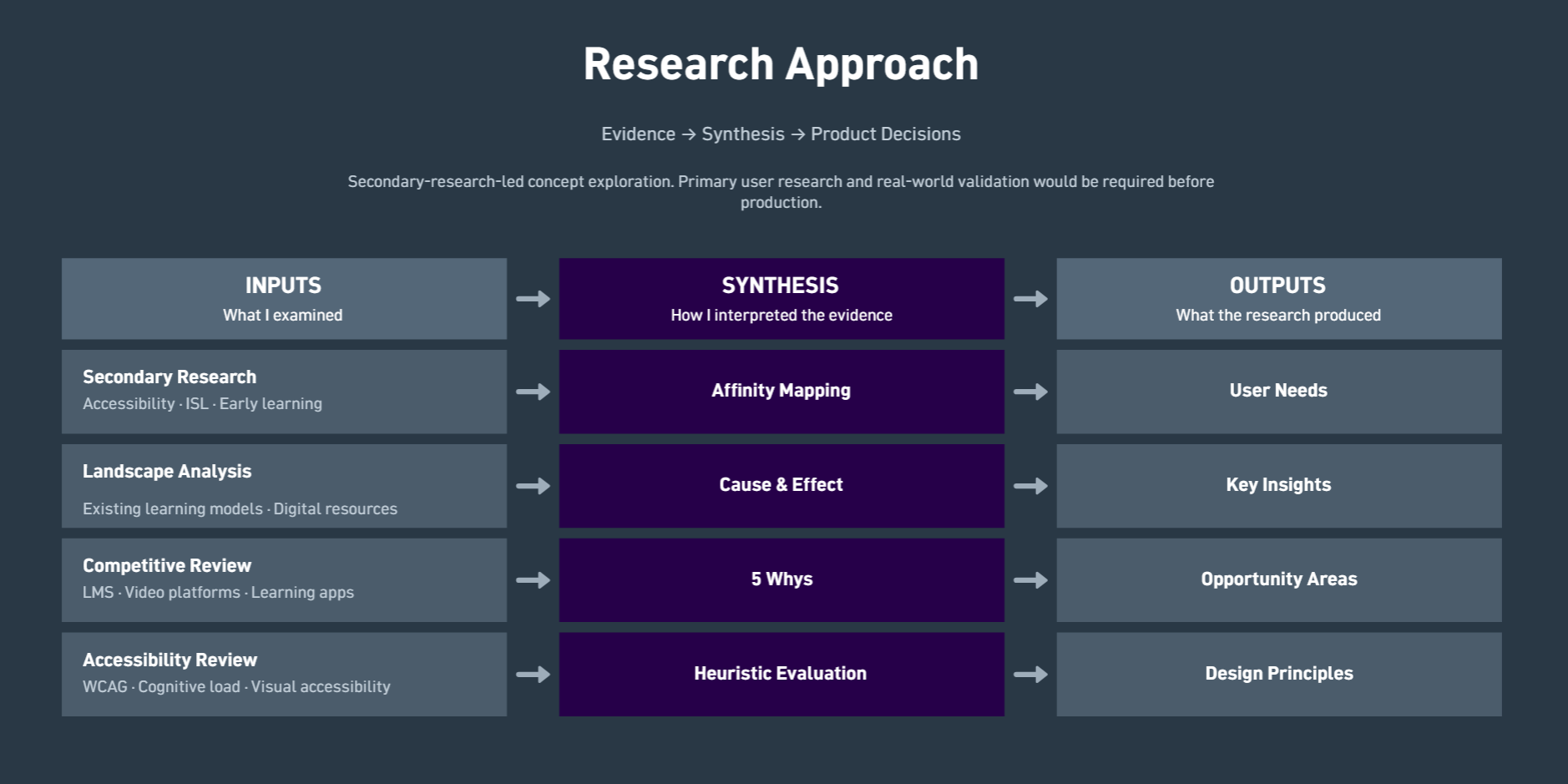
Rather than beginning with an LMS or an AI translator, I first explored the learning environment around young Deaf and non-speaking children: how foundational language is introduced, where practice breaks down, what role teachers and guardians play, and where existing digital resources leave gaps.
Secondary research-led concept exploration. No interviews or usability sessions were conducted; every conclusion below is drawn from published material, existing products and structured evaluation.
How are young Deaf and non-speaking children introduced to language and foundational learning?
Where does existing ISL learning become difficult for children?
Is watching a sign enough to demonstrate learning?
How can children practise without depending entirely on teacher correction?
How can camera-based practice be made optional rather than mandatory?
What role should parents play?
How can an interface reduce cognitive load for early learners?
How can accessibility be embedded into the product architecture rather than added later?
Landscape
Learning resources exist across teachers, schools, video platforms, educational content and digital tools. However, these experiences are often fragmented across content delivery, practice and feedback.
| Approach | Strength | Limitation | Opportunity |
|---|---|---|---|
| Teacher-led learning | Live correction and human context. | Attention is shared across a whole class. | Extend practice beyond the classroom session. |
| Video-based learning | Consistent, repeatable demonstration. | Delivery without verification of performance. | Attach an activity to every demonstration. |
| Open video platforms | Wide availability of ISL content. | No curriculum order or progression. | Structure content into levels and lessons. |
| Traditional LMS | Progress tracking and structure. | Text-first patterns built for older learners. | Rebuild the same structure visually. |
| Camera-based practice | Feedback on the child's own signing. | Privacy, comfort and device constraints. | Offer an equivalent camera-free route. |
| Signa | Structured lessons paired with optional practice modes. | Concept stage; recognition accuracy unvalidated. | Treat accessibility as product architecture. |
Synthesis
A child may be able to recognise a sign without being able to reproduce it.
Implication
The product needs a practice layer, not only a content layer.
Children are not only learning a gesture. They are building relationships between written symbol → meaning → ISL sign → physical action.
Implication
Lessons should make these relationships explicit.
Camera practice can create privacy, comfort and access considerations.
Implication
Camera-based practice should coexist with a meaningful camera-free alternative.
Children need simple, visual, low-cognitive-load interactions. Guardians need deeper controls around accessibility, privacy, practice and learning rhythm.
Implication
Create two complementary experiences rather than forcing both users into the same interface.
Context
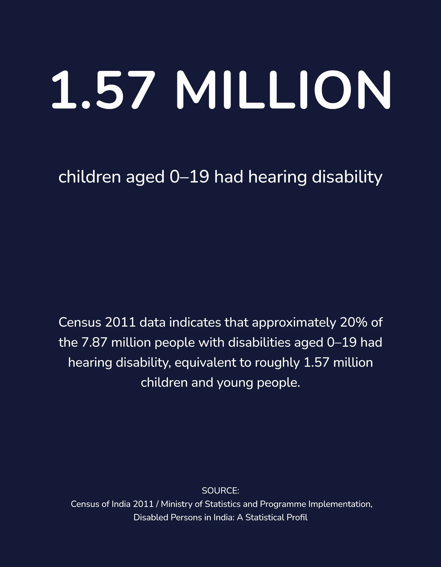
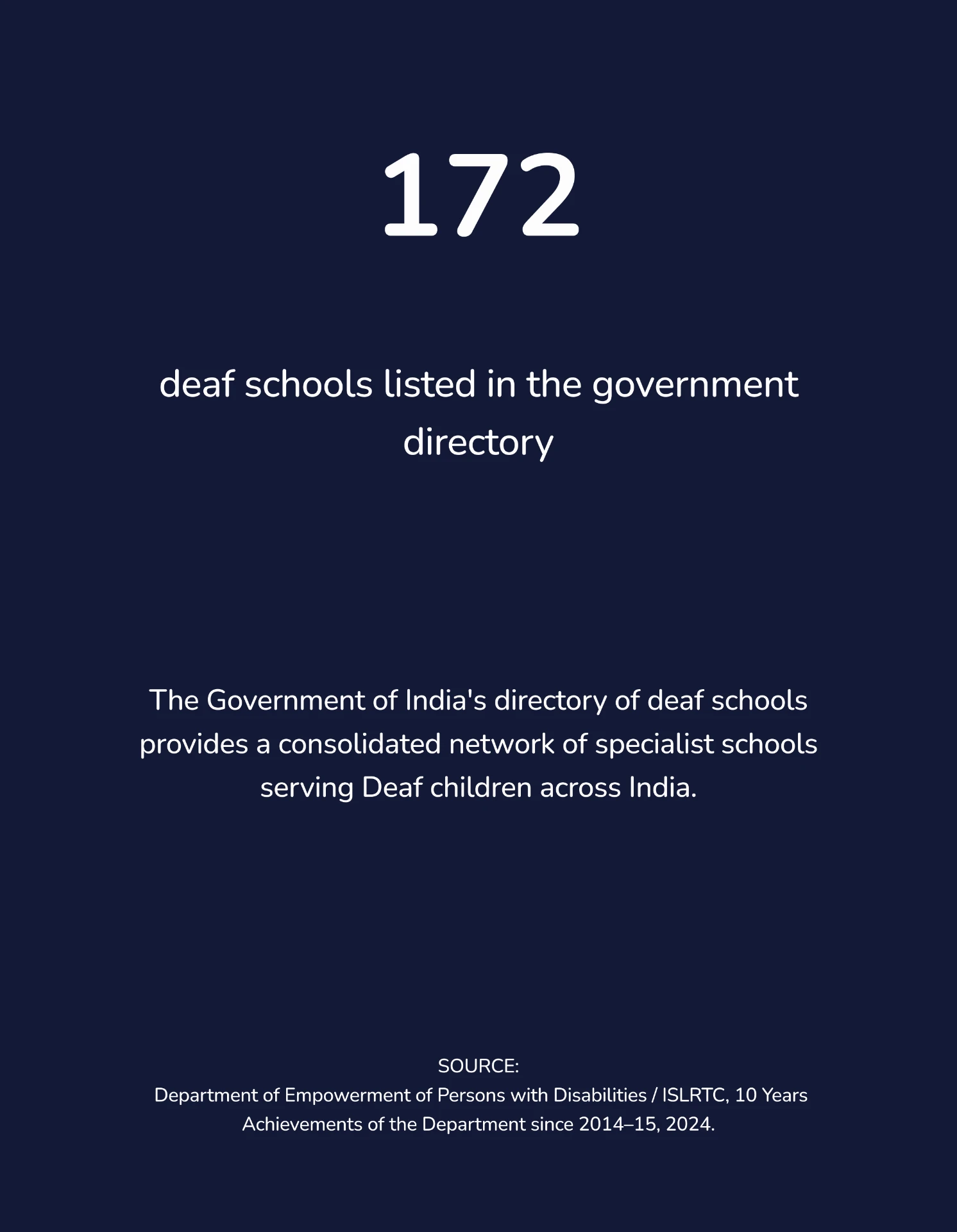
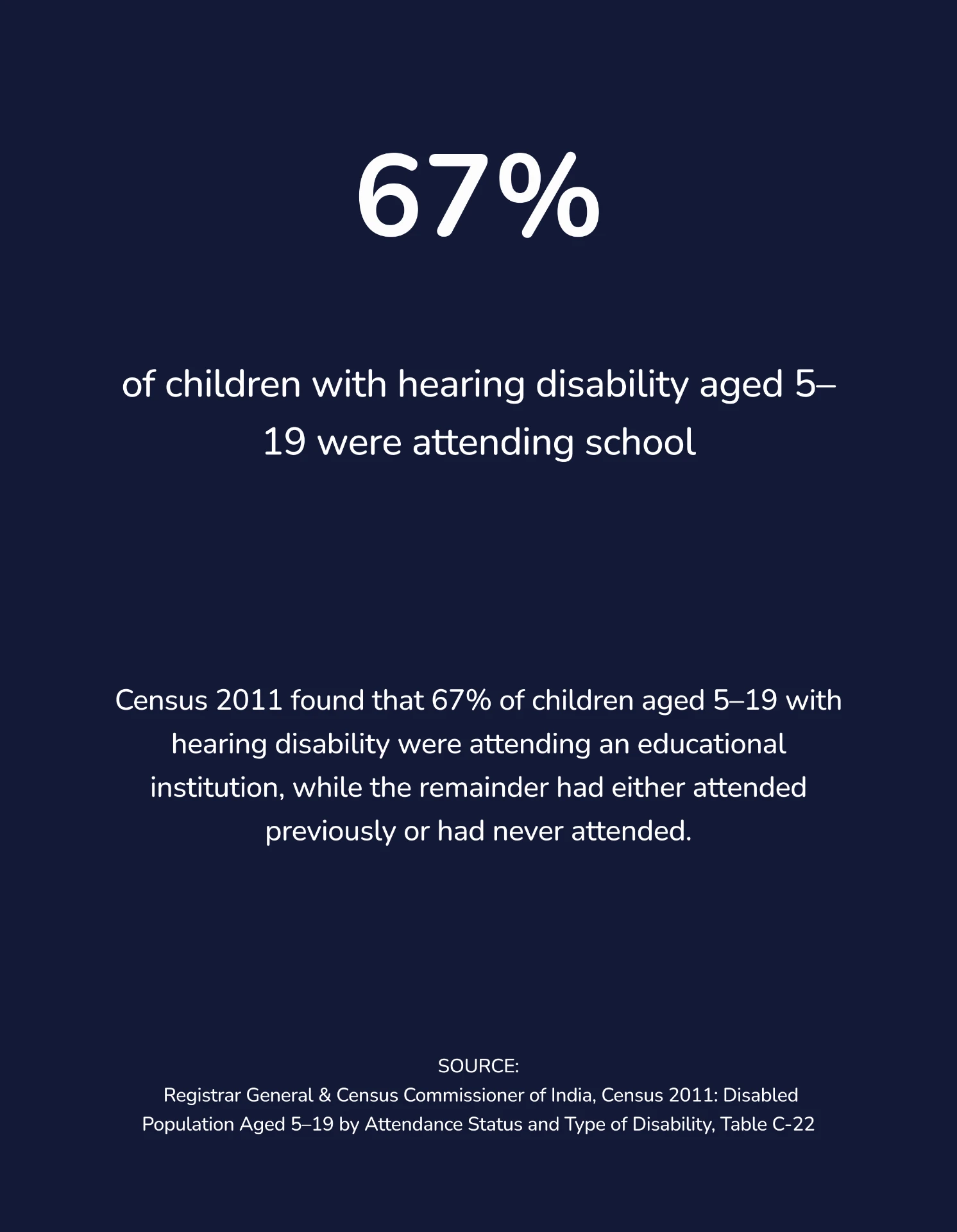
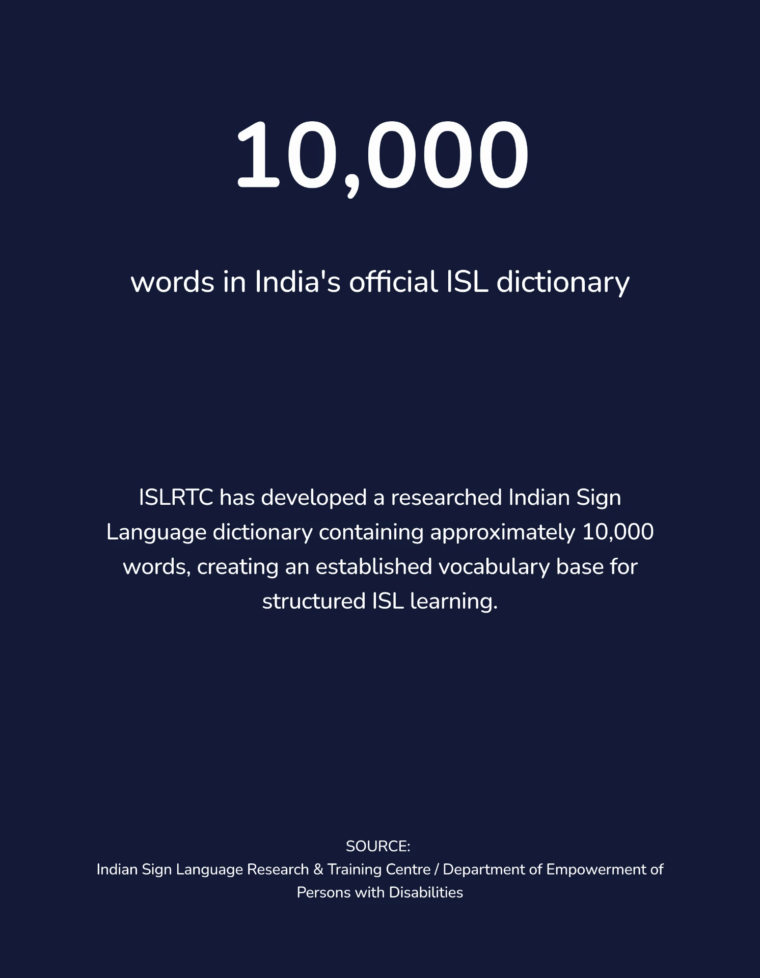
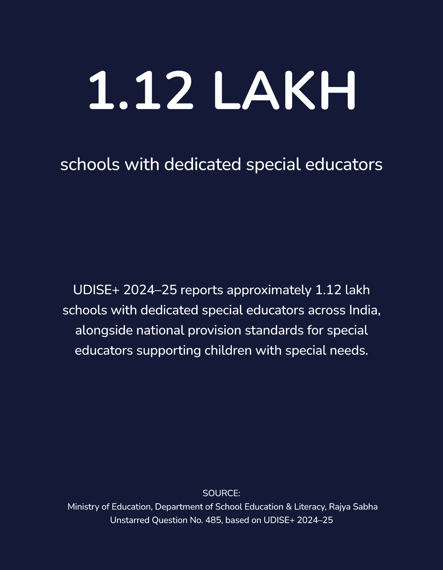
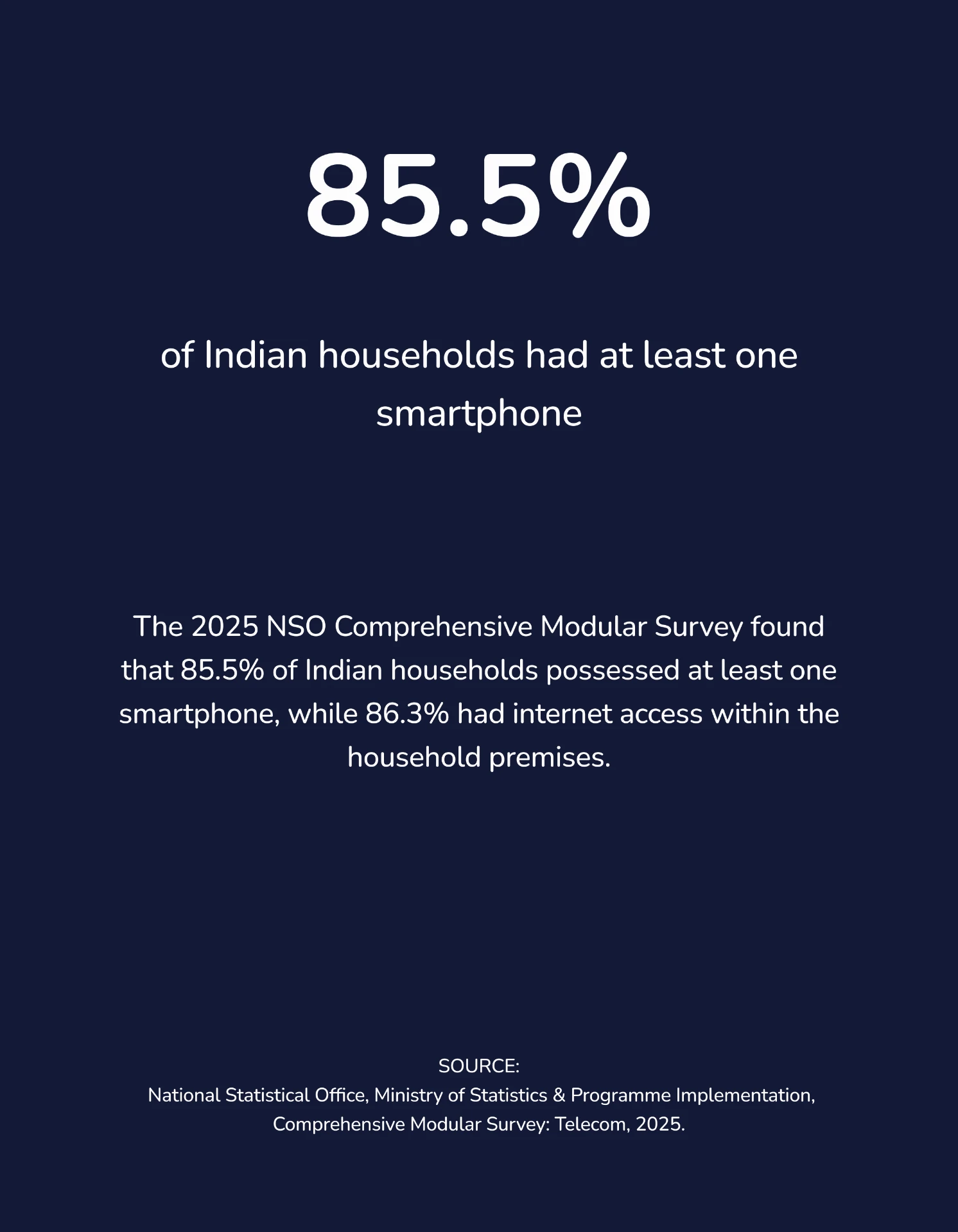
I reviewed government datasets, institutional reports and established research to quantify the scale of the problem, understand education access, and identify the existing ISL and digital infrastructure surrounding young Deaf learners in India.
Synthesis
I clustered recurring observations across learning, practice, accessibility, guardian involvement and engagement to identify patterns that could influence the product direction.
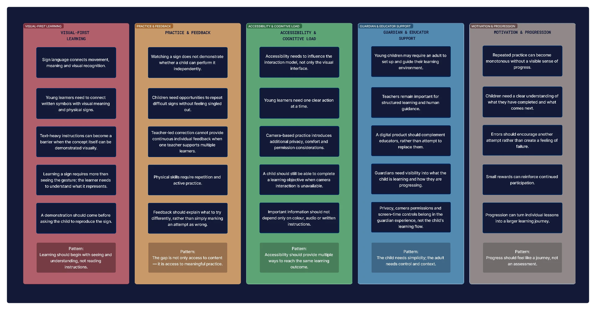
Affinity map — clustered observations across five themes
Demonstration carries more instructional weight than text.
Repetition needs a response to be useful.
Input methods cannot be assumed.
Support without ISL fluency.
Progress needs to be visible.
Users
Journey
Mapping the child's session end to end made the gap visible: everything before Practice is well served by existing tools, and everything after it is not.
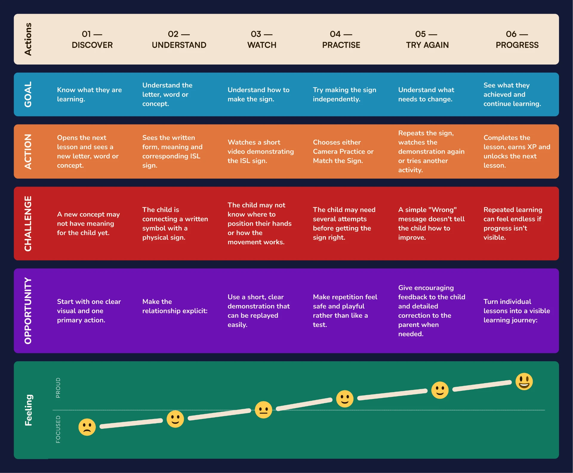
Journey map — goal, action, challenge, opportunity and feeling per stage
Root cause
Children can recognise an ISL sign without having enough opportunity to practise and verify their own signing.
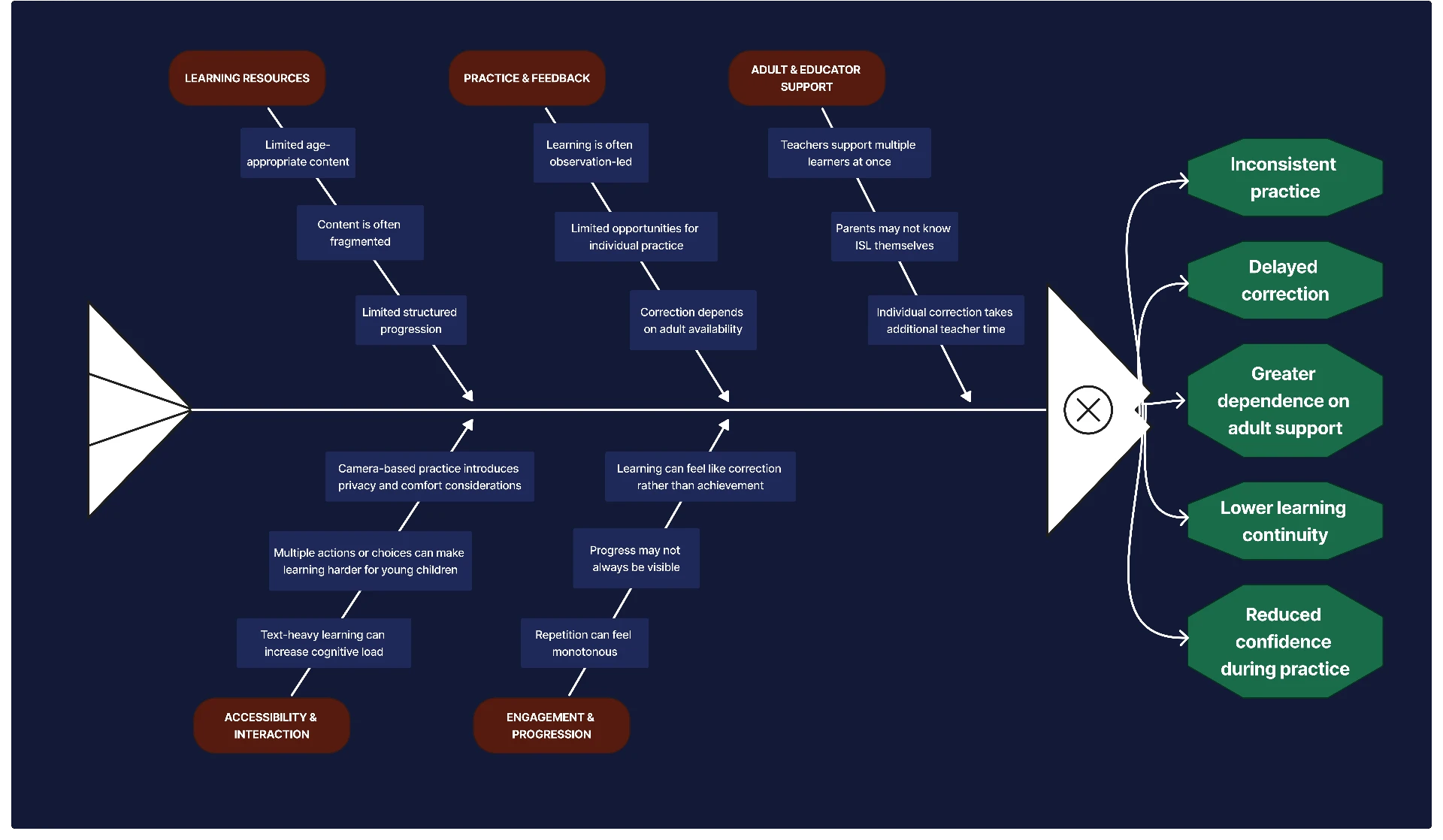
Cause & effect — five contributing branches and their downstream effects
5 Whys
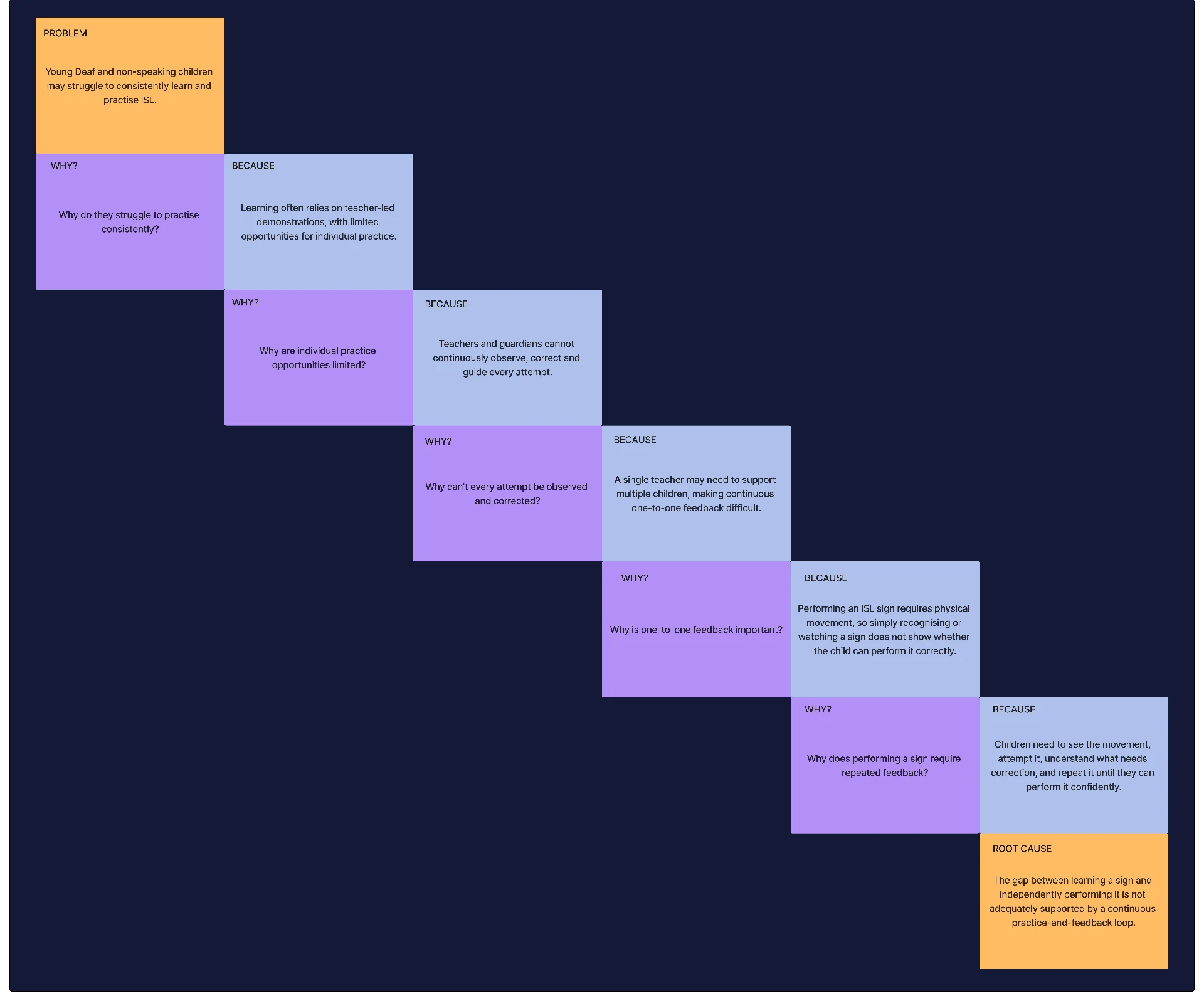
5 Whys — from symptom to root cause
Why can children struggle to learn ISL?
Because learning can depend heavily on demonstration without enough individual practice.
Why is individual practice limited?
Because teachers cannot continuously observe every child's signing.
Why can't the child practise independently?
Because many resources primarily deliver content rather than interactive practice.
Why does this matter?
Because recognising a sign and performing a sign are different learning outcomes.
What is the underlying opportunity?
The product needs to bridge see → understand → perform → receive feedback.
The opportunity wasn't simply to create more ISL content. It was to create a meaningful practice layer around that content.
02 / Define
Problem statement
Young Deaf and non-speaking children need a visual-first way to build foundational ISL skills that goes beyond watching demonstrations, while guardians need control over accessibility, privacy and learning rhythm.
How might we…
How might we create a visual-first ISL learning experience that allows young children to learn, practise and reinforce signs independently, while giving guardians meaningful control over accessibility, privacy and learning rhythm?
Young Deaf and non-speaking children and their guardians.
Learn, practise and reinforce ISL through structured visual lessons and interactive activities.
Build foundational communication skills through accessible, low-pressure practice while giving guardians control over the learning environment.
Principles
Show before explaining.
Every lesson should provide an opportunity to perform.
Accessibility should not depend on one input method.
Keep child interactions simple while giving guardians meaningful controls.
Make learning feel like a journey rather than a test.
Product strategy
Each lesson is a complete cycle rather than a page of content. The loop is what makes practice a structural part of the product rather than an optional extra.
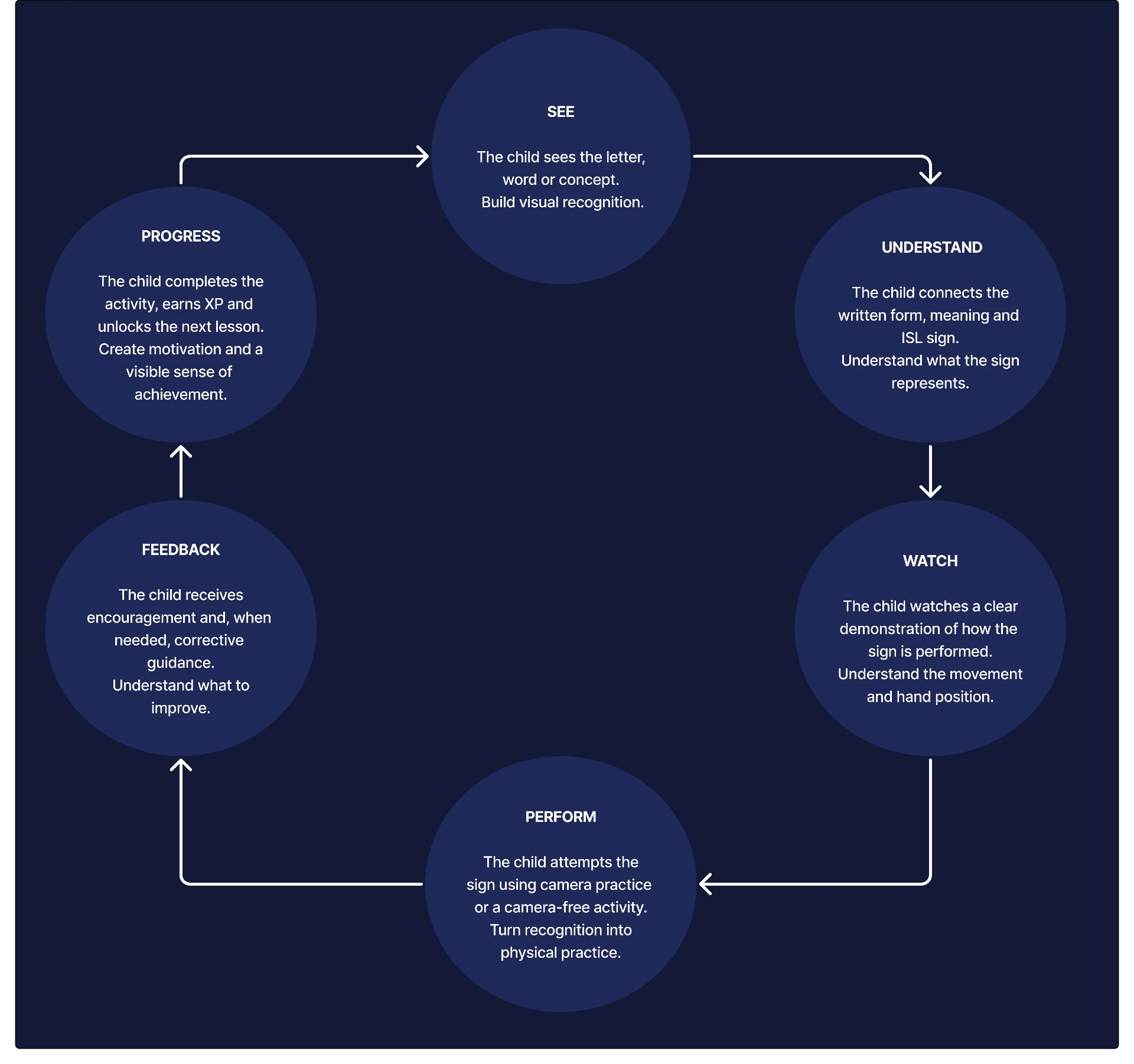
Core learning loop — see, understand, watch, perform, feedback, progress
Information architecture
The child-facing tree stays four levels deep at most; everything configurable lives behind the parent section.
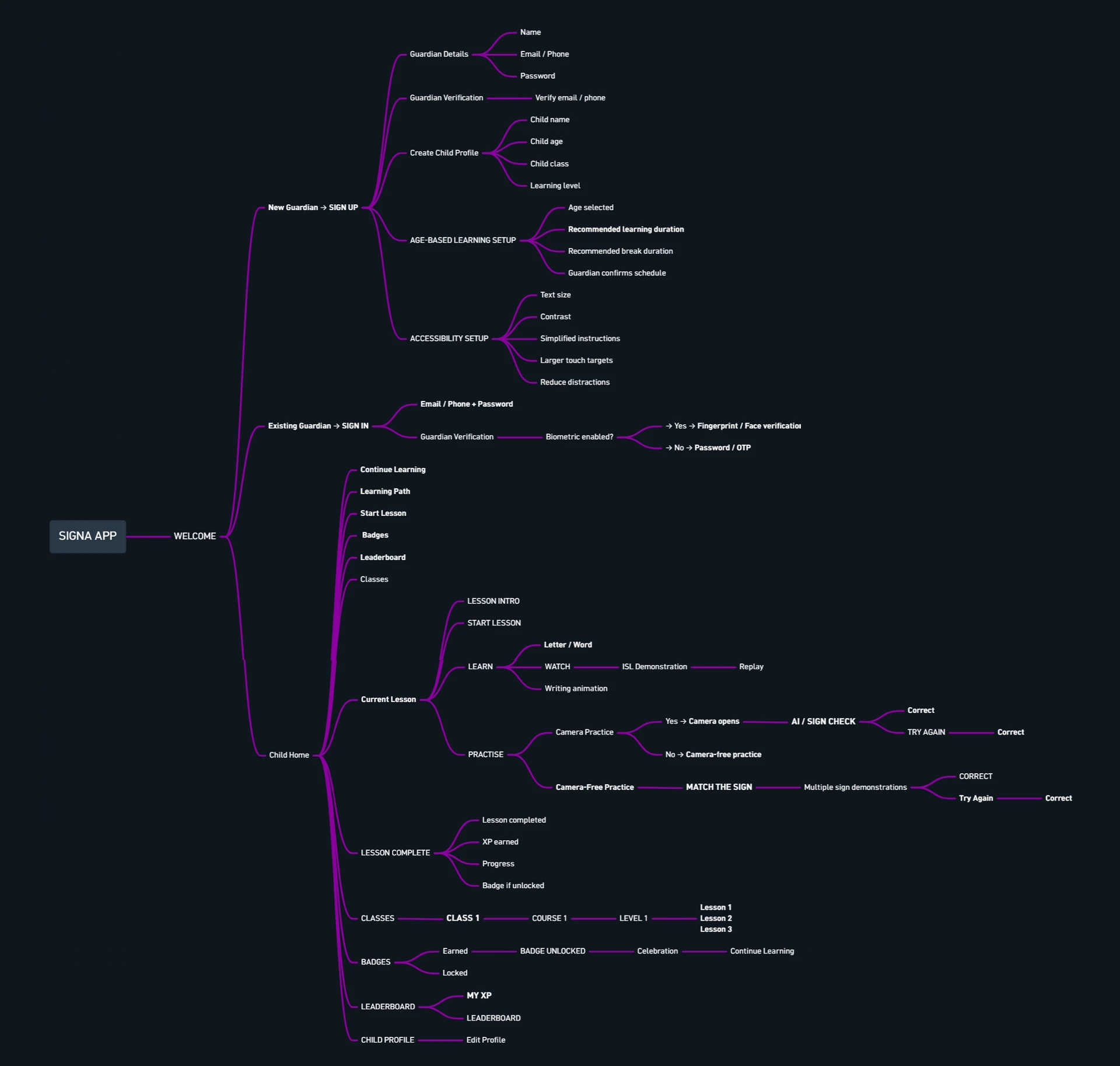
Information architecture — child and guardian trees
User flow
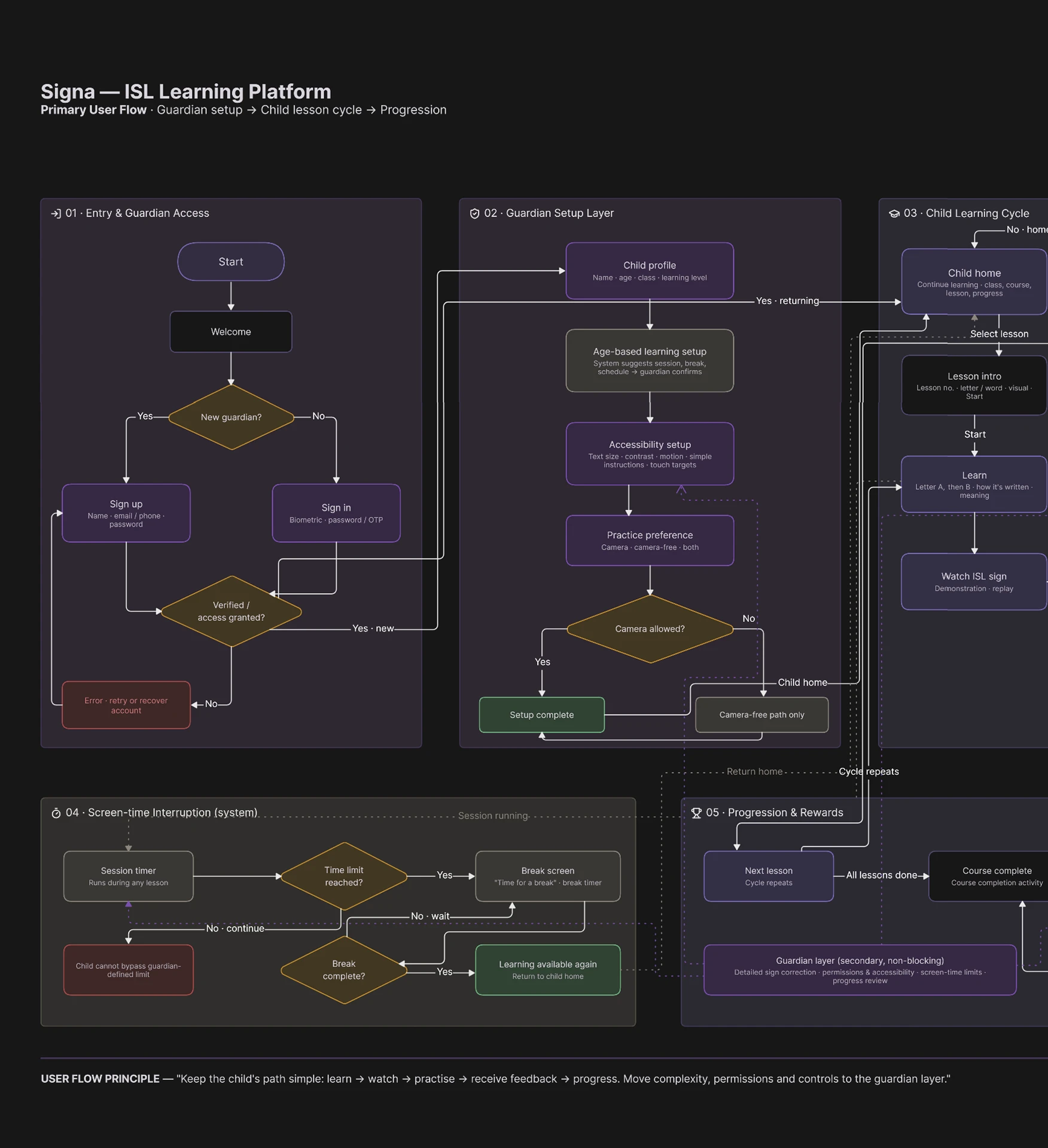
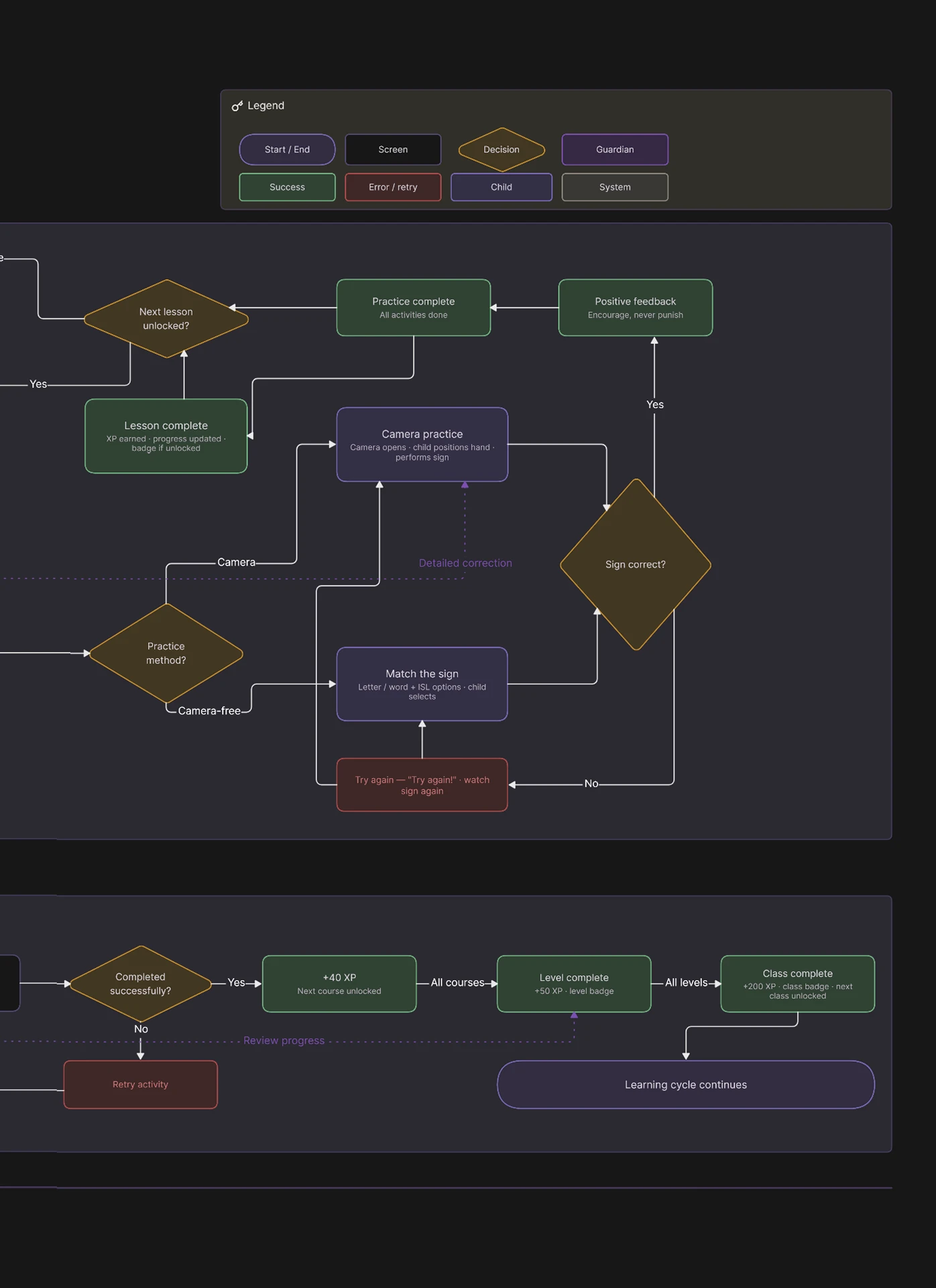
The branch below is where accessibility becomes structural: the camera route and the camera-free route both complete the same lesson objective.
03 / Develop
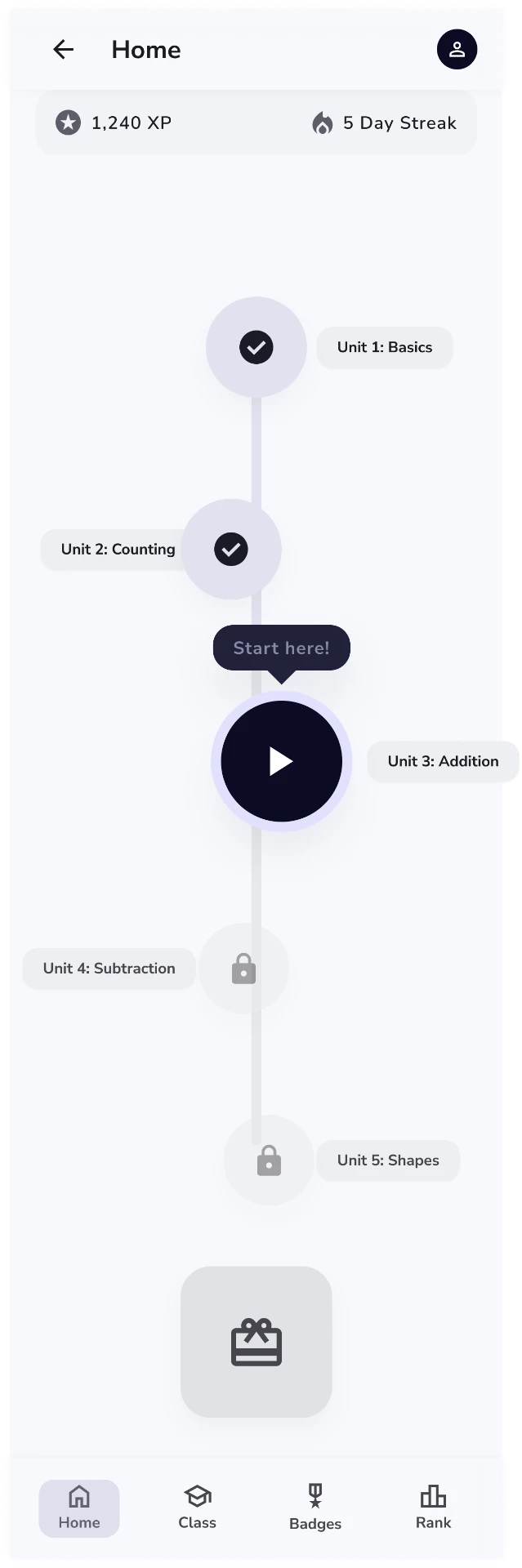
I chose to focus the product on structured learning and meaningful practice rather than making translation the centre of the experience.
Design decision
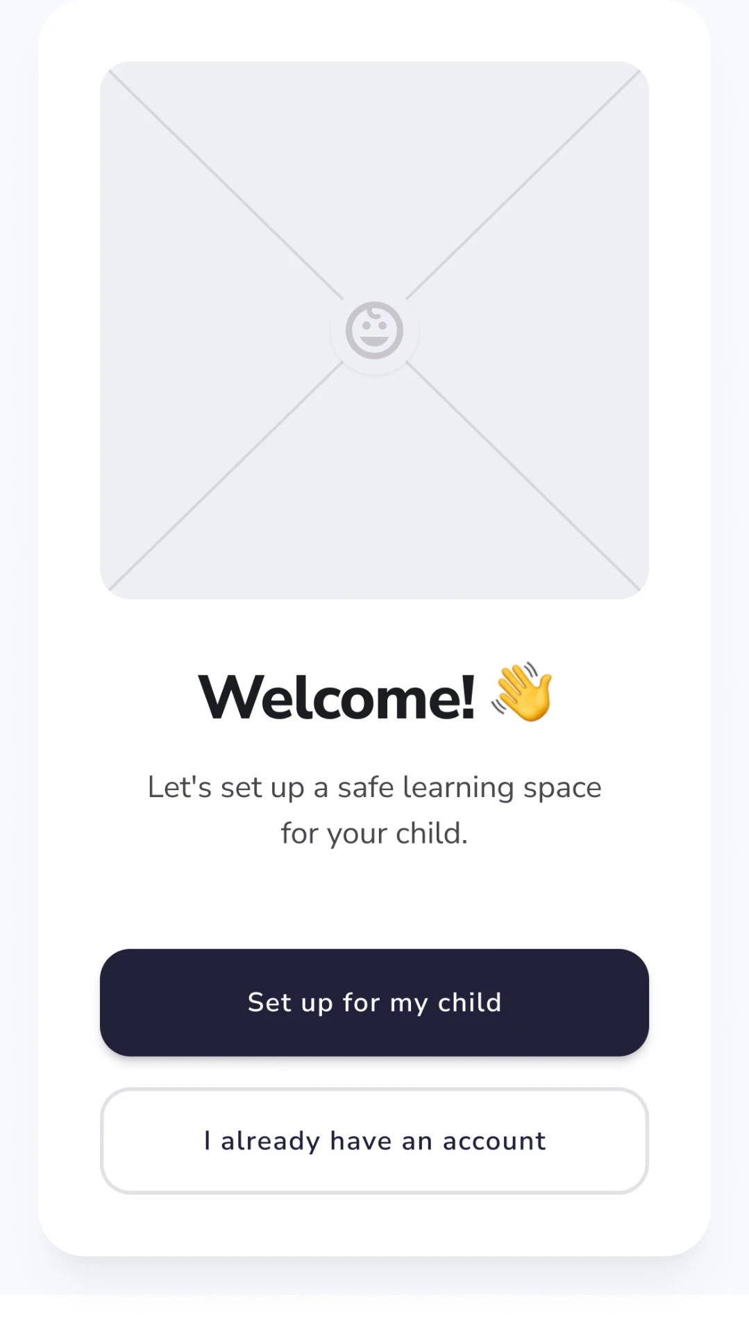
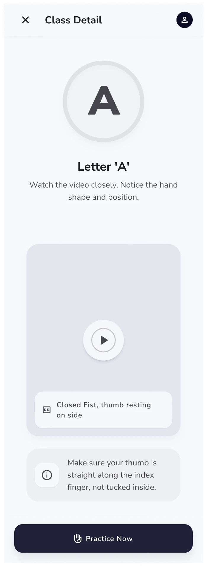
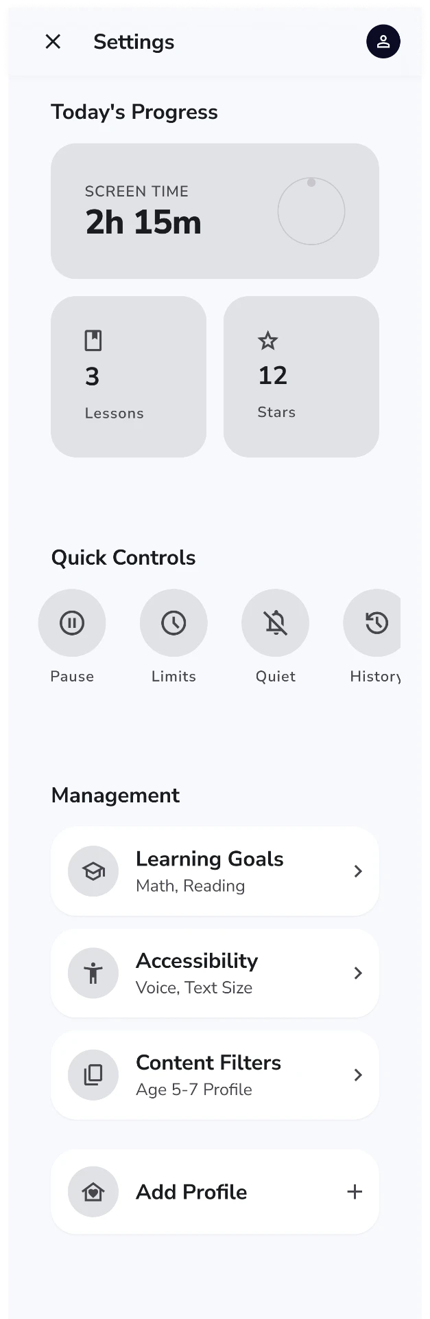
Early wireframes intentionally reduced each screen to one primary action to minimise cognitive load for younger learners.
Design system
Component decisions followed the constraints: large targets, non-colour feedback states, and cards that lead with visual content.
Signa
18 sections — foundations through accessibility. Live components, not a screenshot.
Every token exists to serve one of three constraints: visual-first learning, large touch targets, and feedback that never depends on colour alone.
Brand
color.primary
#4B49E5
Accent
color.secondary
#FF8A3D
Surface
color.surface
#FFFFFF
Text
color.text
#171632
Base unit
4 px
Min touch target
48 × 48
Body contrast
≥ 4.5:1
Primary
primary/600
#4B49E5
Primary soft
primary/100
#E8E7FF
Secondary
secondary/500
#FF8A3D
Success
semantic/success
#1EA96C
Warning
semantic/warning
#E9A507
Error
semantic/error
#E1483F
Info
semantic/info
#2E86F0
Neutral
neutral/200
#E2E1EE
Background
bg/base
#F7F7FB
Surface alt
surface/alt
#F0F0F7
Text
text/primary
#171632
Text muted
text/muted
#5C5B7A
Colour never carries meaning alone — every state pairs a hue with an icon and a word.
Display
Learn to sign
Nunito · 700 · 40/44
H1
Today's lesson
Nunito · 700 · 32/38
H2
Course 1 — Alphabet
Nunito · 700 · 26/32
H3
Practice modes
Nunito · 600 · 20/28
H4
Camera-free practice
Nunito · 600 · 16/24
Body large
Watch the sign, then try it yourself.
Inter · 400 · 17/28
Body
Copy the hand shape shown in the video.
Inter · 400 · 15/24
Body small
You can practise without the camera.
Inter · 400 · 13/20
Label
GUARDIAN ACCESS
Inter · 600 · 11.5/16
Caption
Video plays at 0.5× by default
Inter · 400 · 11/16
Button
Go to practice
Inter · 600 · 14/20
Numeric / XP
+40 XP
Nunito · 800 · 26/30
Mobile — 4 col
20px page margin · 12px gutter · cards stack full-width.
Tablet / guardian — 8 col
Max content width 720px · 24px card spacing.
SM 8
MD 16
LG 24
XL 32
Pill
Rounded stroke icons, 2px weight, 24px grid — friendly without being cartoonish.
Completed
Current
Locked
Course 1 · Lesson 3
Letter C
Watch · Copy · Check
Play lessonActivity card
Match the sign
3 of 5 activities
Class card
Alphabet Class
2 courses · 26 lessons
Course card
Course 1 — A to M
Level card
Level 2
Unlocks at 200 XP
Lesson card
Letter B
In progressLesson progress
Course progress
18 of 26 lessons
XP rewards effort and attempts, never accuracy alone — a wrong attempt still earns progress.
Locked
In progress
Earned
First lesson!
Celebration state
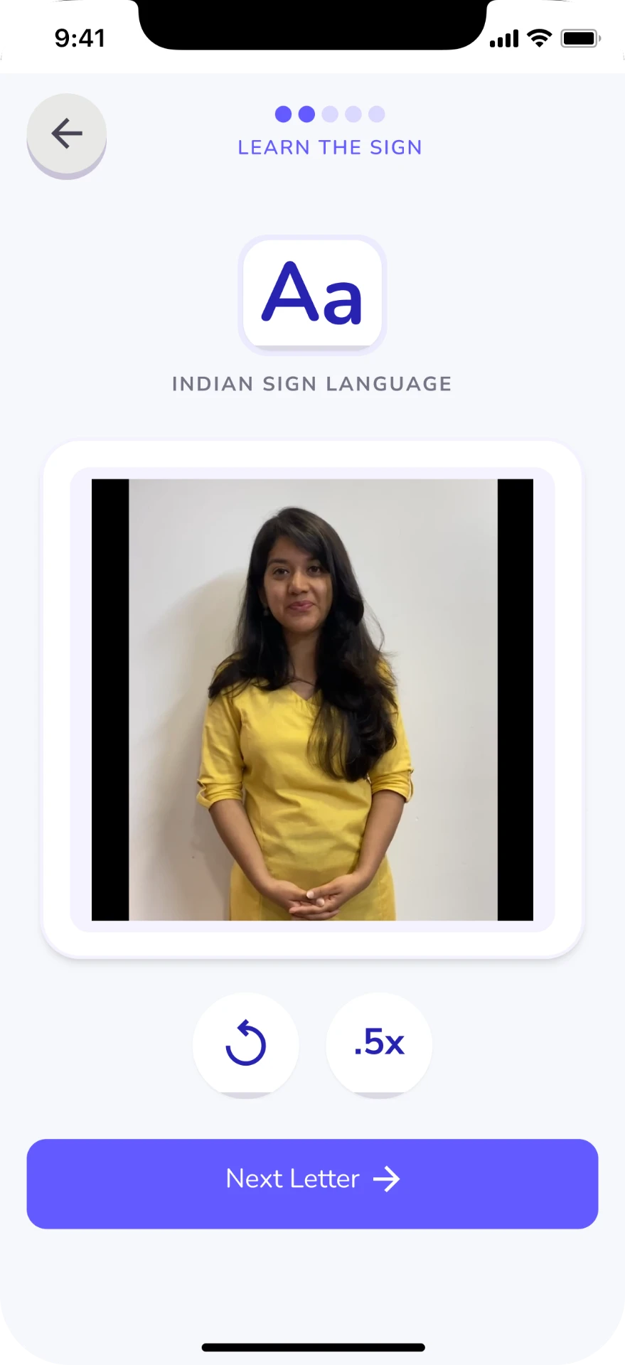
Hand shape: closed fist, thumb at the side. Video occupies ≥60% of the learning card.
Aa
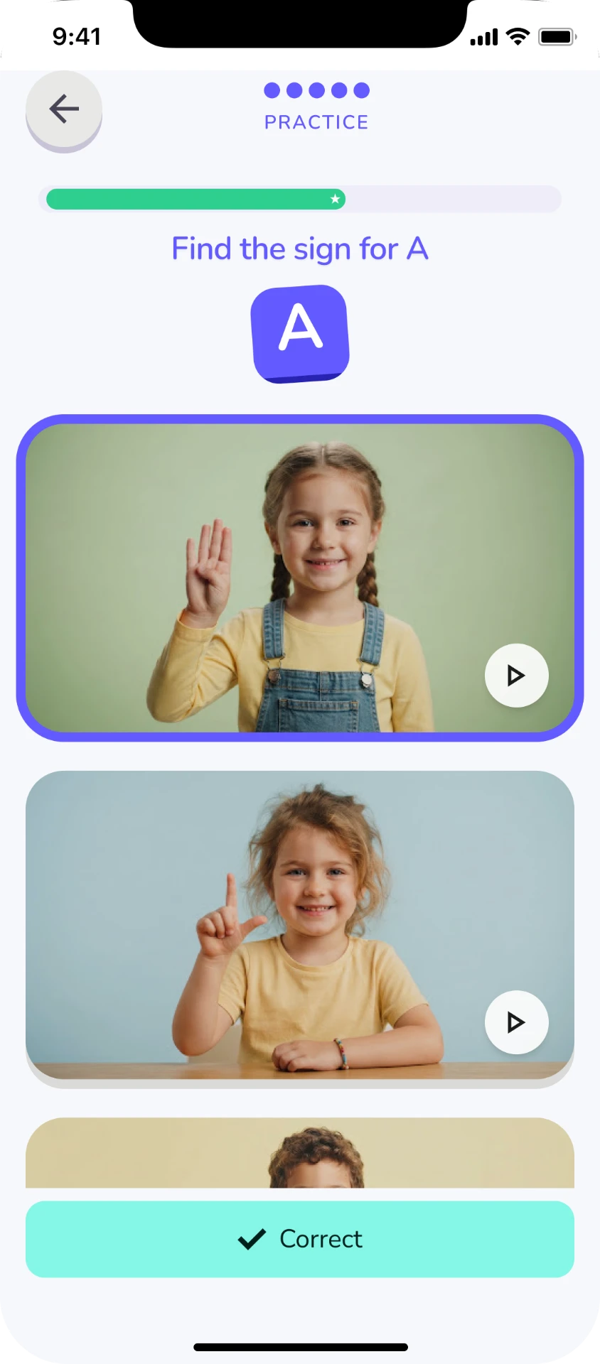
Which one is the sign for A?
Success
Great job!
Encouragement
Nearly there — one more go.
Try again
Try again!
Incorrect
That's a different sign.
Locked
Finish Letter A first.
Completed
Lesson complete.
Child-facing copy stays to three words where possible; guardian views carry the detail.
Accessibility components live in the core library — not in a separate "accessible mode".
Accessibility
Accessibility was treated as a product-level constraint rather than a visual layer added at the end. Designed with WCAG 2.2 principles in mind; formal conformance has not been tested.
Privacy by design
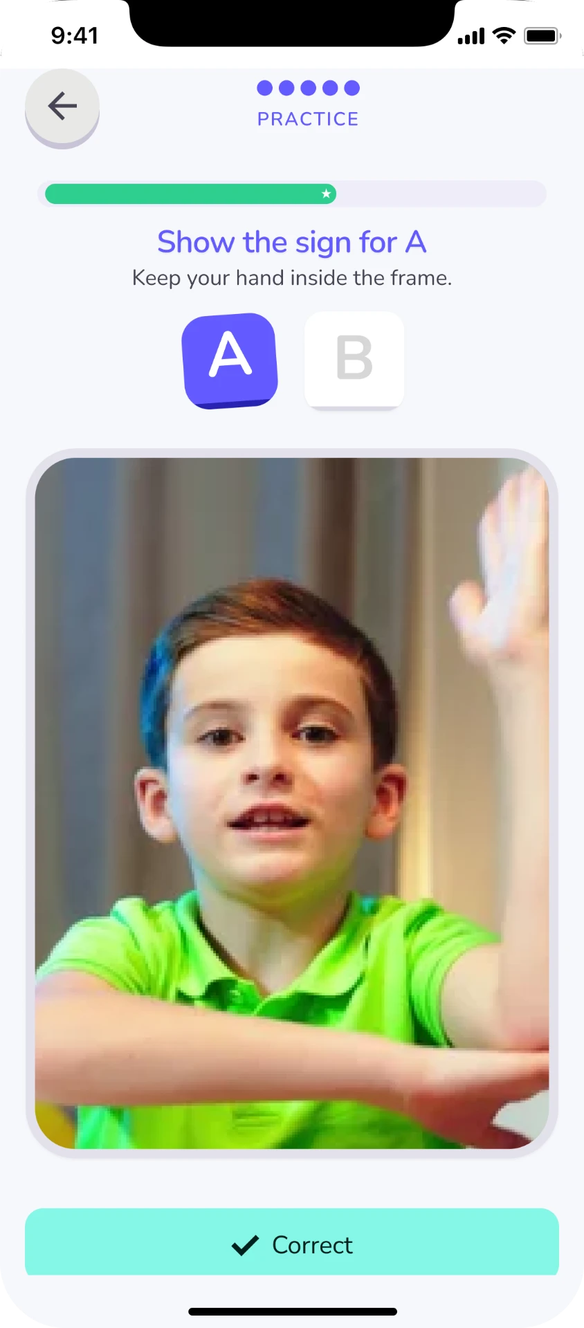
Camera-based practice can provide richer feedback, but it also introduces privacy, comfort and access considerations. Instead of making camera use mandatory, Signa provides an equivalent camera-free learning activity.
Practice signs while keeping the face outside the frame.
Optional practice including facial expression.
Visual matching activity.
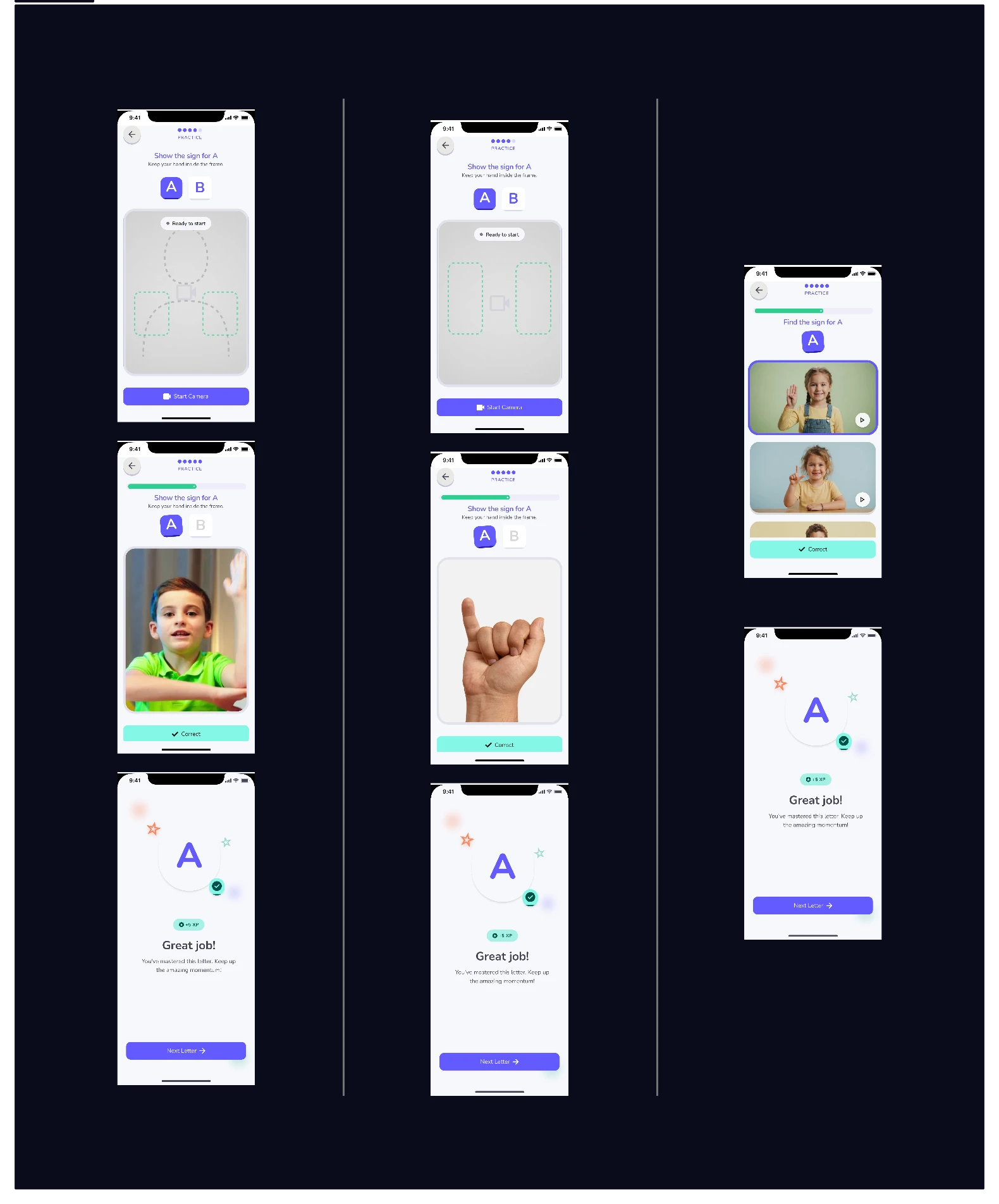
Three practice modes against the same lesson objective
Cognitive load
Because the primary learner is young, reducing cognitive load became a central design constraint.
Large visual hierarchy, a single decision per screen.
Use demonstration instead of explanation where possible.
Show signs, objects and examples.
The same interaction patterns repeat across lessons.
Errors become opportunities to try again rather than moments of failure.
04 / Deliver
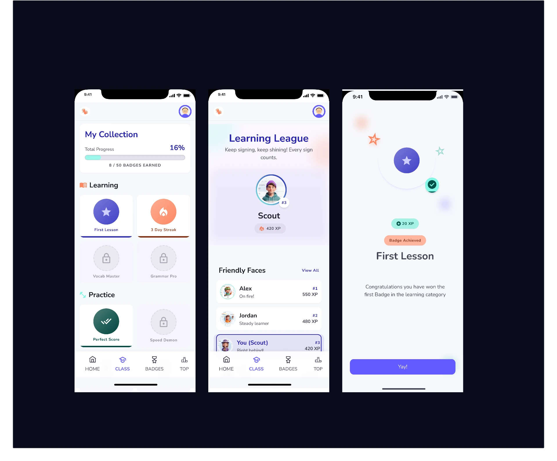
Key interactions
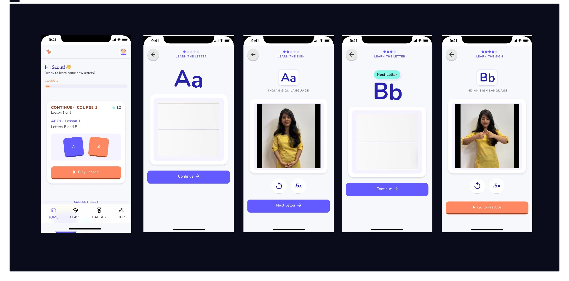
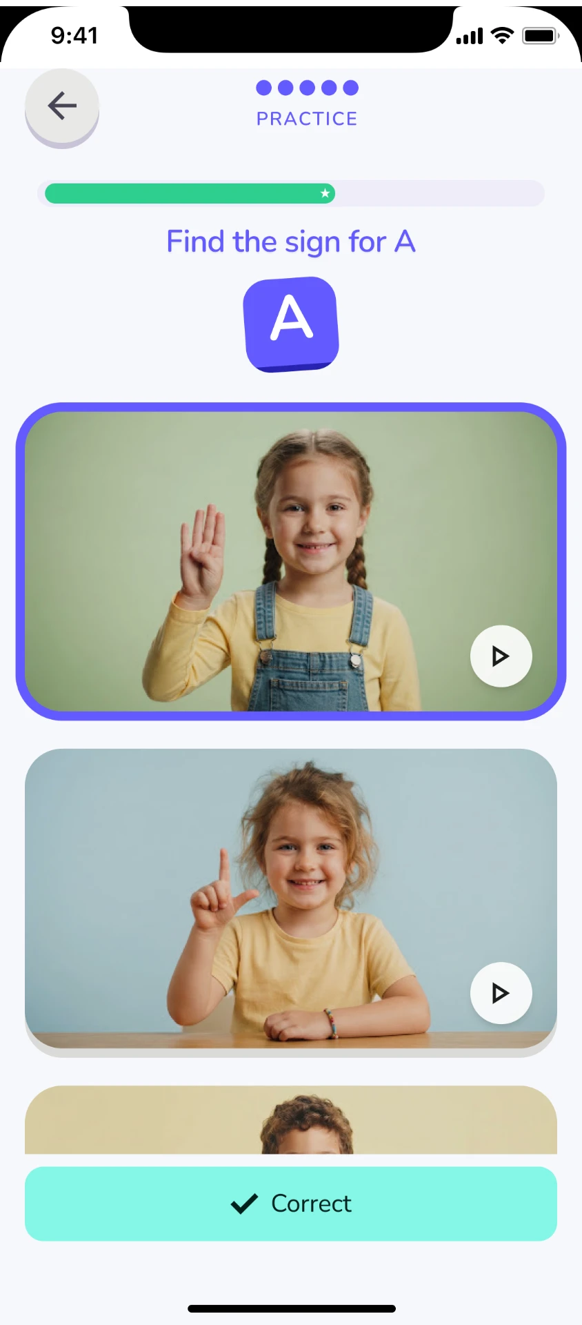
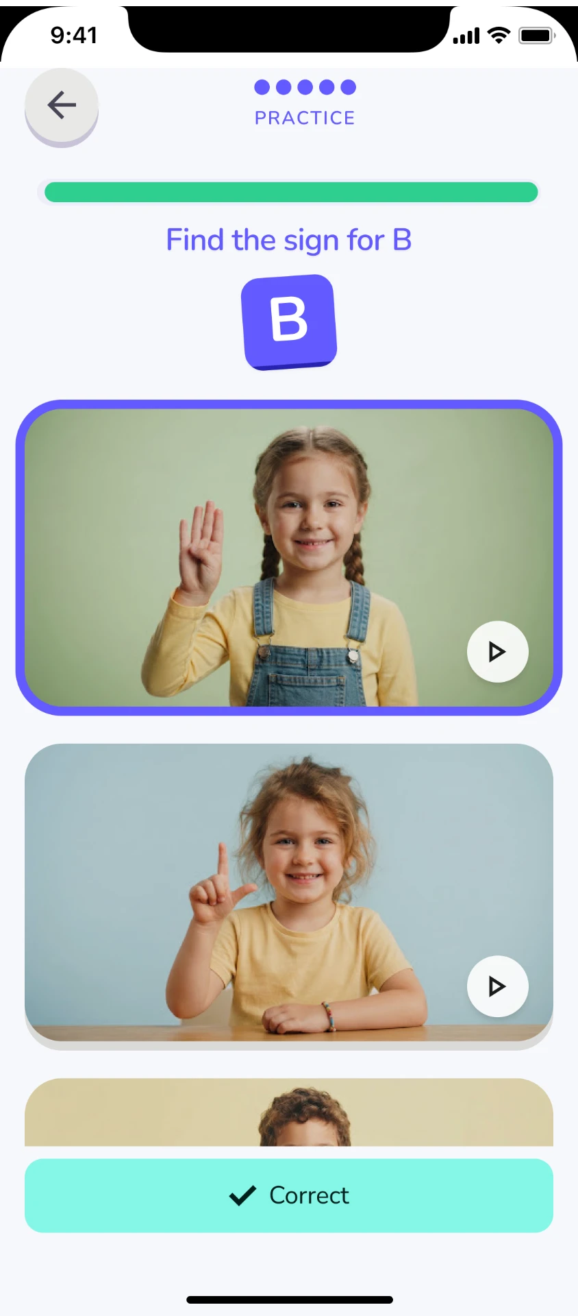
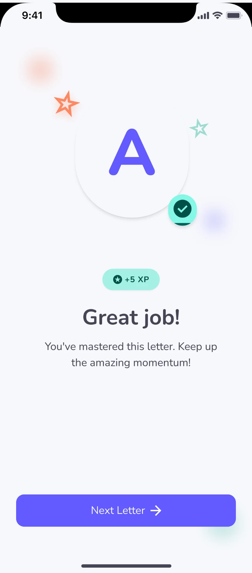
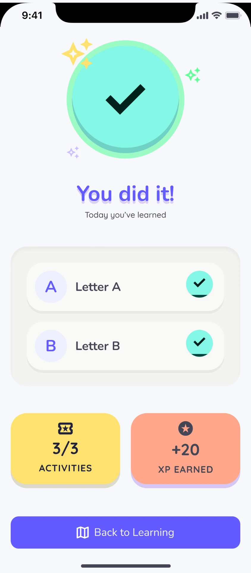
The lesson intentionally separates recognition from performance: the child first understands the symbol and its meaning, observes the ISL sign, and only then attempts to reproduce or identify it.
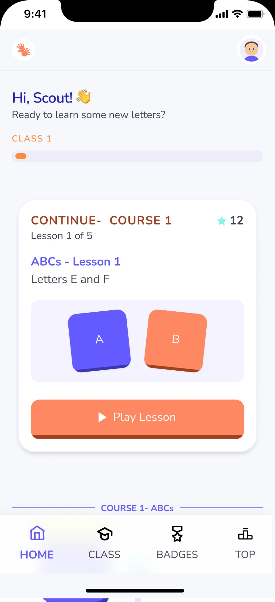
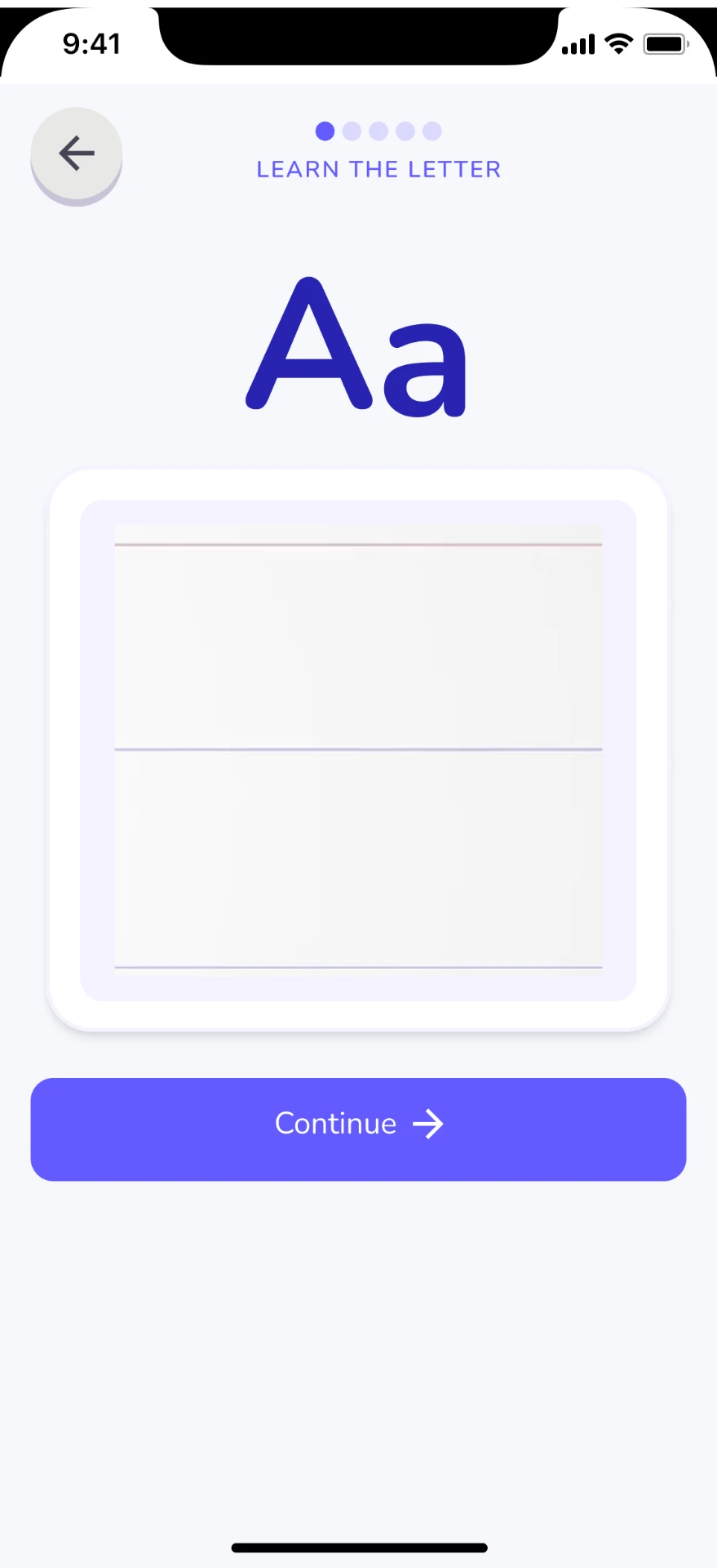
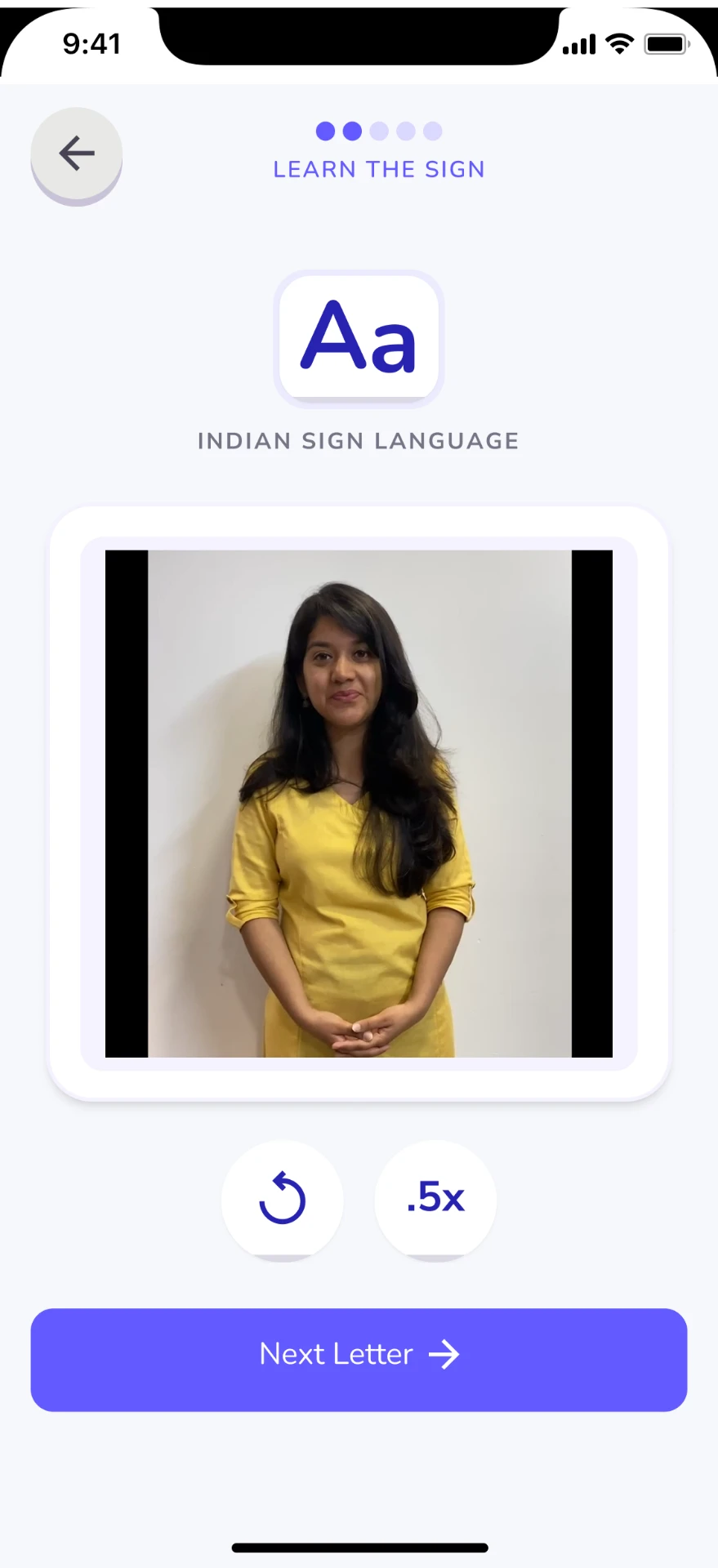
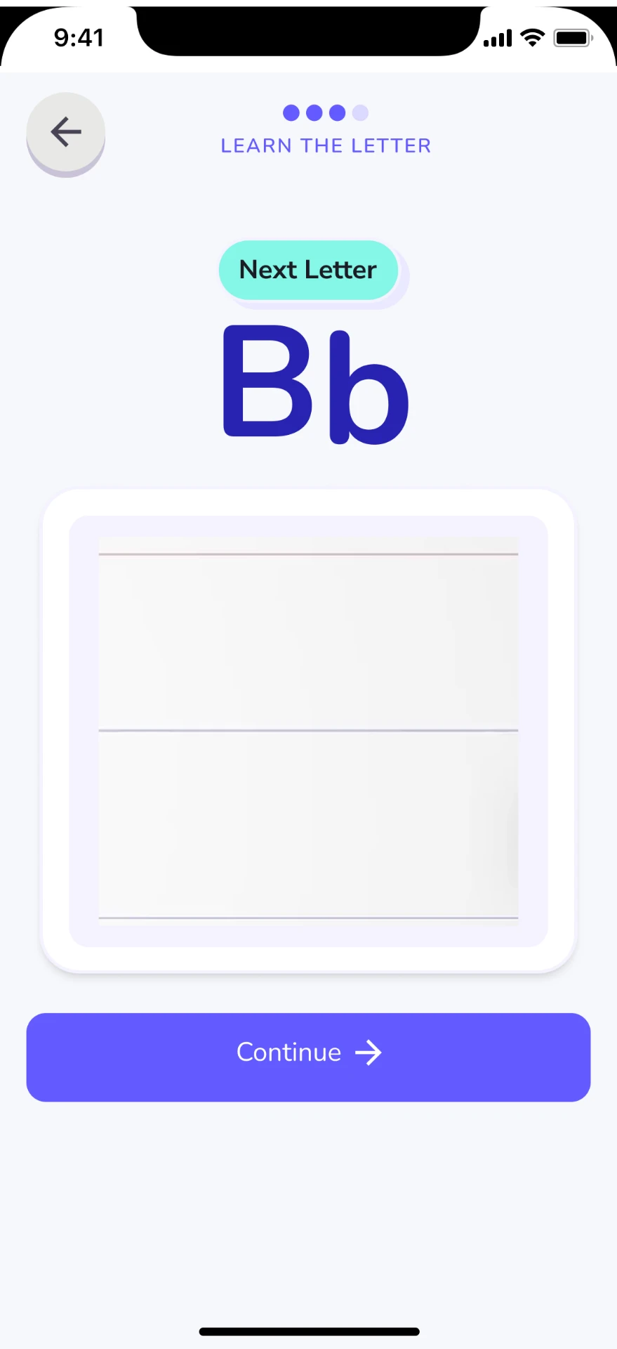
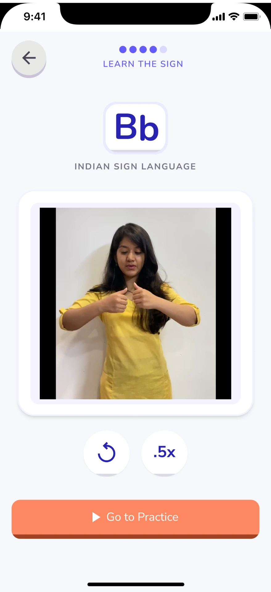
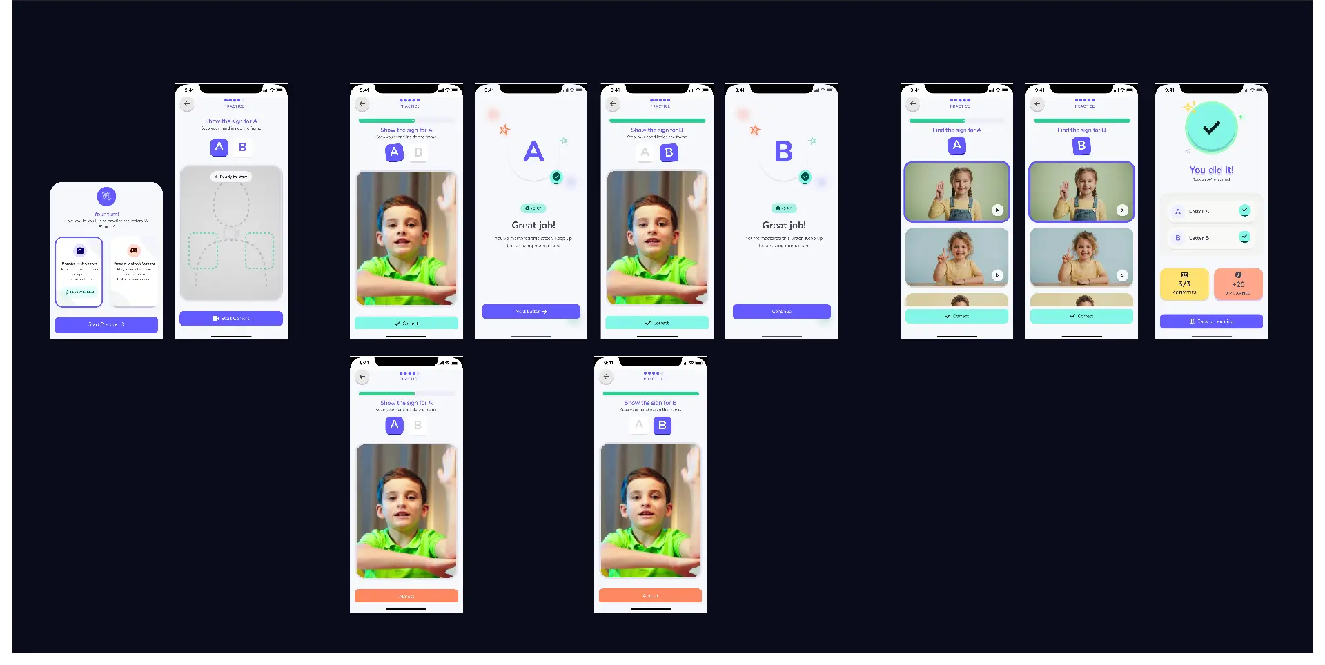
Camera practice is designed as an optional layer rather than the only route to completing a lesson.
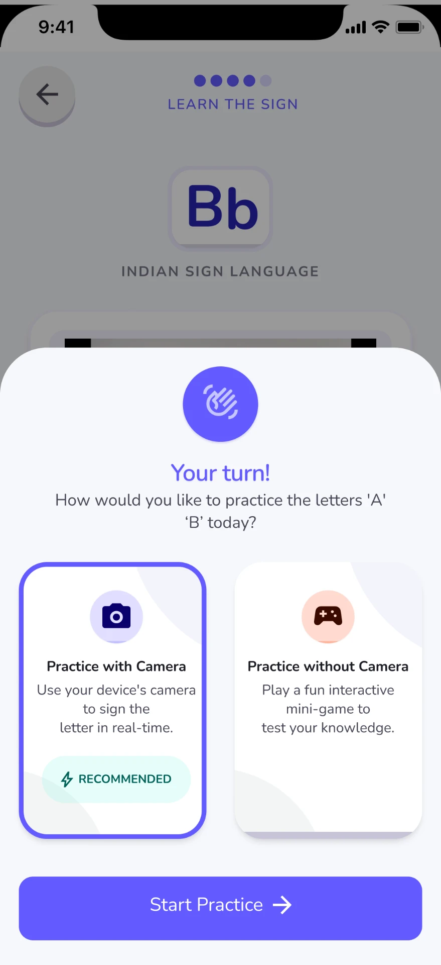
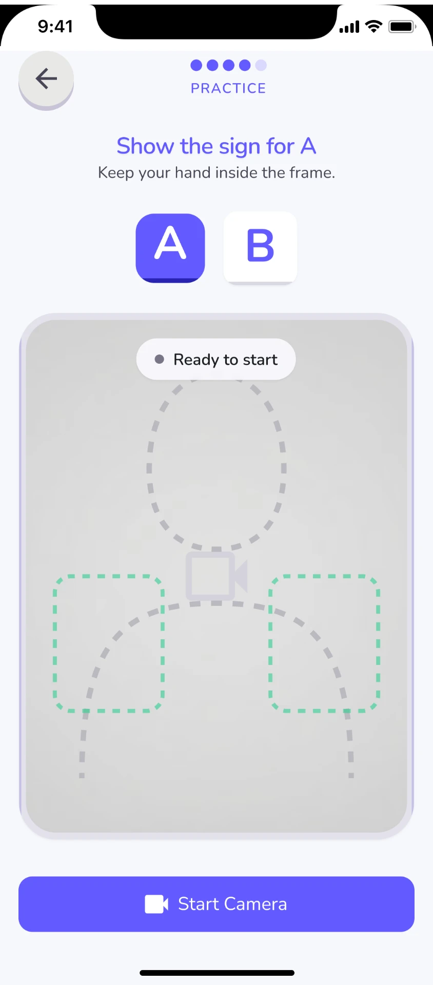
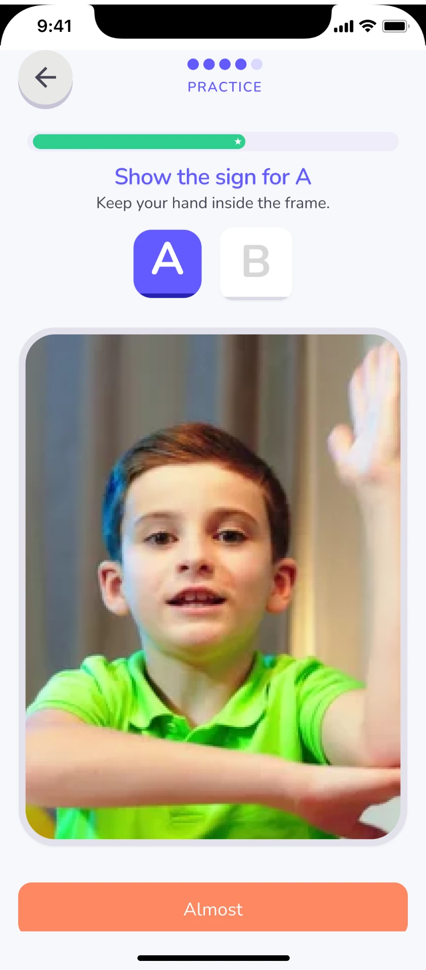
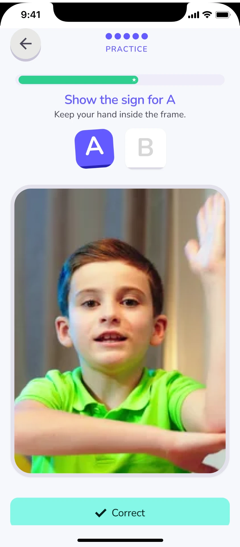
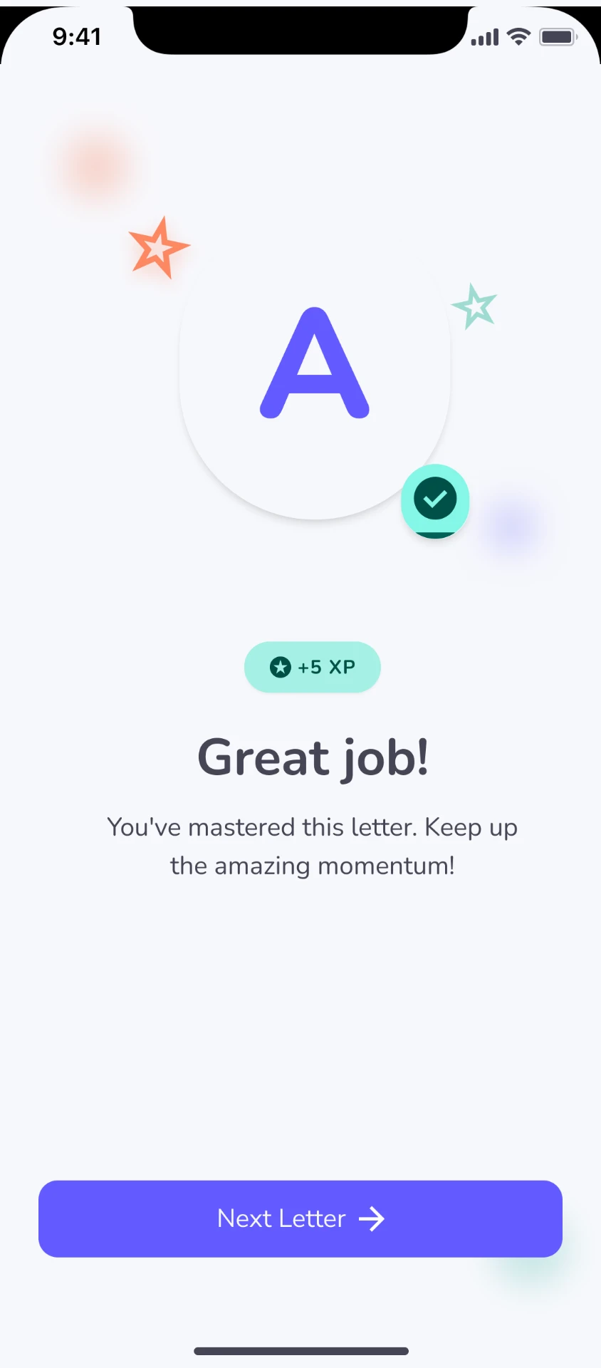
The camera-free activity preserves the learning objective while removing the privacy and device constraints associated with camera input.
Parent experience
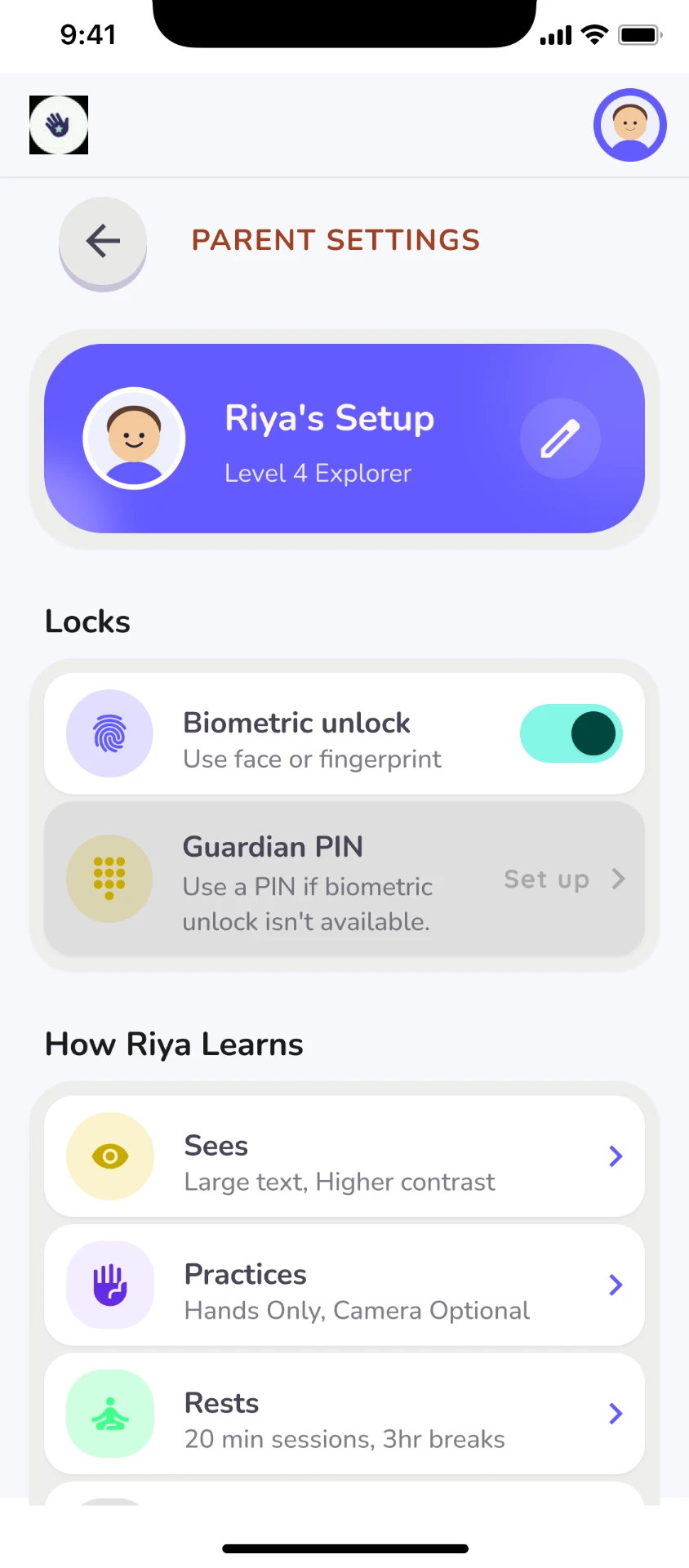
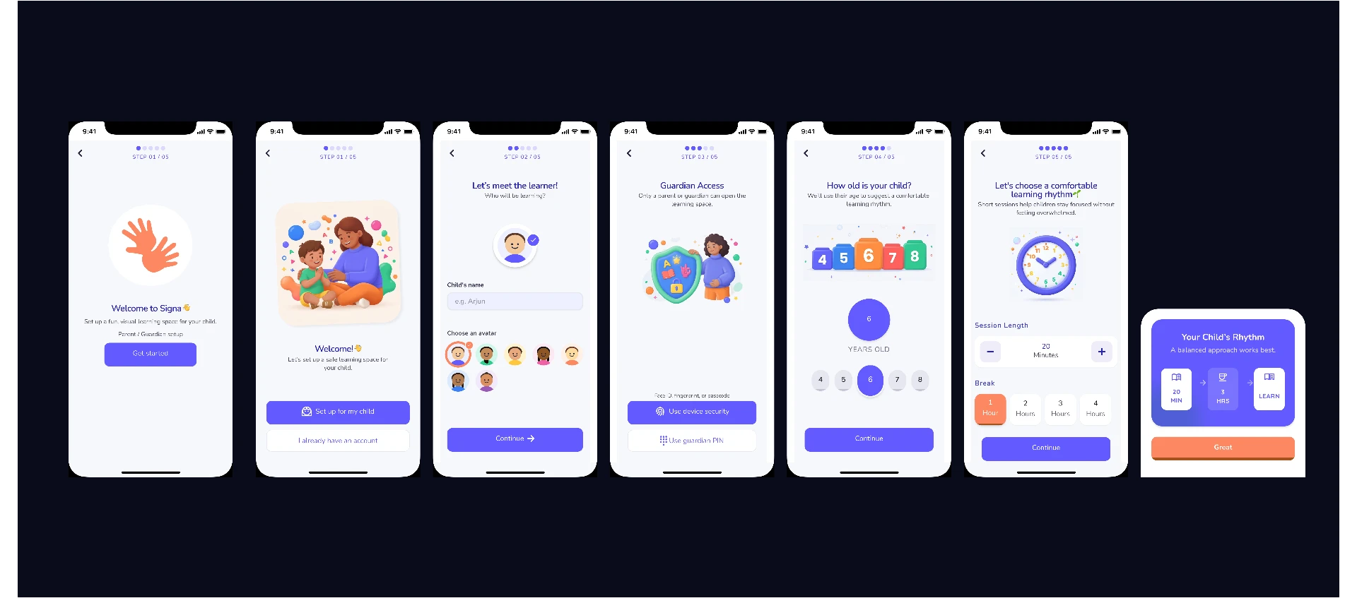
The parent experience intentionally uses a different level of complexity: children receive simplified interactions, while guardians receive the controls and context required to configure the learning environment.
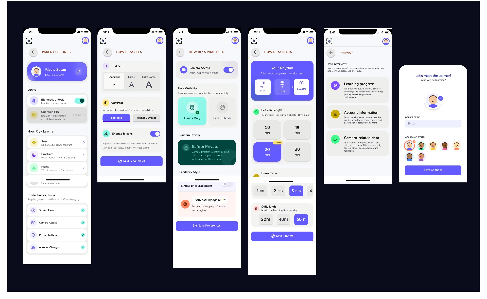
Riya's setup · How Riya sees · How Riya practices · How Riya rests · Privacy & safety
Evaluation
After building the initial experience, I evaluated the flow against usability heuristics, accessibility principles and the needs of the two user groups.
Camera framing was unclear.
Change — Added explicit hand-position guidance.
Parent accessibility settings were too abstract.
Change — Reorganised settings around concrete child needs.
Camera practice could become a privacy barrier.
Change — Introduced Hands Only and No Camera alternatives.
Error feedback could feel punitive.
Change — Introduced encouraging retry states and parent-level guidance.
Learning hierarchy was difficult to understand.
Change — Established Class → Course → Level → Lesson → Activity.
Iteration
Design iterations driven by usability findings.
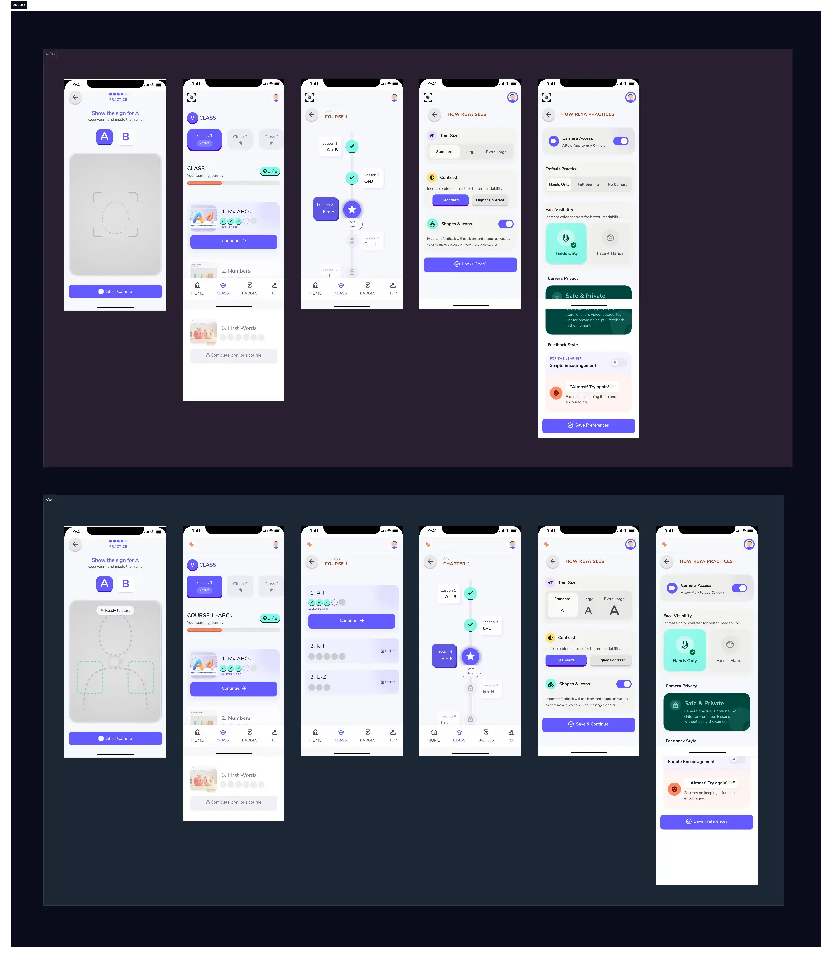
Problem — The original camera screen focused mainly on generic camera settings and did not clearly communicate where the user's hands should be positioned.
Change — Added clear hand-position guidance so students understand where to place their hands before starting.
Problem — The original learning flow moved too quickly from the ABCs into the course and did not provide enough structure.
Change — Restructured the learning experience into Course → Chapters → Lessons. Each course contains 2–3 chapters, and each chapter contains 1–3 short lessons. This keeps the learning journey simple and prevents students from feeling overwhelmed.
Problem — The original accessibility-related interactions were more complicated than necessary.
Change — Simplified the accessibility screens and interactions so students can understand what to do with less cognitive effort.
Problem — The hands-only interaction created a usability issue because students were not given enough guidance about the required hand position.
Change — Redesigned the interaction to make the expected physical behavior and hand placement more explicit.
I also iterated on several other screens throughout the product based on usability issues, simplifying interactions and improving clarity wherever the original experience created unnecessary friction.
Final product
Understand visually.
Observe ISL.
Perform the sign.
Understand how to improve.
Continue the learning journey.
Expected outcomes — concept stage; not measured post-launch
Make foundational ISL learning more structured and visually engaging.
Give children meaningful opportunities to practise rather than only consume content.
Provide a camera-free alternative for children who cannot or do not want to use camera practice.
Give guardians meaningful control over accessibility, privacy and learning rhythm.
Reduce unnecessary cognitive load through visual-first interaction.
Limitations
If taken into development
Reflection
Signa changed how I think about accessibility. I initially approached accessibility as a set of interface requirements, but the project showed me that it can fundamentally change the product architecture itself.
Accessibility can change the interaction model.
For children, simplicity is a product strategy rather than merely a visual style.
Designing for multiple users means giving each user the right level of control rather than giving everyone the same interface.
Good accessibility shouldn't make a product feel different. It should make the product feel easier.