Skip to content
Back to work

Kleo

AI-Powered Room Organization & Cleaning Companion

Designing a calmer, more actionable way for students and people who struggle with maintaining their spaces to organize, clean and care for their rooms.

Role
Product Designer
Project
Independent Product Concept
Focus
UX Research · Product Strategy · UX/UI Design · Design System
Platform
Mobile App
  • Kleo — Room health

    Room health

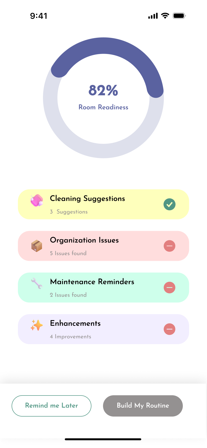
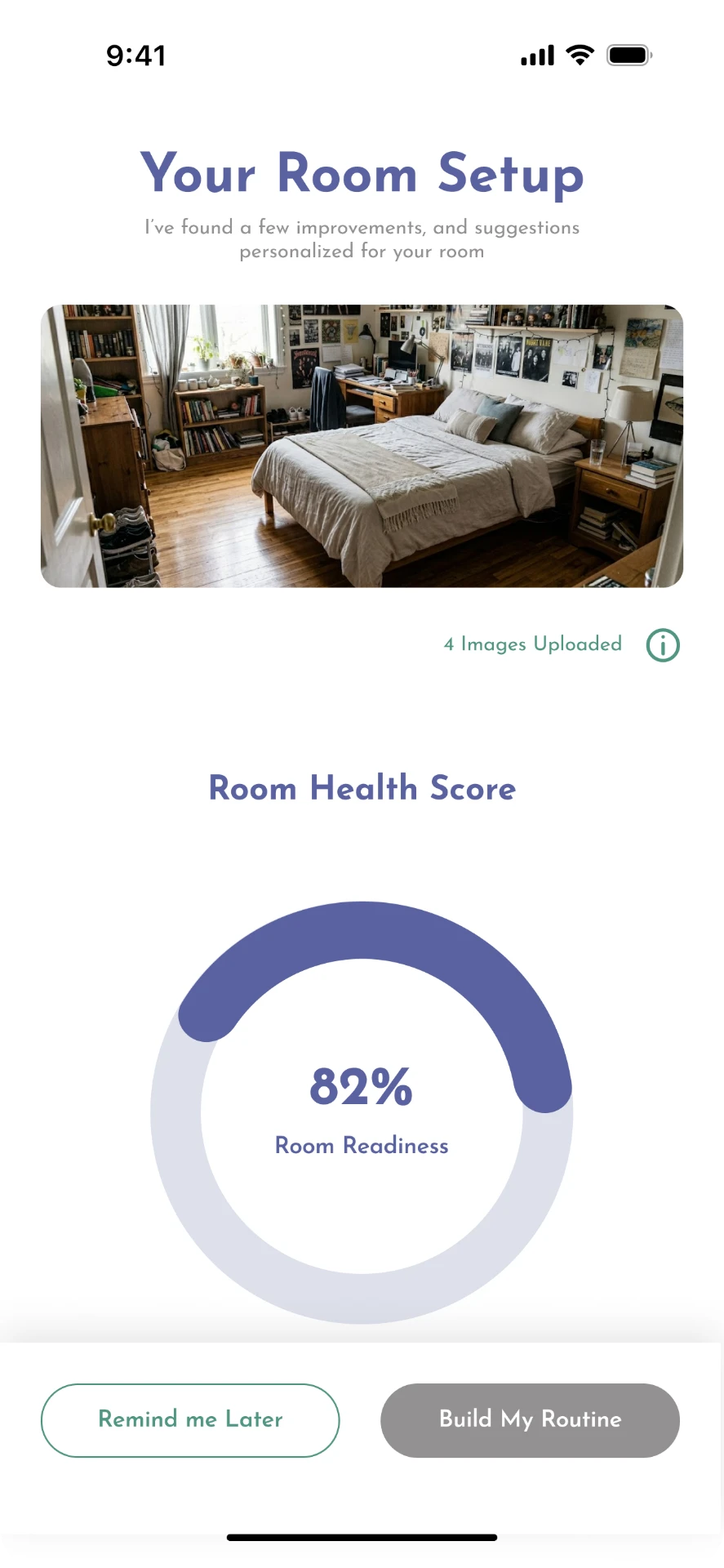
    A photo of the room becomes a readiness score and a set of specific improvements.

  • Kleo — Room setup

    Room setup

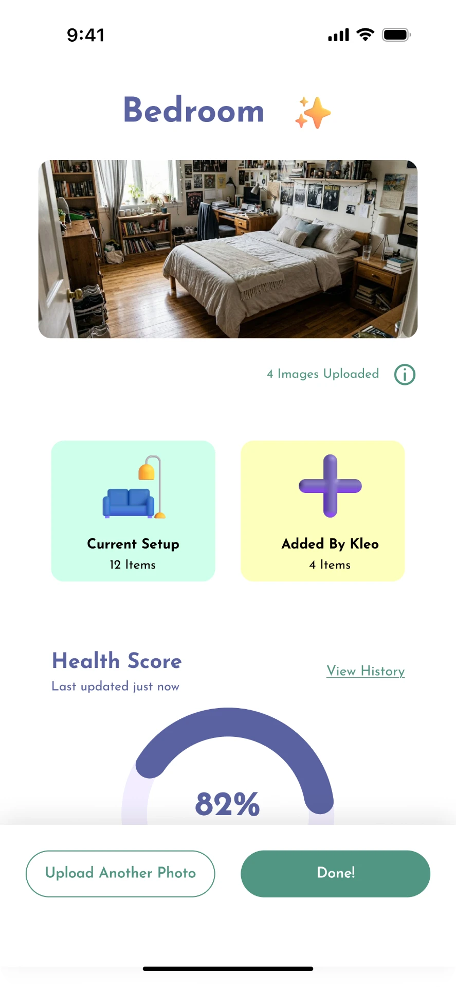
    Detected items, Kleo's additions and health history, all editable.

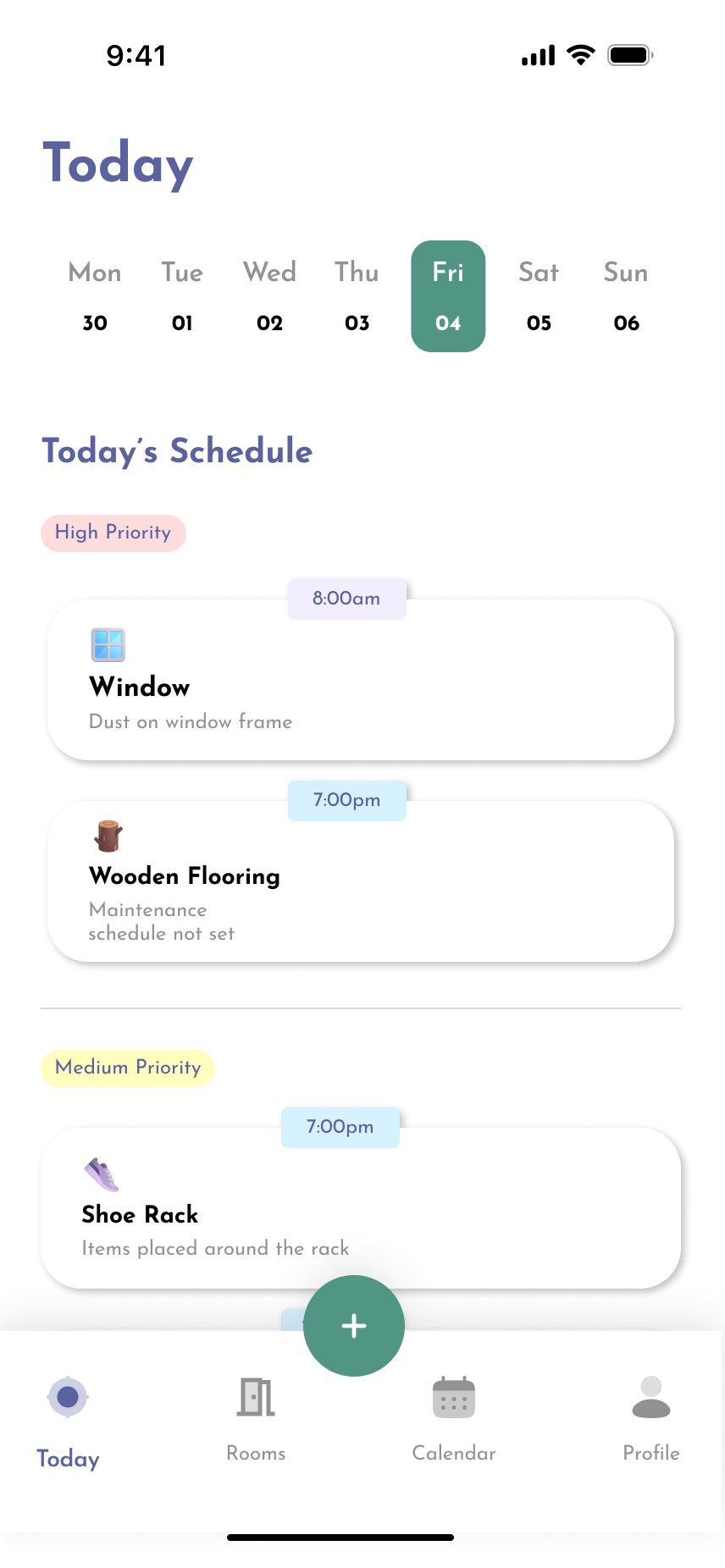
  • Kleo — Today

    Today

    An abstract goal reduced to the tasks that can be completed now.

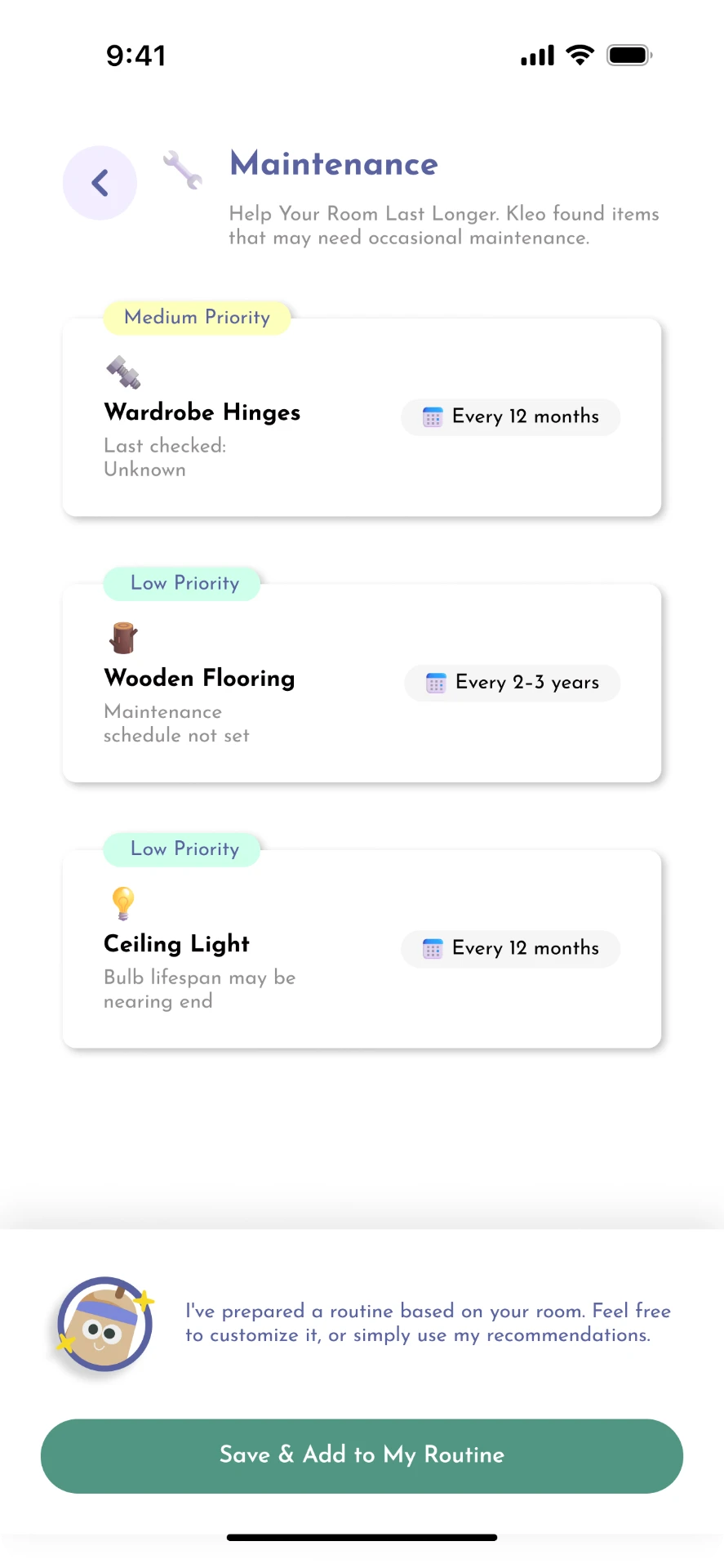
  • Kleo — Maintenance

    Maintenance

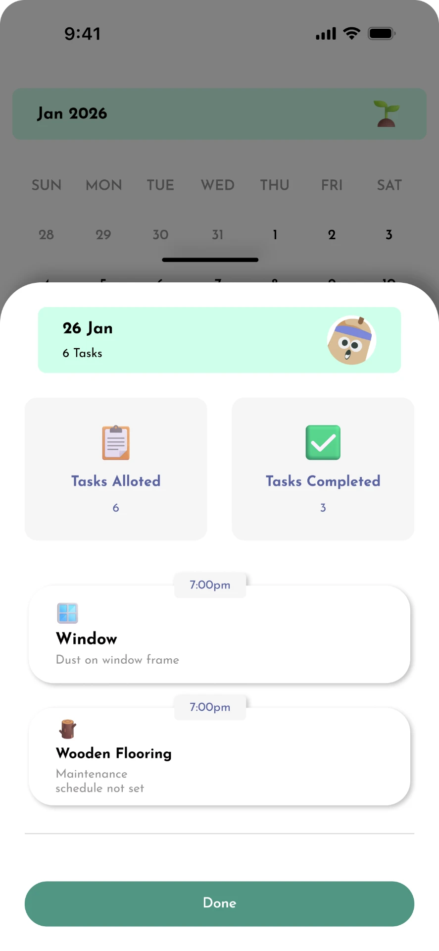
    Long-cycle upkeep surfaced before it turns into a problem.

Project snapshot

The problem

Maintaining a room can become overwhelming when the task feels too large or when people do not know where to start.

The audience

Students, hostellers and people who need more structured and actionable ways to manage their spaces.

The opportunity

Turn an overwhelming cleaning/organization task into small, understandable actions.

The concept

Kleo uses AI to understand the state of a room and convert it into personalized, actionable routines.

In short

  1. 01

    What I did

    Designed Kleo end-to-end — research synthesis, personas, information architecture, user flows and a high-fidelity AI room-organisation prototype.

  2. 02

    What changed

    Cleaning became one clear next action instead of an open-ended decision: capture the room, get a sequenced routine, do one thing.

  3. 03

    What I'd test next

    Whether the single-action model lowers avoidance for people with ADHD across a two-week diary study.

This is an independent case study I designed to practice end-to-end product thinking — from research through to a working prototype.

View interactive prototype

Process

A human-centered product design process

I used a lightweight human-centered design process to move from understanding the problem and people to defining the opportunity, exploring possible solutions and refining the final product experience.

  1. 01

    Understand

    Understand the people, behaviours, environment and emotional challenges surrounding room organization.

  2. 02

    Define

    Identify recurring pain points, motivations, barriers and opportunities.

  3. 03

    Explore

    Translate insights into product opportunities, flows and possible interactions.

  4. 04

    Design

    Develop the information architecture, interaction model, visual language and interface.

  5. 05

    Refine

    Iterate on the experience and create a clearer, more approachable final product.

Understanding the problem

Why does keeping a room organized feel so difficult?

The problem is not simply that people do not clean. The experience of maintaining a space is shaped by how large the task feels, how clearly it can be started, and how much structure exists around it.

17.3%

Reported 30-day retention for productivity apps — a secondary-research data point that suggests tools in this category struggle to stay part of a routine. It supported the hypothesis that the barrier is sustained use, not intent.

Secondary research · not primary data

Factors that shape the experience:

  • Task overwhelm
  • Unclear starting points
  • Lack of structure
  • Low motivation
  • Inconsistent routines
  • Decision fatigue
  • Difficulty breaking a large task into manageable actions
  • Environmental and emotional factors

Research

The problem wasn’t cleaning. It was getting started.

At first glance, the problem seemed simple: people struggle to keep their rooms clean and organized. Looking deeper, the challenge was less about knowing how to clean and more about how people perceive, start and maintain the task.

A messy room can become a combination of physical clutter, mental overload and emotional friction. When everything feels like it needs attention at once, even a simple task can feel difficult to begin.

How might we

How might we make taking care of a space easier to start — and easier to maintain?

01 — Understand

The problem is cumulative

Small actions become a bigger problem

Rooms rarely become disorganized because of one large event. Small unfinished actions accumulate over time.

  1. Small action

    Clothes left on a chair

  2. Another action

    Objects placed wherever there is space

  3. Another action

    Trash postponed

  4. Accumulation

    Surfaces become cluttered

  5. Perception

    The entire room feels difficult to manage

Research insight

The experience is cumulative.

The product should support users before the room reaches a point where the entire space feels overwhelming.

Design implication

Support small, repeatable actions instead of relying only on large cleaning sessions.

02 — Explain

The starting problem

The hardest part can be knowing where to start

  • Clear desk
  • Put away clothes
  • Organize shelf
  • Take out trash
  • Change bedsheets
  • Clear floor

Where do I start?

01

Too many possible actions

02

Decision overload

03

Delayed action

Insight

The barrier is often initiation, not capability.

People may know how to clean their room but still struggle to decide what to do first.

Design implication

Reduce the number of decisions required before action.

02 — Explain

Psychological friction

A large task feels larger than its individual parts

One large block

“Clean your room”

“Clear your desk”

“Put away 5 items”

“Throw away empty bottles”

Behavioural loop

Mess creates overwhelm, overwhelm creates avoidance, and avoidance creates more mess. The loop keeps feeding itself, which is why the entry point matters more than the effort.

Self-reinforcing loop

MessOverwhelmAvoidanceMore messMore overwhelmAvoidance

Insight

A task can become harder simply because it is perceived as too large.

Design response

Break broad goals into small, concrete actions that feel achievable individually.

02 — Explain

The emotional layer

The room is not only a physical environment

  1. Physical

    • Clutter
    • Dirt
    • Disorganization
  2. Cognitive

    • Overwhelm
    • Decision fatigue
    • Uncertainty
  3. Emotional

    • Frustration
    • Guilt
    • Avoidance
    • Loss of control

The state of a room can influence how a person feels about the space — and those feelings can make the task harder to begin.

Insight

The product needs to support the user’s emotional state, not make them feel judged for it.

Design implication

Kleo should feel supportive and non-judgmental.

Conceptual UX writing example

Avoid

“Your room is a mess.”

Use instead

“Let’s start with one small thing.”

03 — Synthesize

Motivation vs maintenance

Cleaning once isn’t the same as maintaining a space

One-time cleaning

  1. Mess
  2. Large cleaning session
  3. Temporary improvement
  4. Routine disappears
  5. Mess returns

Maintenance

  1. Small action
  2. Visible progress
  3. Lightweight routine
  4. Small action
  5. Manageable space

Insight

The product needs to support maintenance, not just recovery.

A successful cleaning session does not necessarily solve the underlying problem if users cannot maintain the new state.

Design implication

Move from a one-time cleaning experience toward lightweight recurring routines.

03 — Synthesize

Progress

Progress needs to be visible

Cleaning can feel unrewarding because the effort involved is often temporary and difficult to quantify. Making progress visible can create a stronger sense of completion.

  1. Before

    Messy / many tasks

  2. Action

    Complete a small task

  3. After

    One area improved

  4. Progress

    More tasks completed

  5. Confidence

    The room feels more manageable

Room healthImproving
  1. Needs attention
  2. Improving
  3. Balanced

Conceptual room-health indicator. It is a product feature for communicating state and momentum — not a measured or validated research metric.

03 — Synthesize

Structure without control

Structure should reduce cognitive load, not create more of it

Too much structure

  • Long checklist
  • Multiple reminders
  • Too many categories
  • Constant notifications
  • Complex routines

The app becomes another task

Lightweight structure

  • One next action
  • Simple categories
  • Visible progress
  • Flexible routine

The app supports the task

Insight

The product should provide structure without requiring users to manage the structure itself.

Design implication

Prioritize one clear next action over a long list of everything that needs to be done.

04 — Identify

Room care is multidimensional

“Messy” is too broad

Different room problems require different actions. Treating everything as one generic cleaning task makes the experience harder to understand.

Cleaning

  • Dirt
  • Waste
  • Immediate attention

Organization

  • Clutter
  • Placement
  • Storage

Maintenance

  • Recurring tasks
  • Functionality
  • Upkeep

Enhancements

  • Comfort
  • Personalization
  • Small improvements

Room health

This became the foundation for the product structure — four dimensions rolling up into one readable state of the room.

  • Cleaning
  • Organization
  • Maintenance
  • Enhancements

Simplified Kleo dashboard categories

04 — Identify

Where AI actually helps

AI should reduce effort, not add complexity

  1. Observe

    Understand the room

  2. Understand

    Identify areas requiring attention

  3. Prioritize

    Determine what matters first

  4. Recommend

    Suggest an actionable next step

Without AI

  1. User observes room
  2. User identifies problems
  3. User decides priorities
  4. User creates tasks
  5. User starts

With Kleo

  1. Room analysis
  2. Kleo identifies areas
  3. Kleo prioritizes
  4. Kleo recommends
  5. User starts

AI is useful when it turns understanding into action.

The point is not that AI replaces the user — it removes unnecessary cognitive work before the user has to do anything.

03 — Synthesize

Research synthesis

From behaviour to opportunity

  1. 01

    People avoid large cleaning tasks.

    →The task feels overwhelming.

    →Break cleaning into small actionable steps.

  2. 02

    People struggle to decide where to begin.

    →Too many possible actions create decision fatigue.

    →Give users a clear recommended next action.

  3. 03

    People complete cleaning but struggle to maintain it.

    →The room gradually returns to its previous state.

    →Create lightweight recurring routines.

  4. 04

    People can feel frustrated or guilty about their environment.

    →Negative emotions can reinforce avoidance.

    →Create a supportive and non-judgmental experience.

  5. 05

    Users cannot always see the value of small actions.

    →Progress feels invisible.

    →Make progress visible and tangible.

  6. 06

    Users need to understand what is wrong with their space.

    →Analysis itself can require effort.

    →Use AI to turn observation into prioritized actions.

The design opportunity

Make room care feel manageable.

Rather than building another cleaning checklist, Kleo could act as a personal room-care companion that helps users understand their space, decide what matters now and take one manageable action at a time.

01

Make it actionable

Turn overwhelming goals into clear next steps.

02

Make progress visible

Help users see that small actions are creating change.

03

Make maintenance easier

Support sustainable routines instead of occasional deep-cleaning sessions.

05 — Translate

Research into product

How the research shaped Kleo

  1. “I don’t know where to start.”

    →Recommended next action

  2. “Everything feels like a lot.”

    →Small actionable tasks

  3. “I clean it, but it gets messy again.”

    →Lightweight routines

  4. “I want to know if I’m actually making progress.”

    →Room health + progress

  5. “I don’t know what needs attention.”

    →AI room analysis

These insights shifted the problem from “help people clean” to “help people know what to do next.”

Next · Information architecture → user flow → design

Personas

Who are we designing for?

Two personas held the research in place while the product took shape — one built around structure, one around motivation.

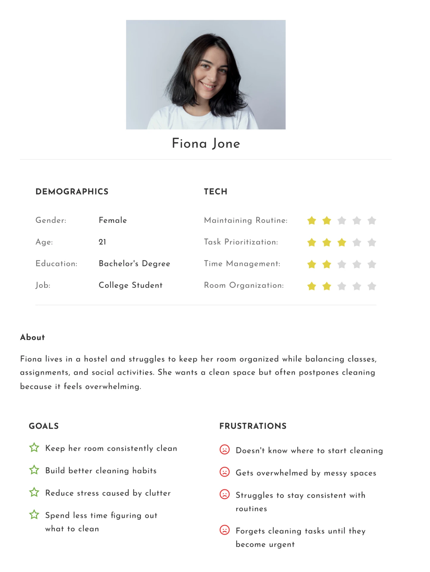
Fiona Jone — 21, college student
Fiona Jone — 21, college student persona sheet

Lives in a hostel and balances classes, assignments and social life. She wants a clean room but postpones cleaning because it feels overwhelming, and she rarely knows where to start.

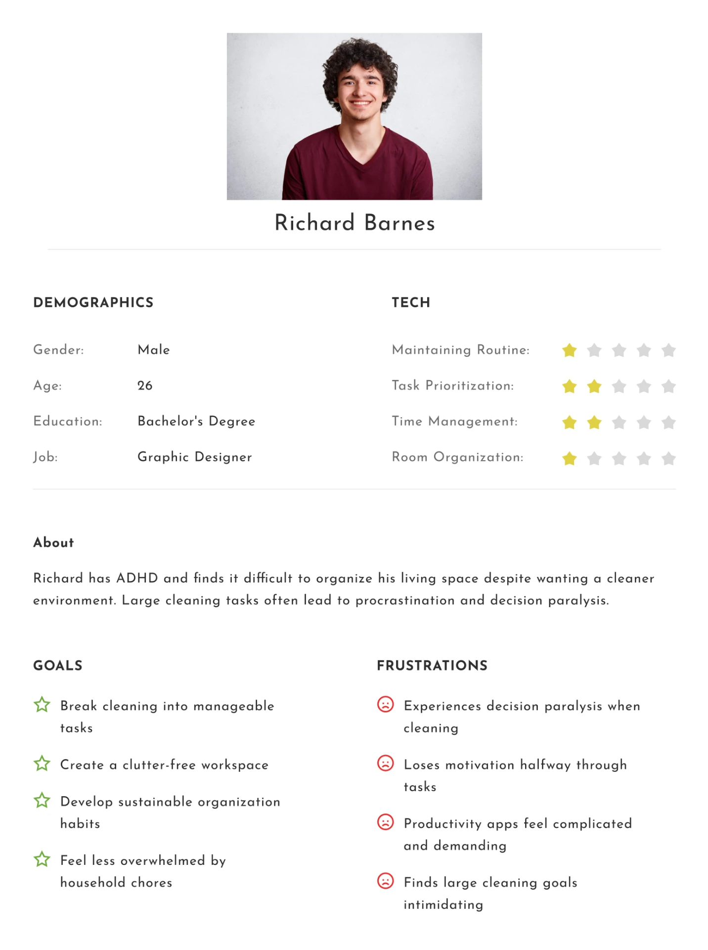
Richard Barnes — 26, graphic designer
Richard Barnes — 26, graphic designer persona sheet

Has ADHD and experiences decision paralysis around large cleaning tasks. He needs work broken into small steps and finds most productivity apps too complicated and demanding.

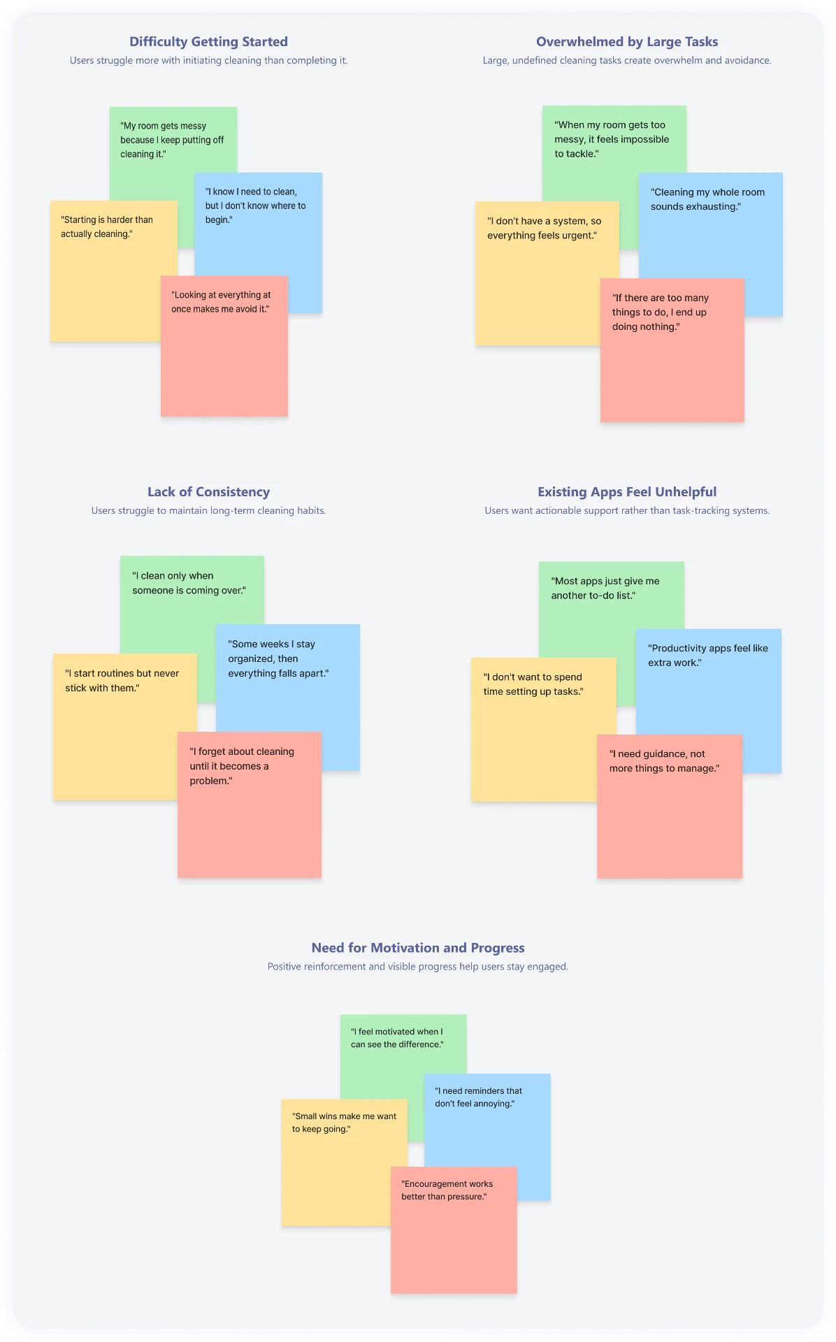
Affinity mapping

From scattered quotes to five recurring themes

Statements collected from community discussion and secondary research were clustered until the same five problems kept reappearing: starting is harder than cleaning, large tasks cause avoidance, routines collapse, existing apps add work, and progress is what keeps people going.

Affinity map
Affinity map clustering user statements into five themes

User flow

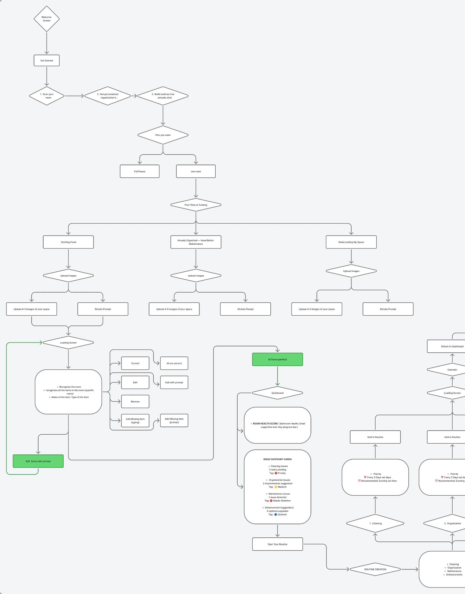
Turning the problem into a simple flow

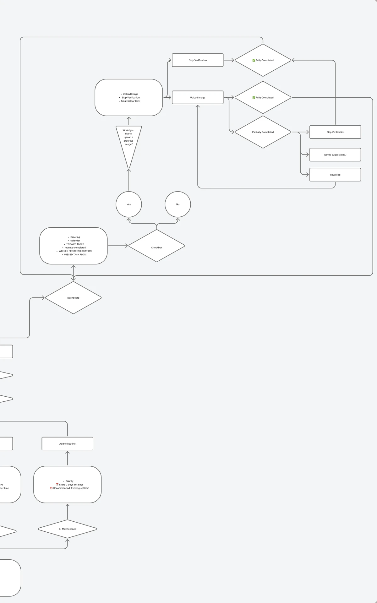
The core flow reduces the number of decisions users need to make before taking action. Instead of asking users to plan an entire cleaning session, Kleo moves them from capture to analysis to a routine, and then to one manageable next step.

User flow
Kleo user flow part 1: welcome, onboarding, room capture and AI recognitionKleo user flow part 2: room health, routine creation, dashboard and progress verification

Welcome and onboarding, room capture, AI recognition and correction, room health and issue categories, routine creation, and the dashboard loop with progress verification.

Design direction

Designing for calm, clarity and action

Because the research pointed at overwhelm and decision fatigue rather than laziness, the interface had to lower effort before it did anything else. It intentionally avoids the density of a generic productivity dashboard.

Soft visual hierarchy

Weight and spacing carry the structure instead of hard containers.

Approachable illustration

A friendly register that never reads as a productivity dashboard.

Clear cards

Each action is a self-contained, scannable unit.

Visible progress

Improvement in the room is reflected back to the user.

Simple actions

One primary action per screen, sized to be finishable.

Limited cognitive load

Fewer decisions before the first useful step.

  • Calm
  • Approachable
  • Motivating
  • Non-judgemental
  • Easy to understand

Design system

Building a visual system for consistency

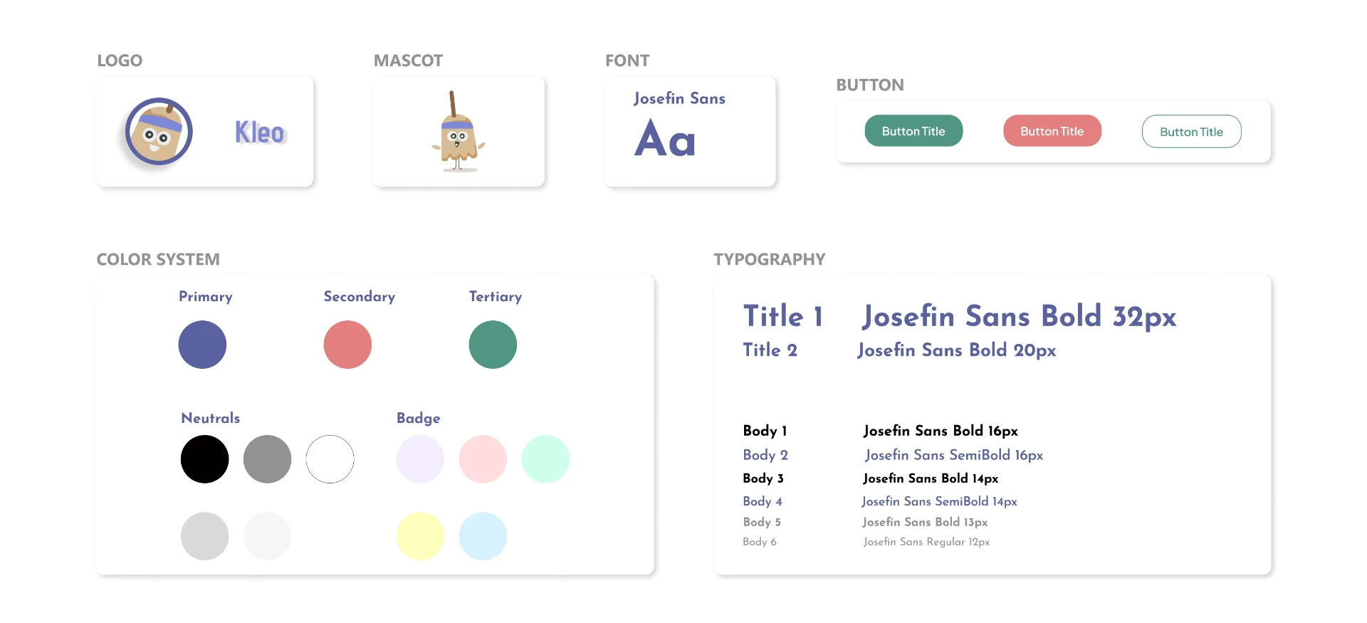
Josefin Sans carries the whole type scale, a three-colour system separates primary actions, warnings and confirmations, and soft badge tints code priority without shouting. The mascot keeps the tone non-judgemental across every screen.

Design system
Kleo design system: logo, mascot, typography, buttons and colour system

Wireframes

Structuring the experience before the visual layer

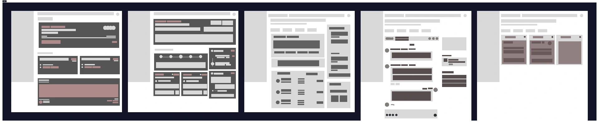
Low-fidelity wireframes mapped out the core screens and information hierarchy, keeping the focus on clarity and task flow before introducing colour, type and final UI details.

Dashboard wireframes
Low-fidelity wireframes of the Kleo dashboard, room setup and task flows

Design decisions

What the product does, and why

Five decisions carry most of the concept. Each one traces back to a pattern found in the research.

  1. 01

    Room health score

    The room health score gives users an immediate understanding of their current state and creates a visible sense of progress.

  2. 02

    Actionable categories

    Breaking the experience into cleaning, organization, maintenance and enhancements makes a large problem easier to understand.

  3. 03

    Start your routine

    A clear primary action reduces decision-making and gives users an obvious entry point.

  4. 04

    Today

    The Today view converts an abstract goal into concrete actions that can be completed now.

  5. 05

    AI room analysis

    AI helps users understand their room without requiring them to manually assess everything themselves.

Final product

The final experience, step by step

The product reads as one sequence: onboard, photograph the room, correct what the AI found, turn it into a routine, and then work through it a task at a time.

01

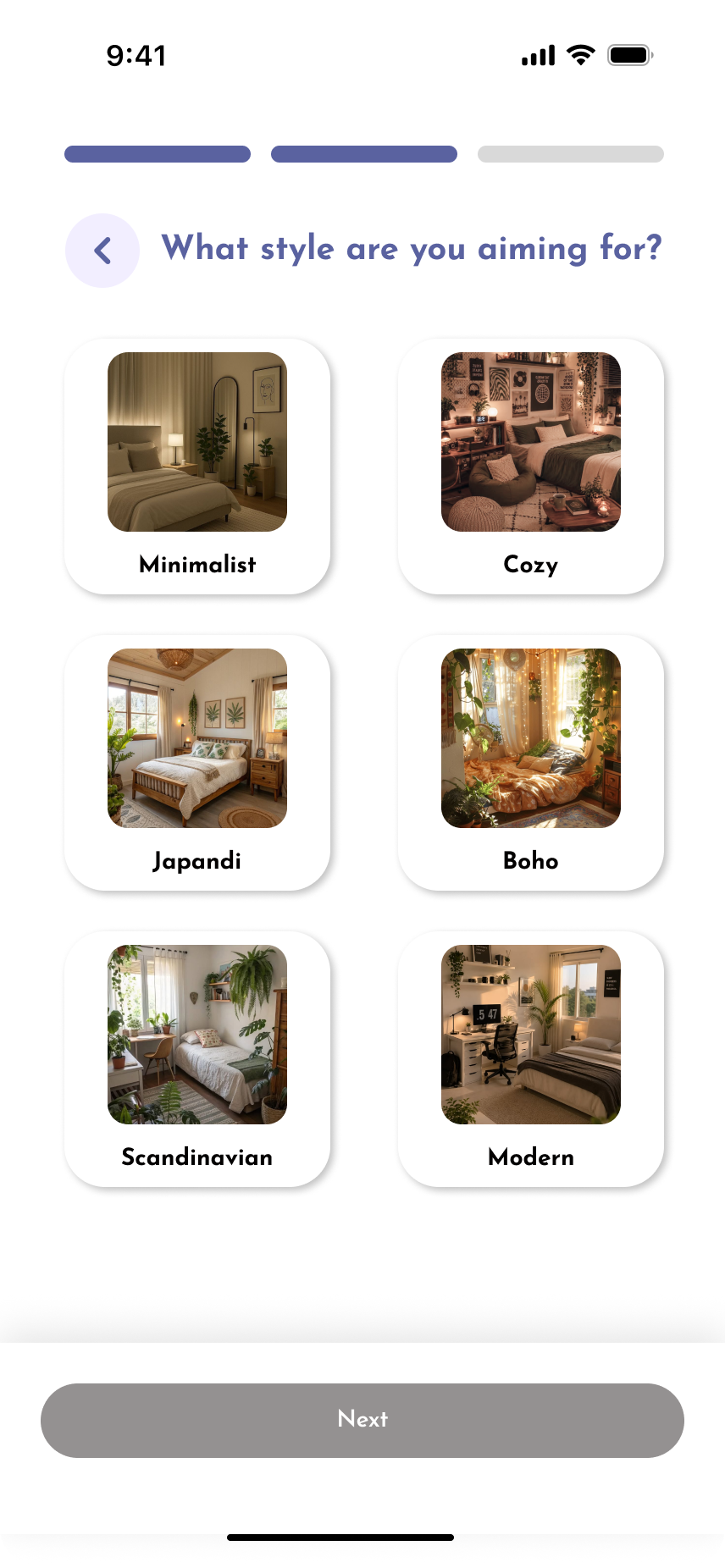
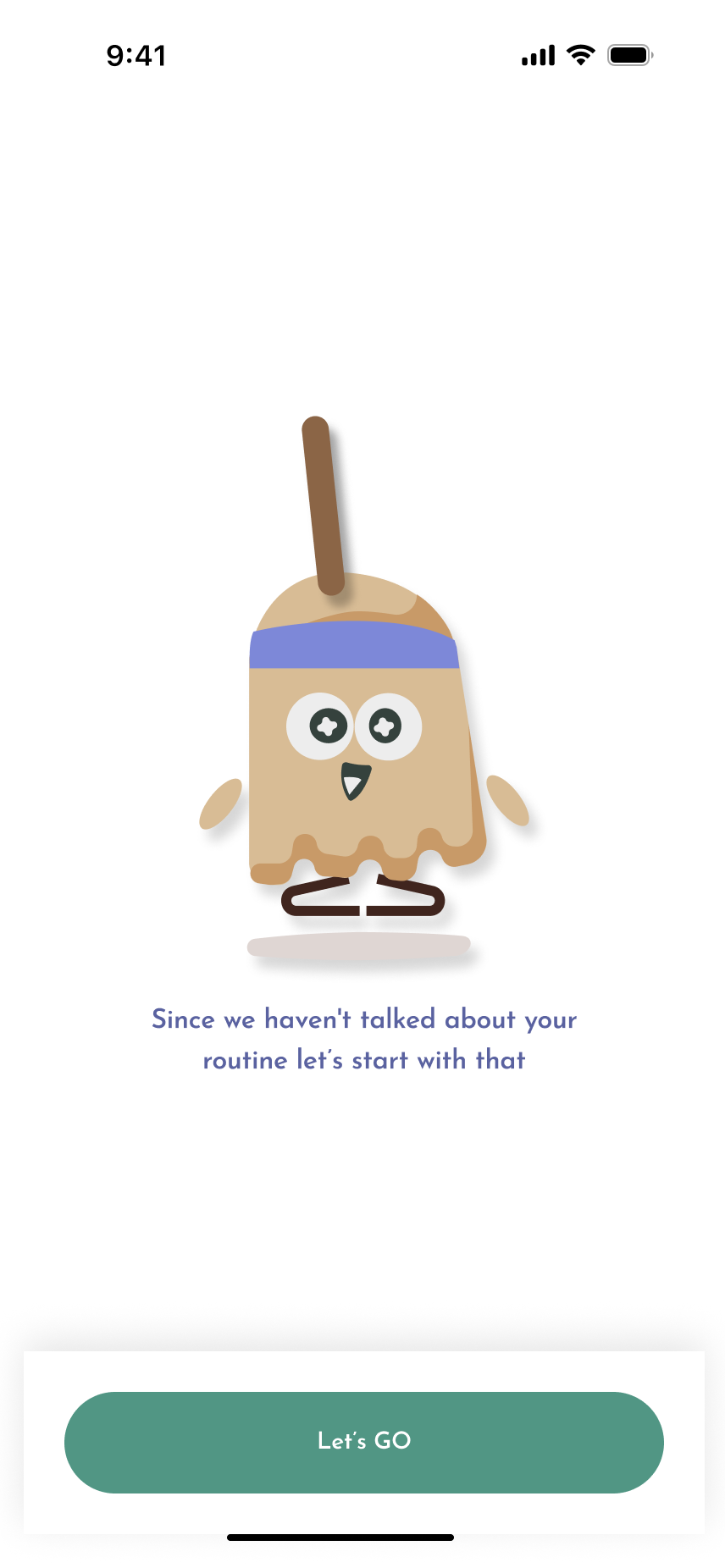
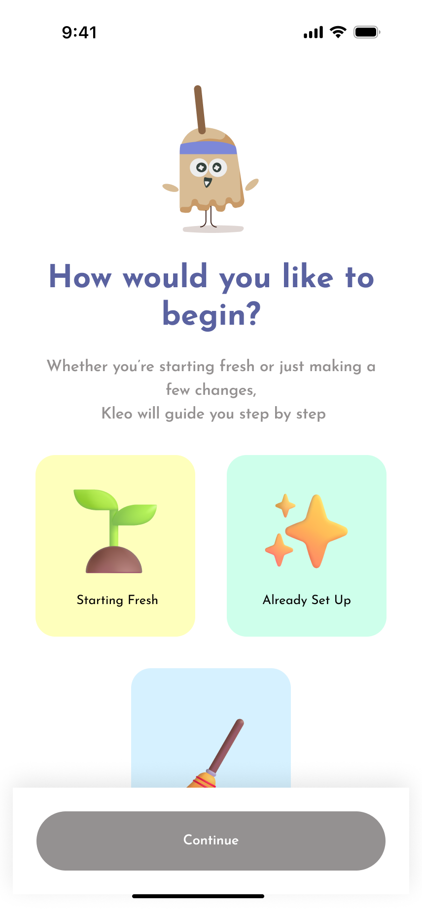
Onboarding

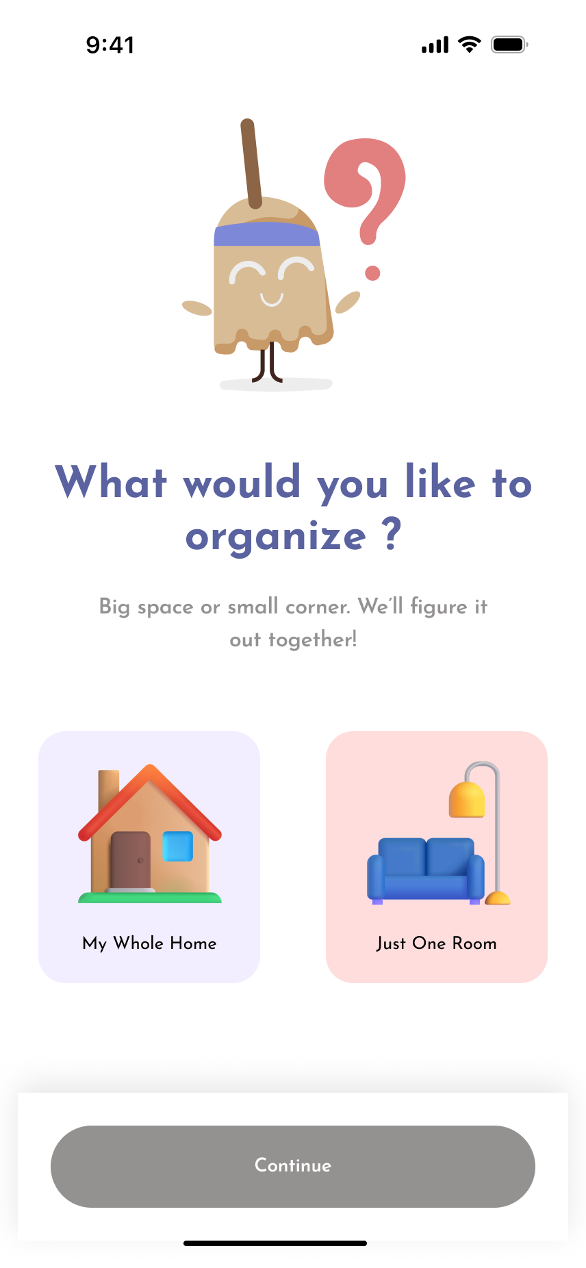
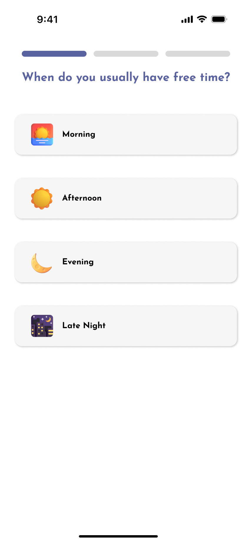
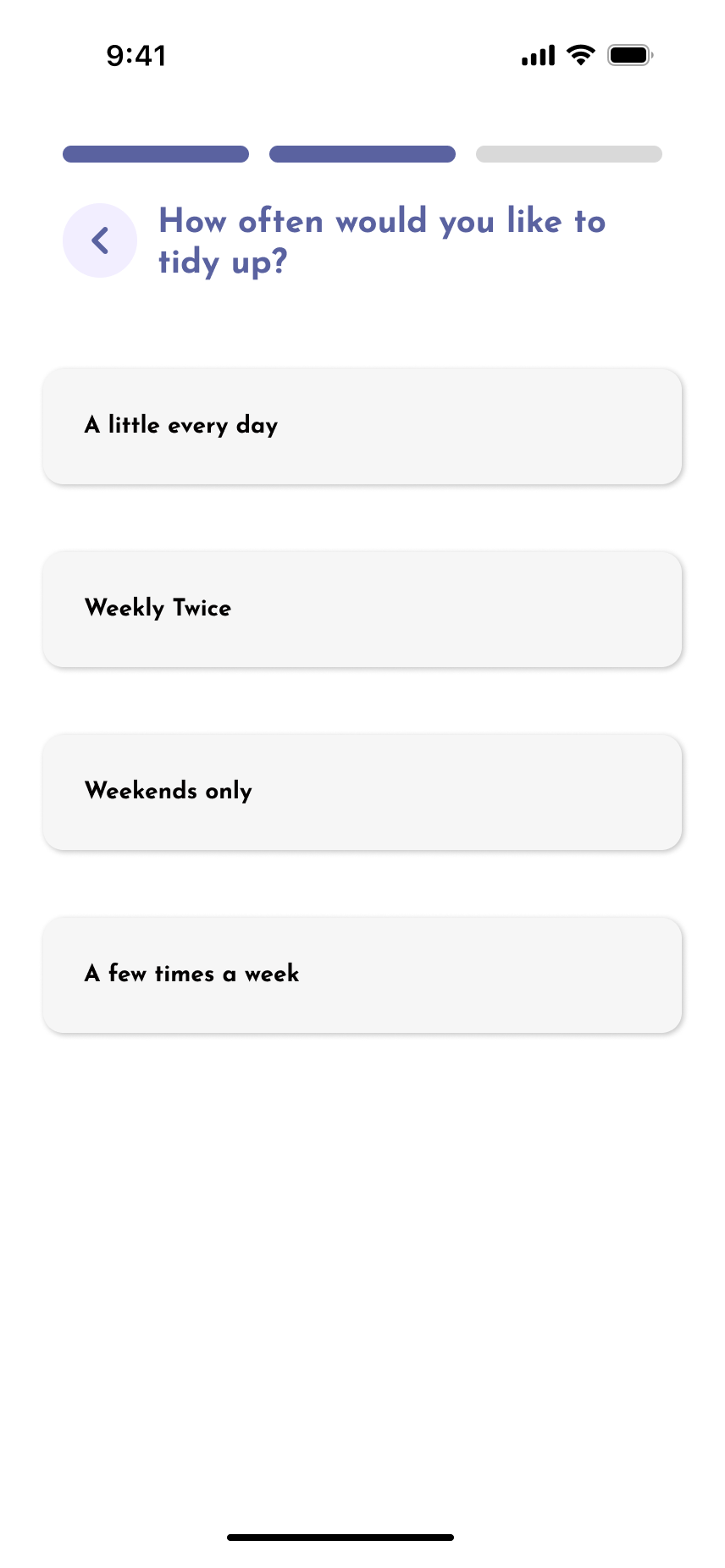
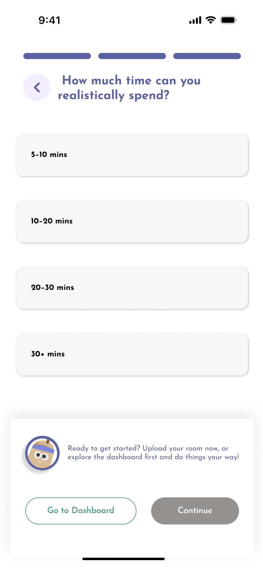
Onboarding asks only what changes the recommendations: whole home or one room, starting fresh or already set up, when free time usually happens, how often the user wants to tidy and how much time is realistic. Five light questions replace a setup wizard, and the mascot carries the tone so the first minute feels like a conversation rather than a form.
Kleo onboarding screen 1Kleo onboarding screen 2Kleo onboarding screen 3Kleo onboarding screen 4Kleo onboarding screen 5Kleo onboarding screen 6
02

Uploading images of the room

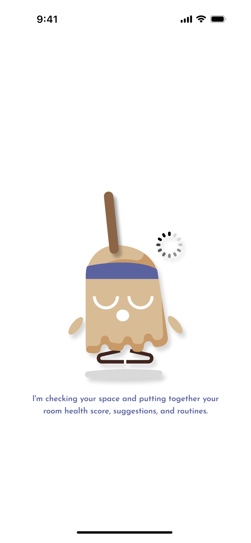
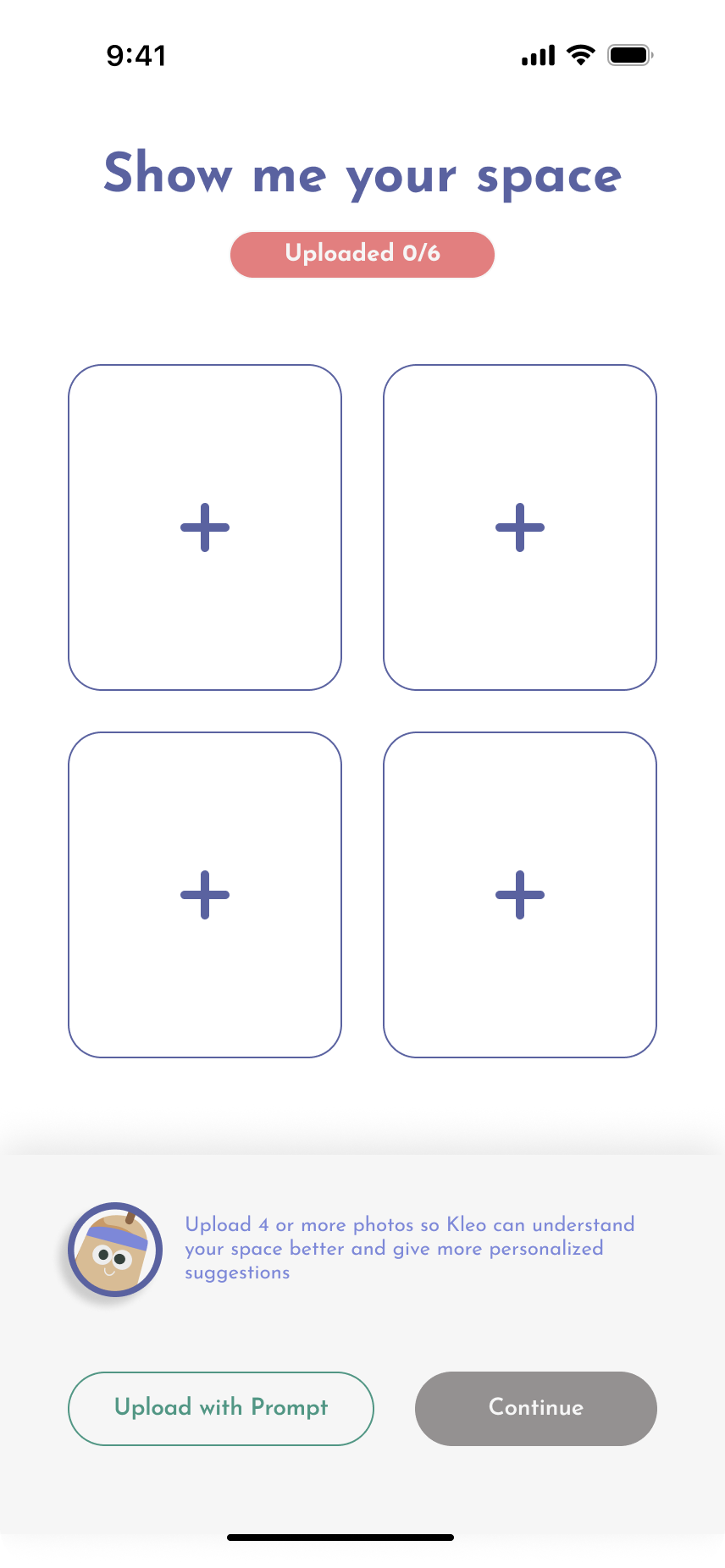
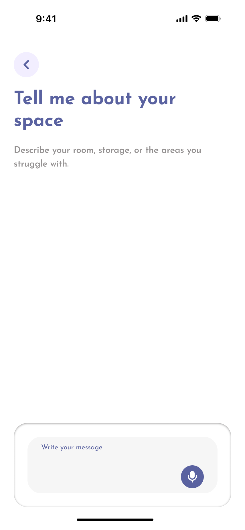
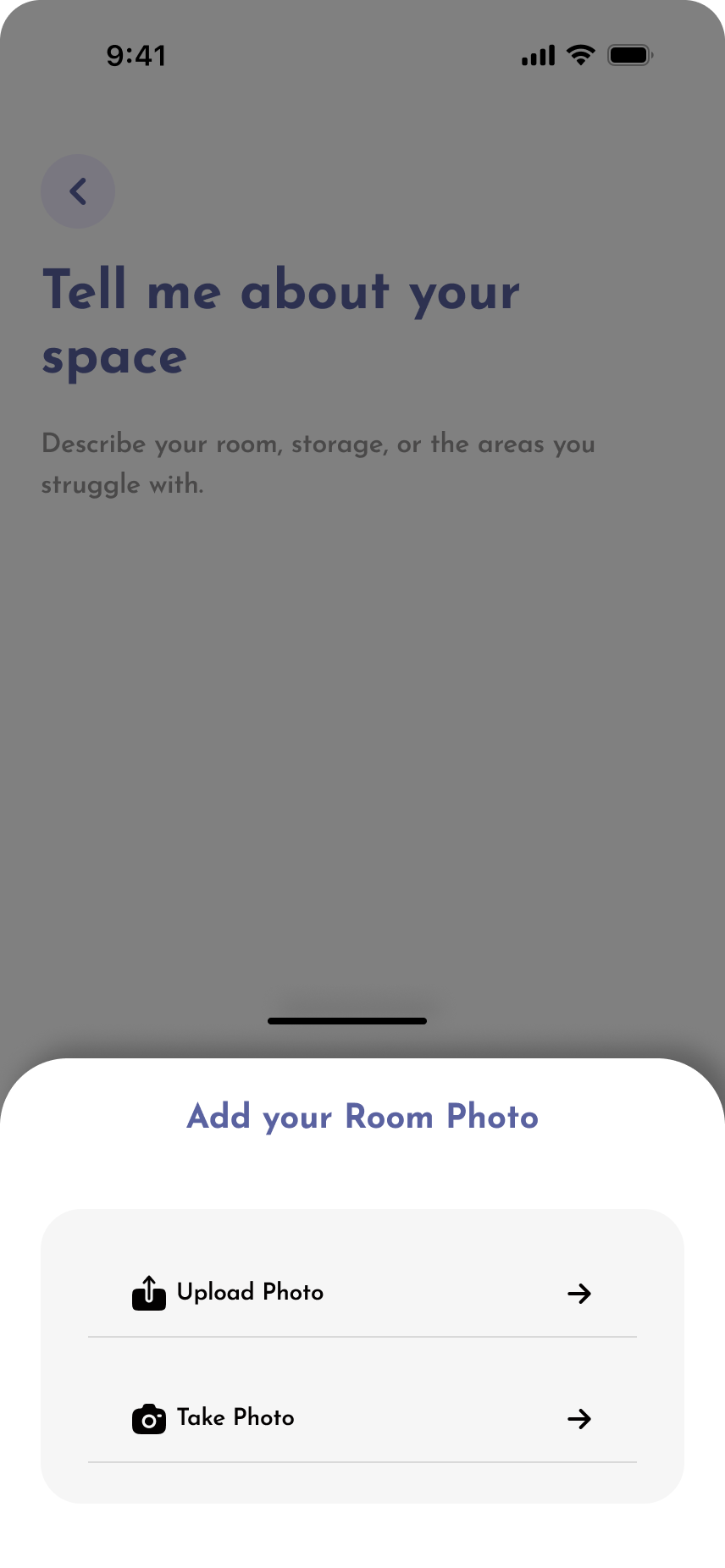
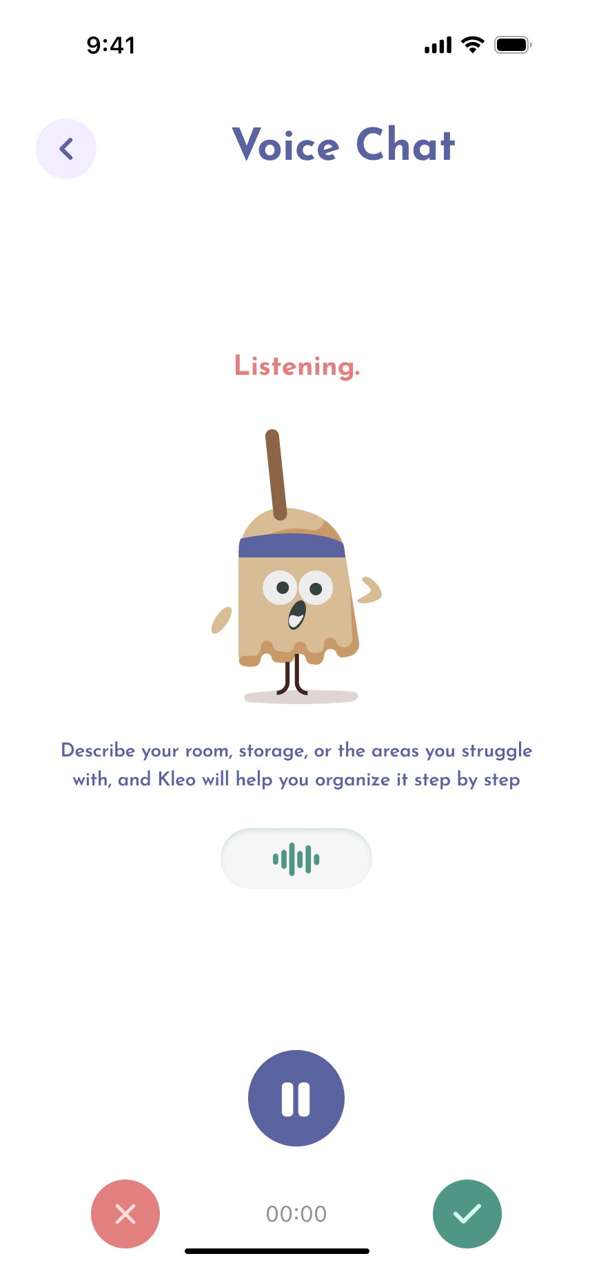
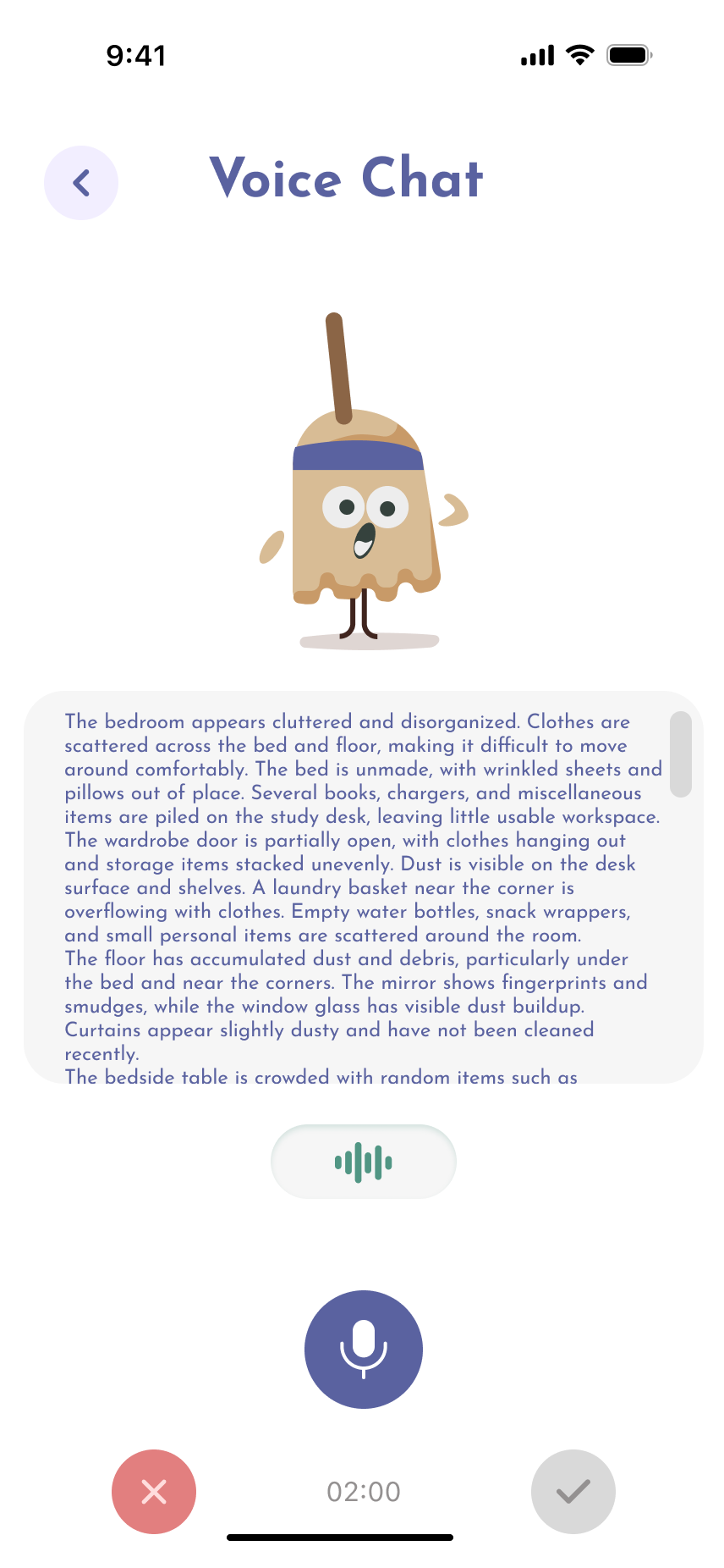
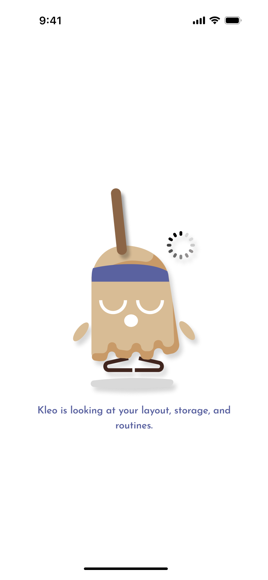
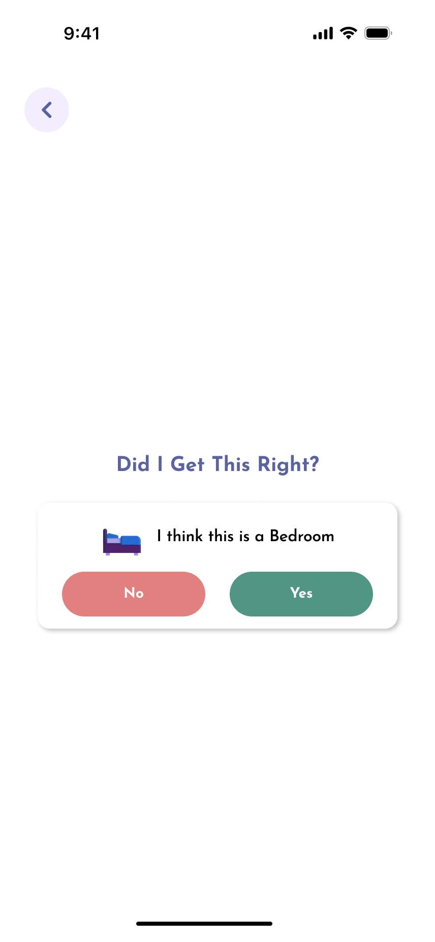
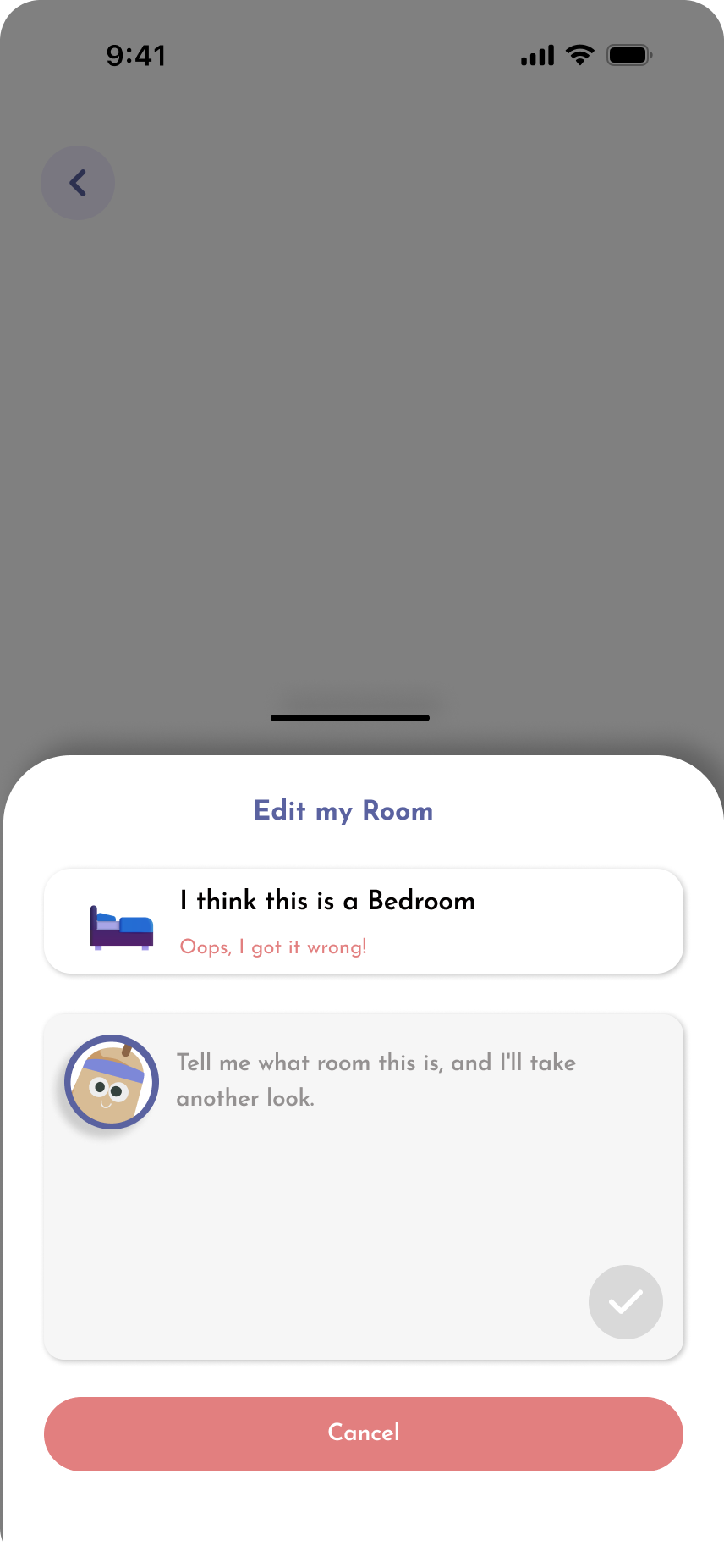
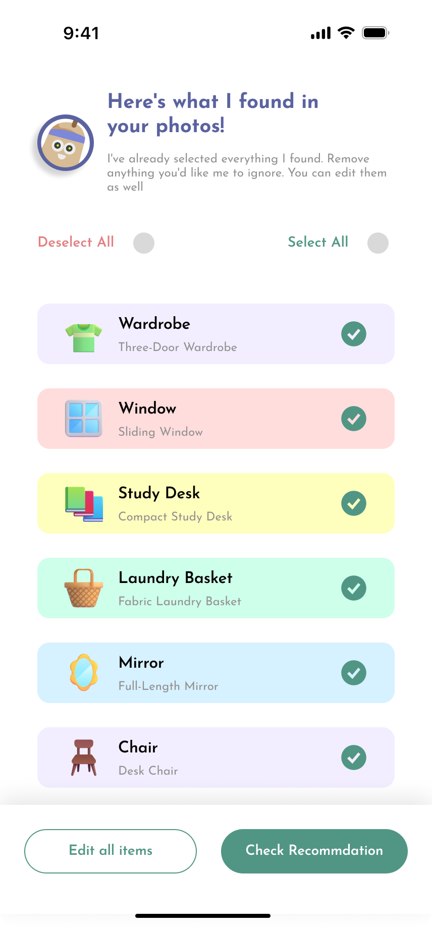
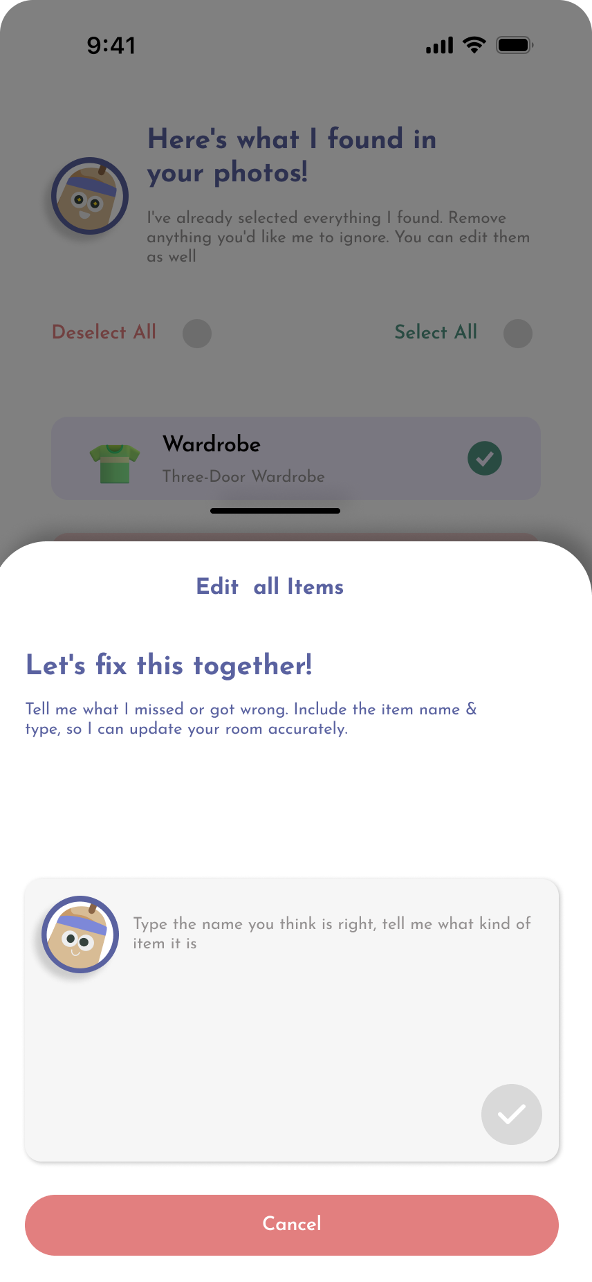
Instead of describing the mess, the user photographs it. Four photo slots, an optional voice note and a typed prompt feed the same analysis. Kleo then reads the images back — the items it recognised, grouped by category — and asks the user to confirm, correct or add anything it missed, so the AI stays a draft the user approves rather than a verdict.

Kleo room capture screen 1Kleo room capture screen 2Kleo room capture screen 3Kleo room capture screen 4Kleo room capture screen 5Kleo room capture screen 6Kleo room capture screen 7Kleo room capture screen 8Kleo room capture screen 9Kleo room capture screen 10Kleo room capture screen 11
03

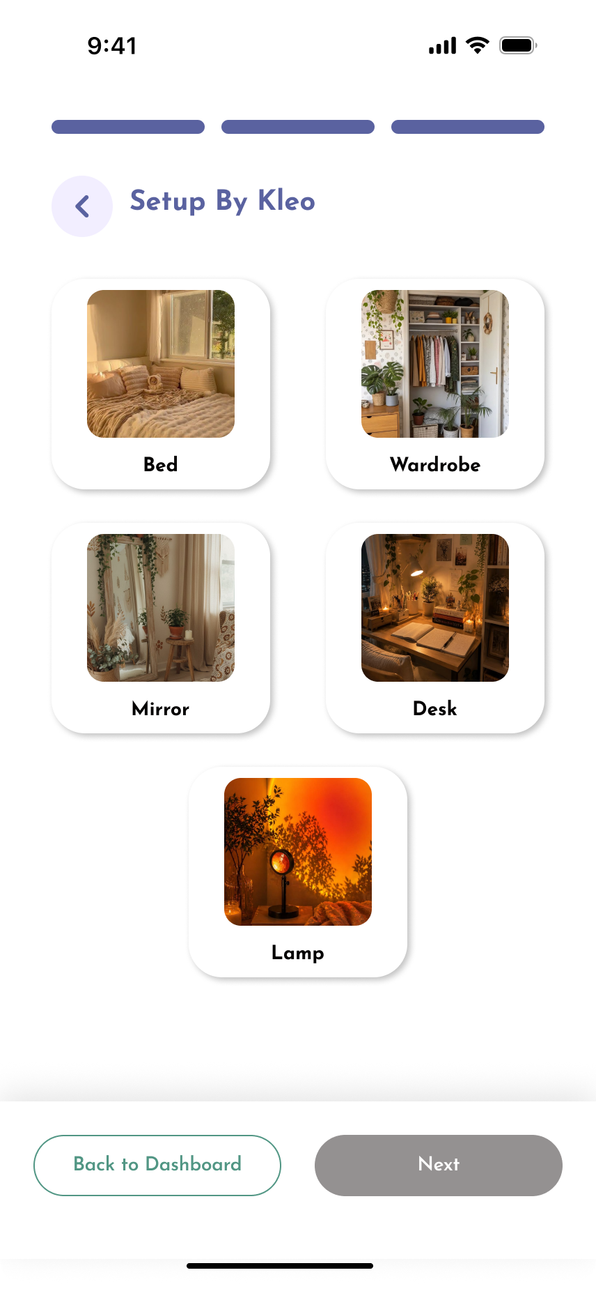
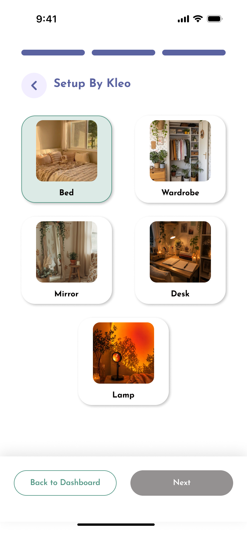
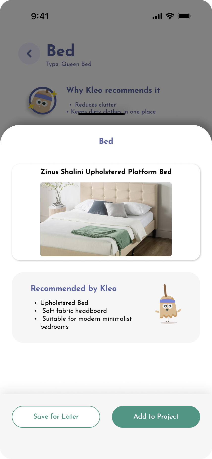
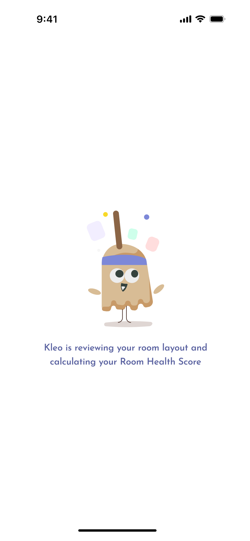
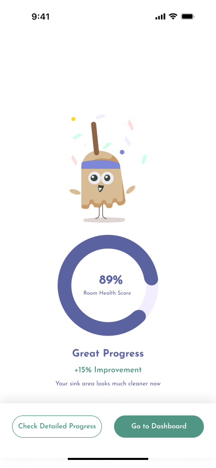
Room setup

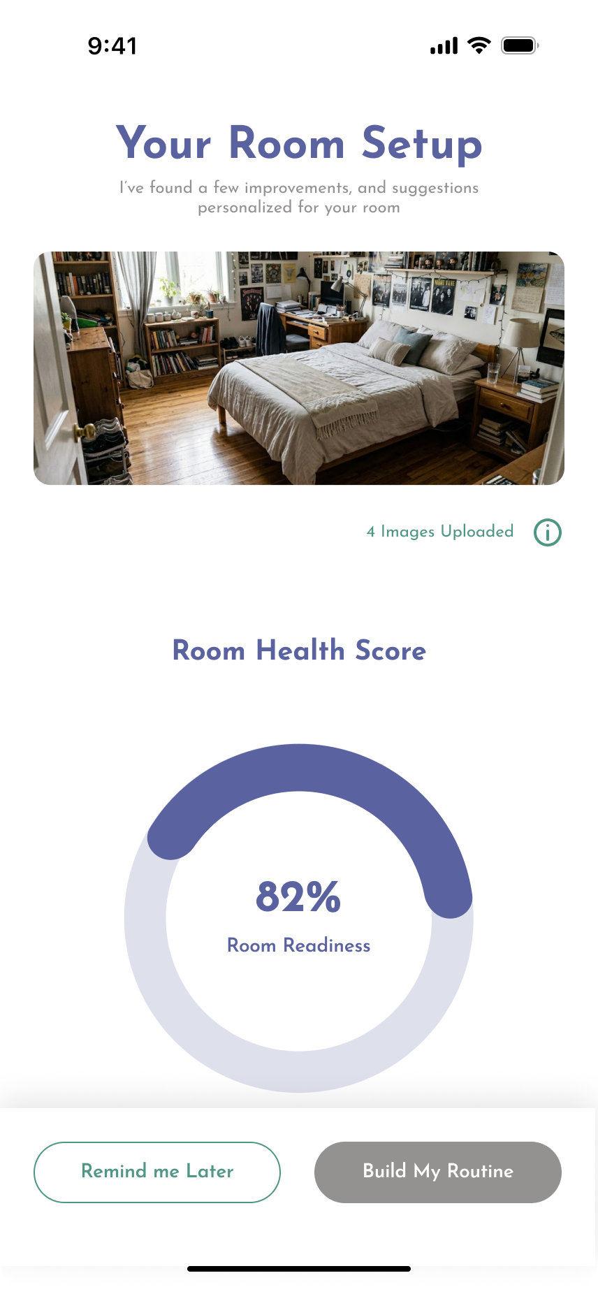
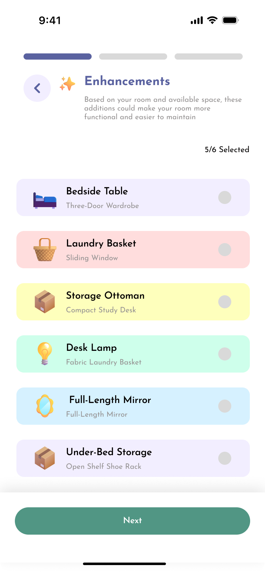
The analysis becomes an editable room. A room health score gives an immediate read on the current state, and the findings split into cleaning, organization, maintenance and enhancement issues with priority tags. Every detected item can be renamed, resized, removed or added, which keeps the user in control of the data the routine is built from.
Kleo room setup screen 1Kleo room setup screen 2Kleo room setup screen 3Kleo room setup screen 4Kleo room setup screen 5Kleo room setup screen 6Kleo room setup screen 7Kleo room setup screen 8Kleo room setup screen 9Kleo room setup screen 10Kleo room setup screen 11Kleo room setup screen 12Kleo room setup screen 13Kleo room setup screen 14
04

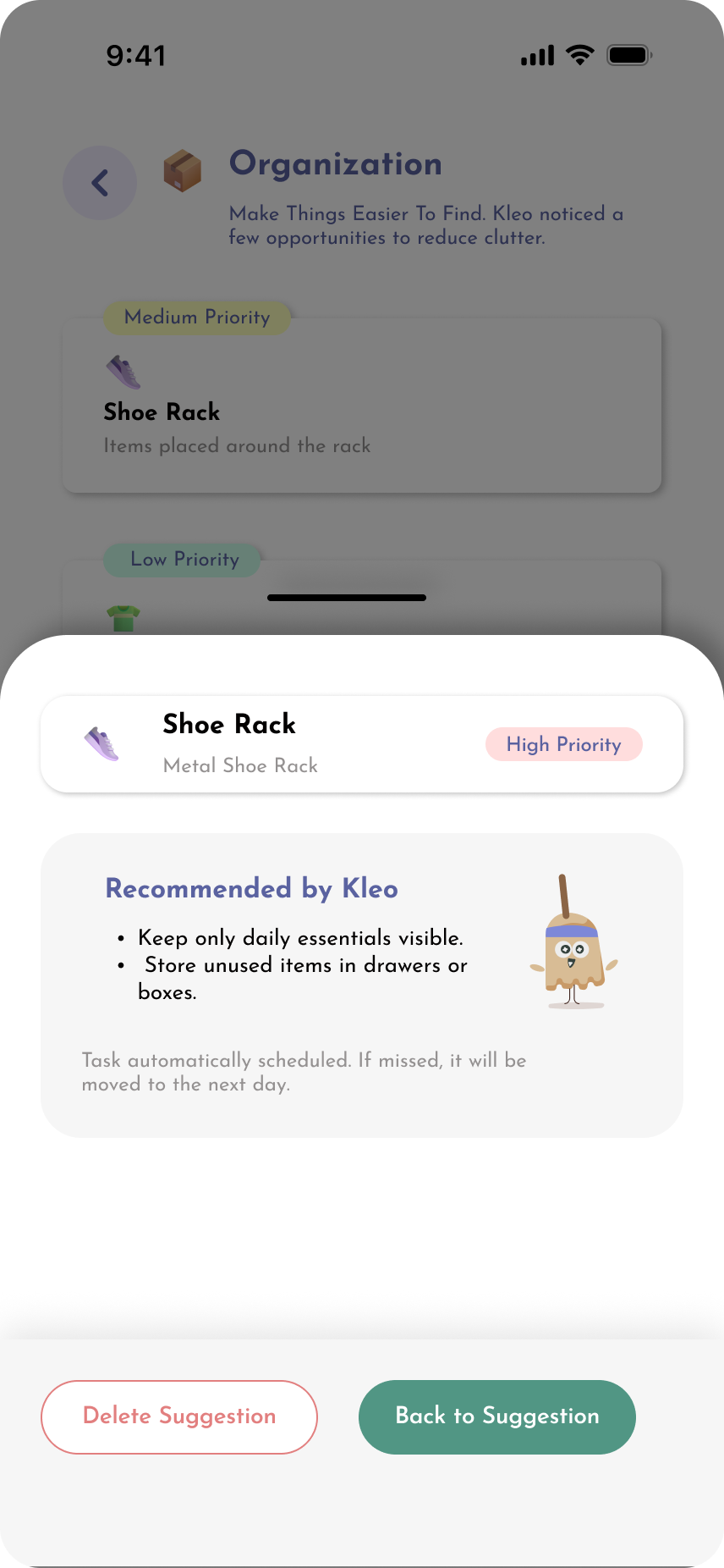
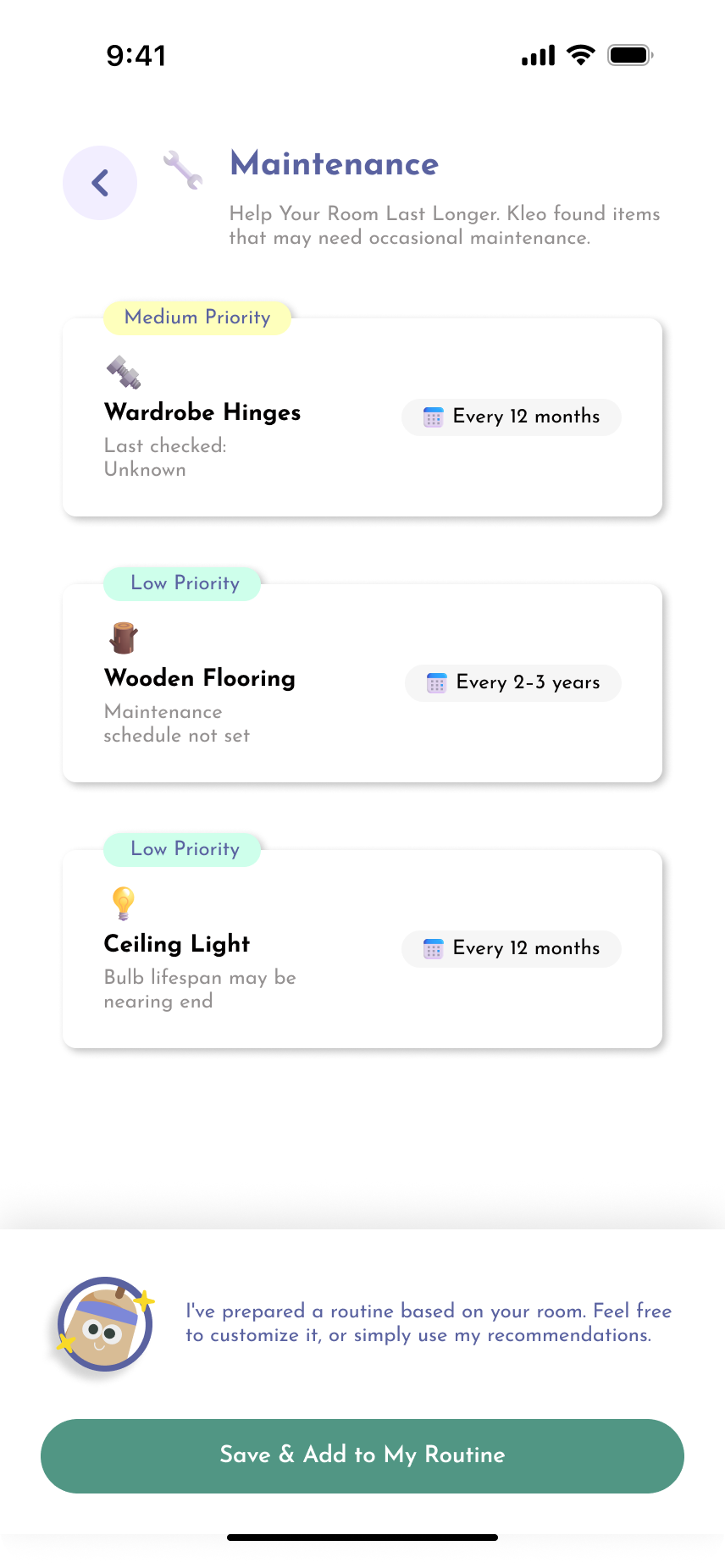
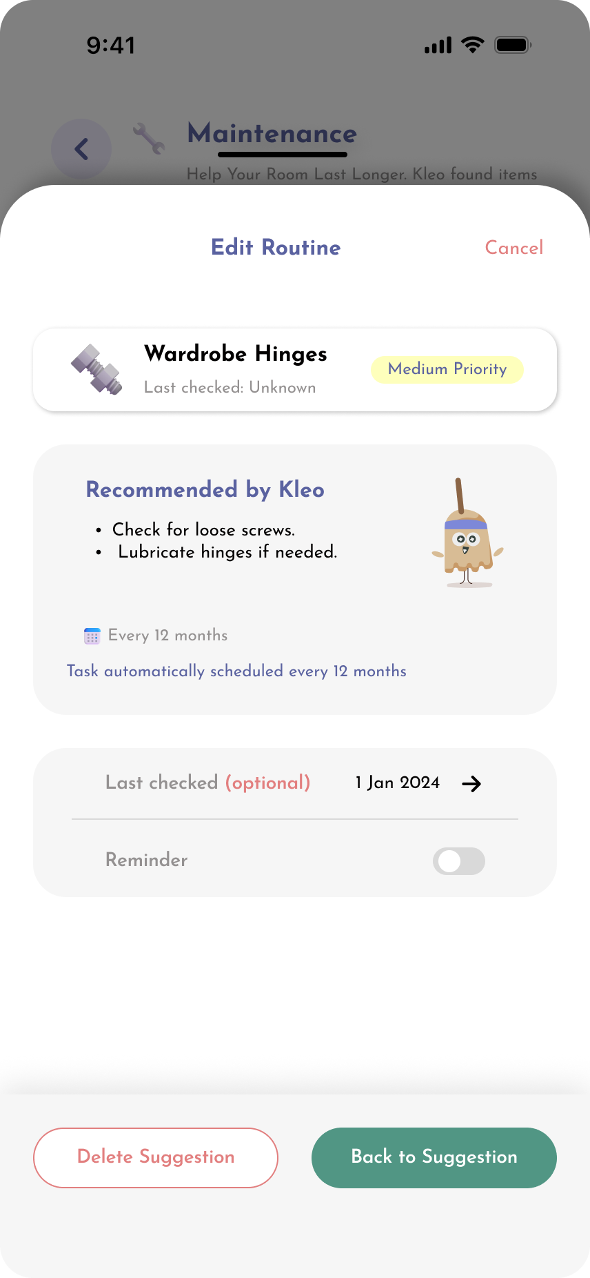
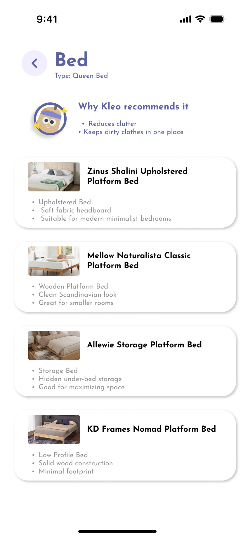
Building the routine

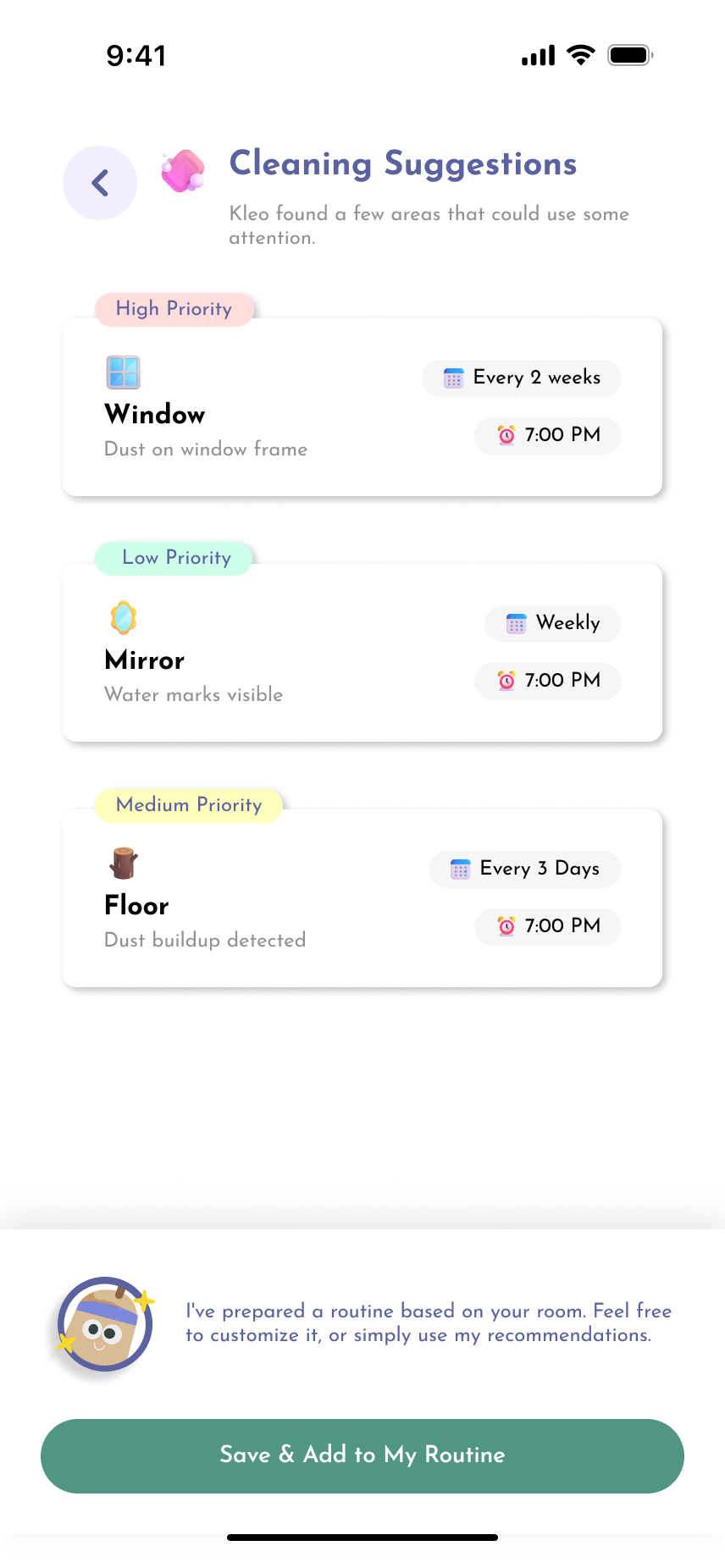
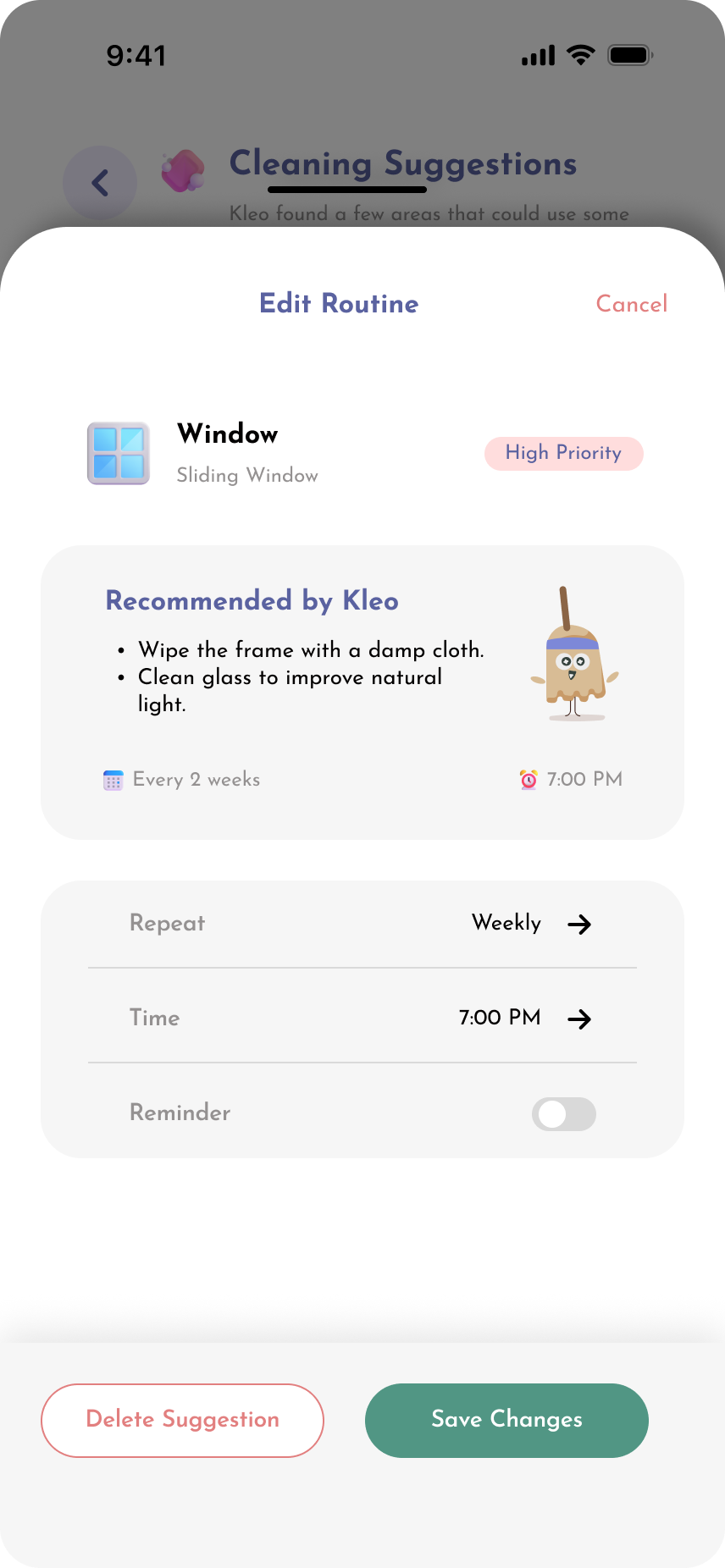
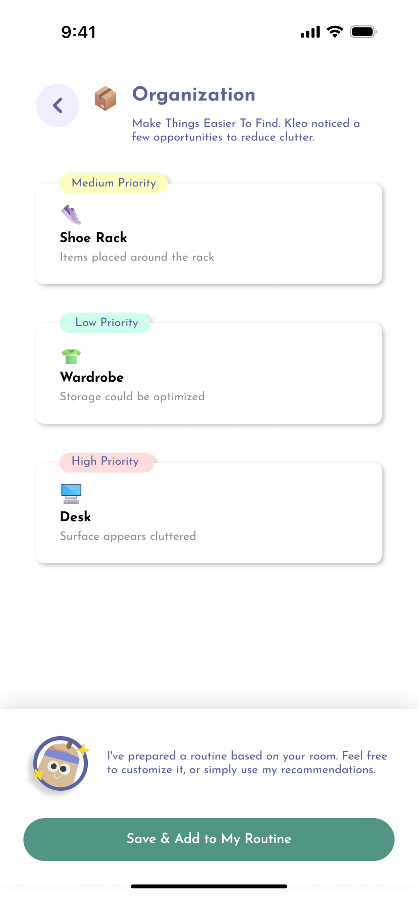
Each category becomes a short, reviewable list rather than one large chore. Items carry a priority tag and a suggested frequency, and a single primary action — save and add to my routine — turns a set of observations into a schedule. Nothing is committed until the user accepts it.

Kleo routine screen 1Kleo routine screen 2Kleo routine screen 3Kleo routine screen 4Kleo routine screen 5Kleo routine screen 6Kleo routine screen 7Kleo routine screen 8Kleo routine screen 9
05

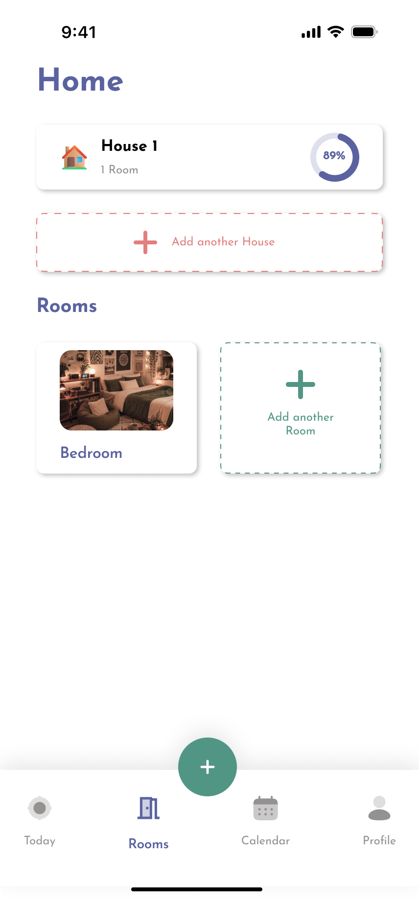
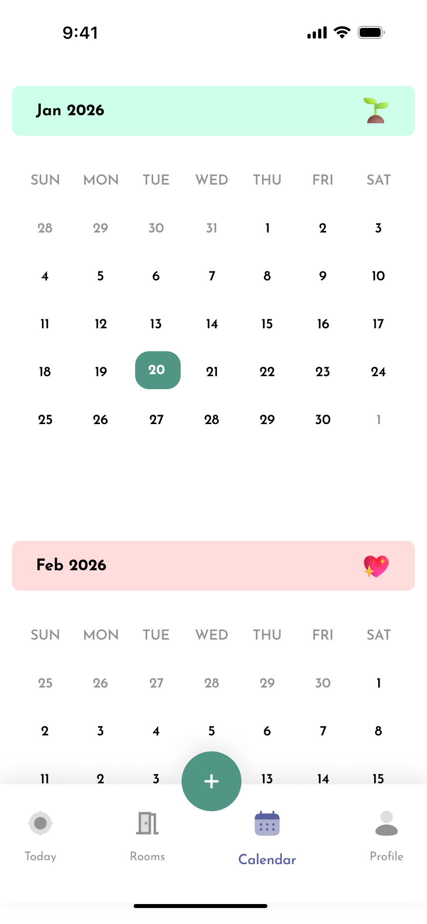
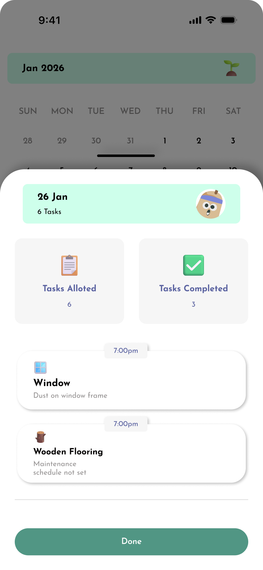
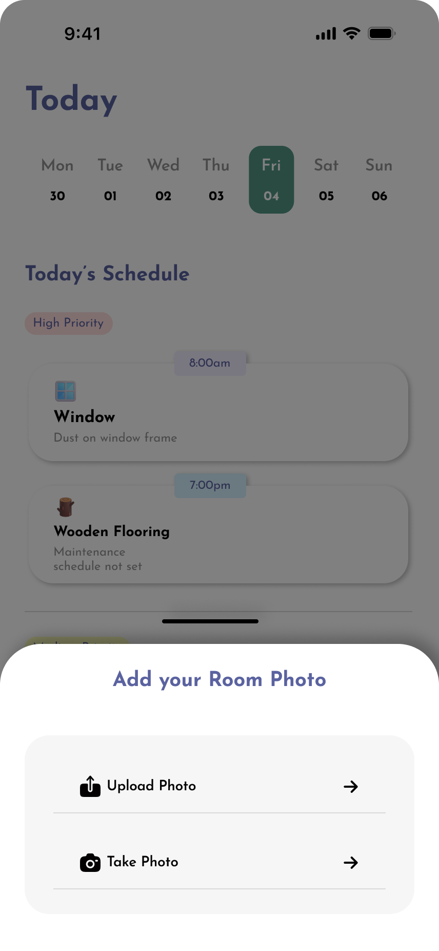
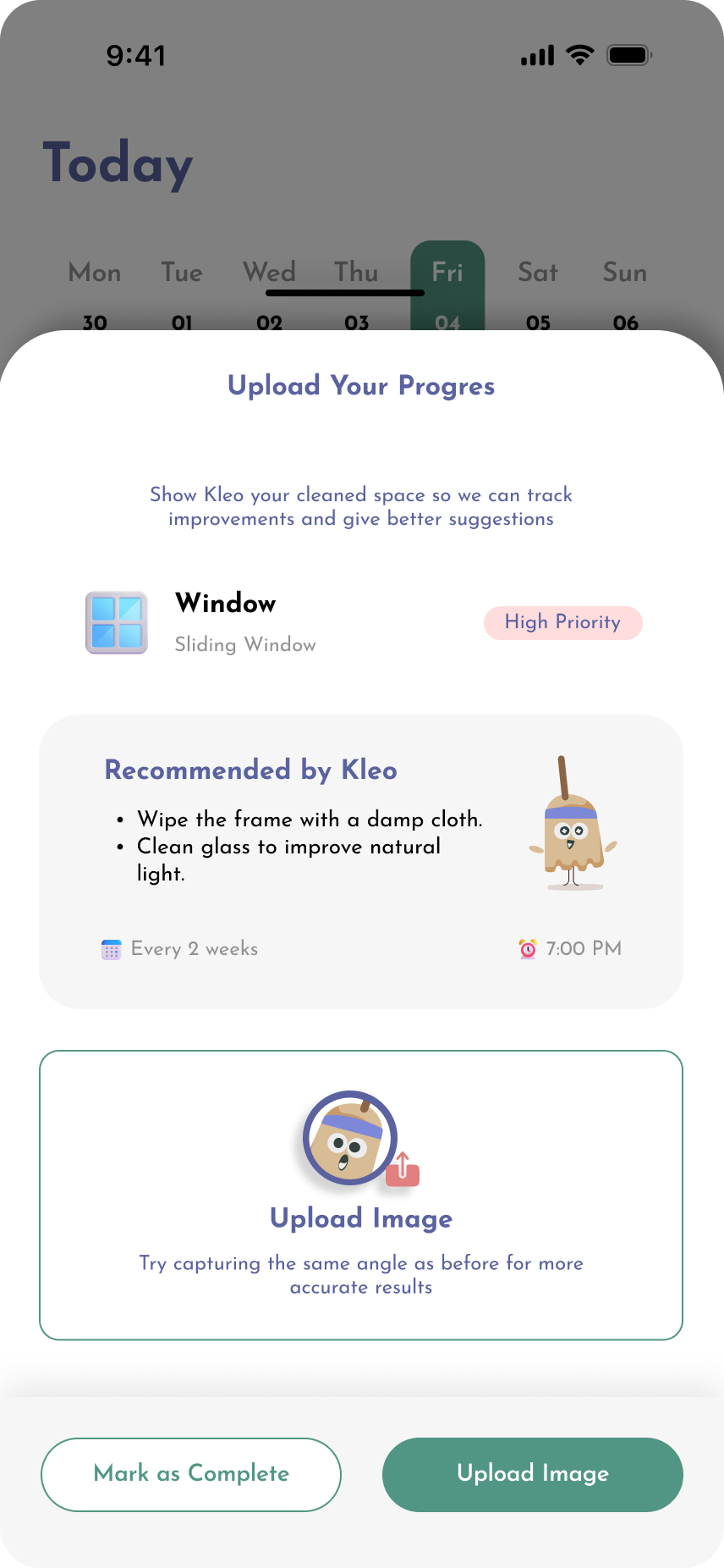
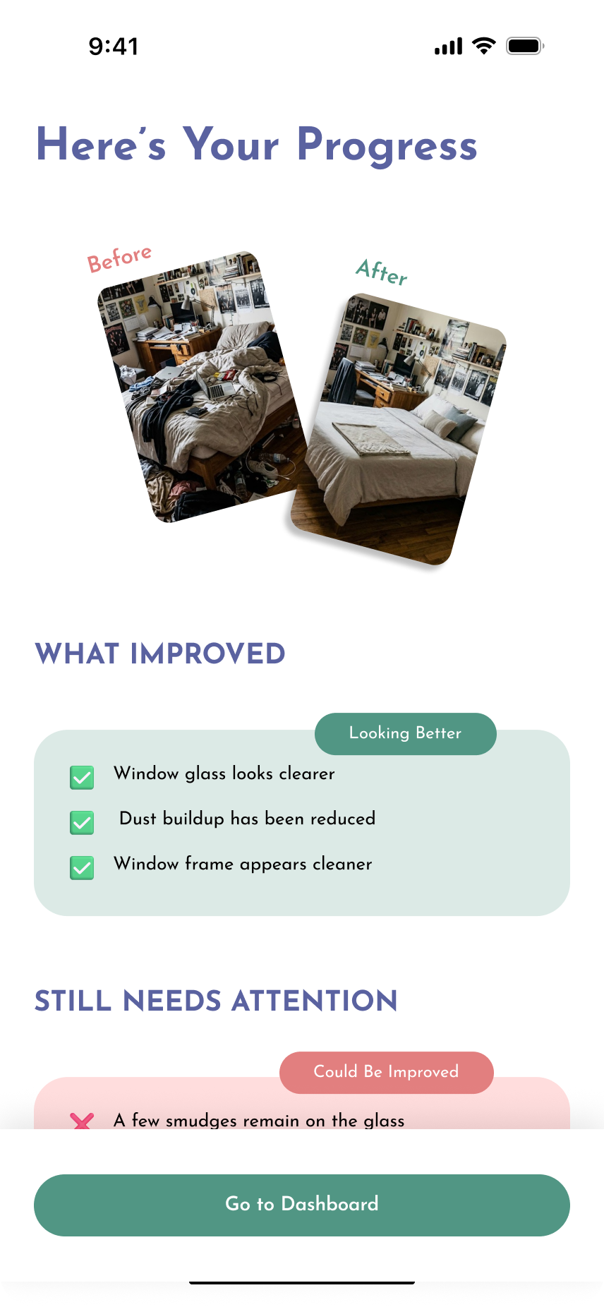
Dashboard, Today and uploading a task

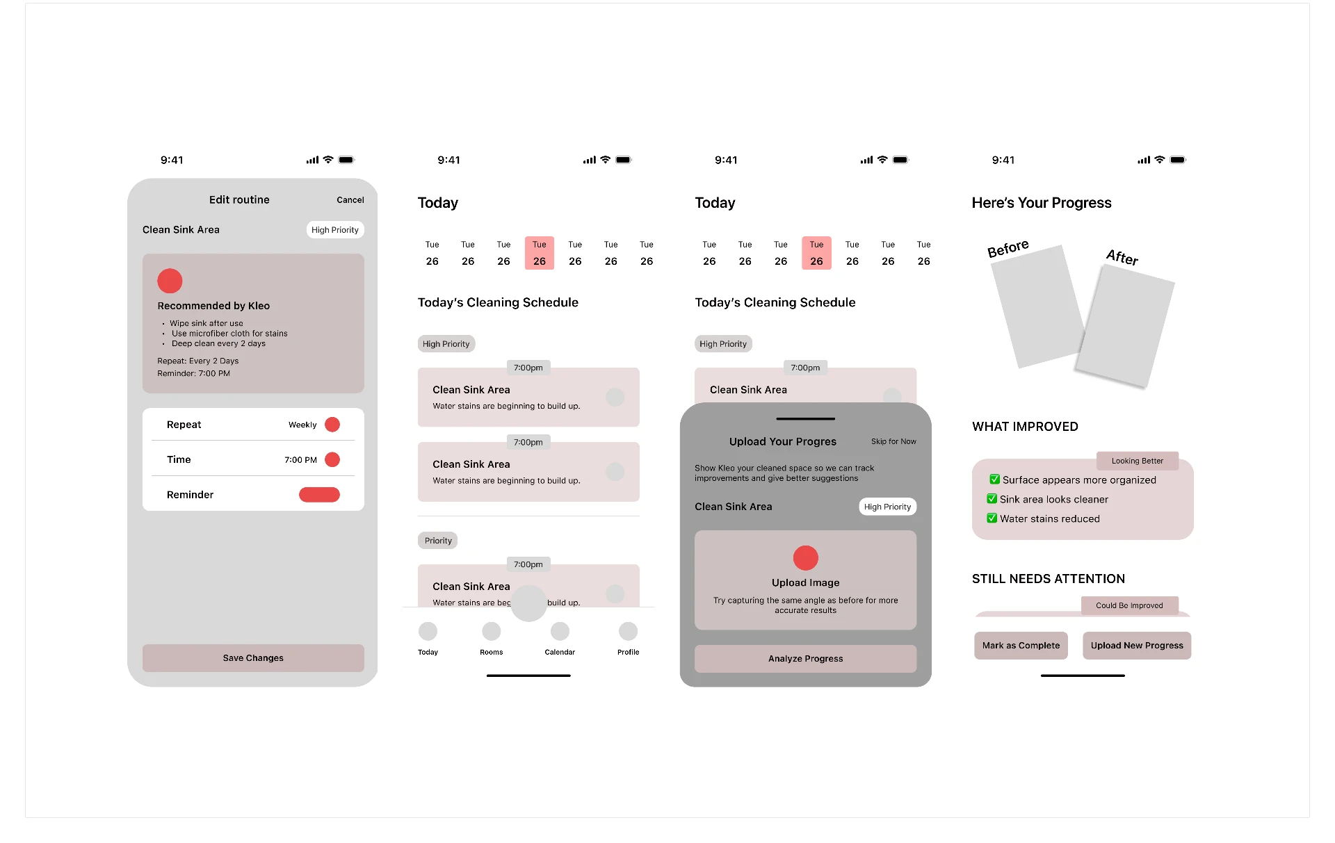
The dashboard opens on Today: the current date strip, the tasks due now grouped by priority, and a bottom navigation of Today, Rooms, Calendar and Profile. Completing a task can be closed with a progress photo, and Kleo compares it to the earlier image to report what improved and what still needs attention — so effort is tied back to the state of the room instead of a streak counter.

Kleo — Dashboard, Today and uploading a task

Before / after

From complexity to clarity

The earlier direction asked the user to plan before the product gave anything back. The refined direction inverts that.

Before

  • A blank checklist waiting to be filled in
  • Routine setup before anything useful happens
  • Everything presented as equally urgent
  • 'Clean the room' as a single task

After

  • A photo that returns specific actions
  • Capture as the entire first interaction
  • Four categories with one recommended starting point
  • 'Clear the two mugs on the desk'

What changed

  • Reduced cognitive load
  • Clearer hierarchy
  • Stronger primary action
  • More visible progress
  • Easier navigation
  • More approachable visual language

These are qualitative design improvements from a self-directed concept. The next step is putting them in front of real users to see how they hold up.

Reflection

What I learned

  1. 01

    Designing for behaviour, not just tasks

    The challenge was not simply creating a cleaning checklist; it was designing around motivation, overwhelm and maintenance.

  2. 02

    Small actions can reduce perceived complexity

    Breaking down a large task can make the experience feel much more approachable.

  3. 03

    AI needs a clear role

    AI should reduce effort and decision-making rather than become another layer of complexity.

  4. 04

    Good UI follows good structure

    The visual design becomes more effective when the information architecture and interaction model are clear first.

Research findings

Secondary research and recurring patterns in public community discussion about cleaning and organization.

Design decisions

Choices made in response to those patterns — structure, categories, and the single-action model.

Conceptual outcomes

Kleo is an independent case study I designed to practice end-to-end product thinking — research through to a working prototype. Real-world testing is the next chapter, not a missing one.